ONG Viva Rio - Flooding - Ad Analysis

AI Editor notes
Straight from the gut!!
“This is incredibly clever. It’s so simple it hurts. For 40 seconds, I'm just reading a list, and then the reveal hits. It doesn't use the shocking images of destruction we're all desensitized to. Instead, it uses typography and sound to create the feeling of loss. It's quiet, respectful, and devastatingly effective. This is how you do a PSA without being preachy or exploitative.”
Quick Summary
This ad brilliantly transforms the abstract concept of loss into a tangible, emotional gut punch. It achieves this by first building value in the everyday items that make a house a home, and then visually and audibly erasing them to simulate the devastation of a flood, making the final call for donations feel urgent and personal.
Executive Summary
This ad from Viva Rio is a masterclass in emotional efficiency, proving that a powerful insight executed with creative simplicity can be more moving than a multi-million dollar production. It operates on a single, resonant human truth and uses basic tools—typography and sound—to land a devastatingly effective message.
The Core Insight: The true tragedy of losing your home in a disaster isn’t about the material cost of the items you lose; it’s about the erasure of the memories, routines, and sense of family that those objects represent. A home is a collection of stories, not just an inventory of possessions. This ad understands that a dining table isn't just wood; it's the place the family gathers. A carpet isn't just fiber; it's where a baby plays. By tapping into this universal truth, the ad makes an impersonal catastrophe feel deeply personal.
The Execution: The ad follows a classic Setup–Turn–Payoff structure.
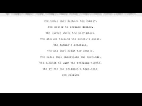
- Setup (0:01-0:42): The first two-thirds of the spot patiently build an emotional world, not with images, but with words. Using a simple typewriter font and sound effect, the ad lists possessions, each tied to a human action: 'The cooker to prepare dinner,' 'The shelves holding the school’s books.' This deliberate, slow-paced litany transforms inanimate objects into vessels of life and family history, forcing the viewer to invest emotionally in what is being described.
- Turn (0:43-0:56): The turn is a brilliant piece of sensory disruption. The familiar clacking of the typewriter ceases, replaced by the unsettling sound of rising water. A blue bar—a stark, graphic representation of a flood—creeps up the screen, submerging each line of text. The very words that built the emotional foundation are now being 'drowned,' visually and audibly erasing the life we just imagined. The line, 'Flooding makes every year thousands of brazilians lose everything,' appears, delivering the sharp, logical blow that re-contextualizes the entire setup.
- Payoff (0:57-1:04): The final appeal is direct and earned. Having made the viewer feel the loss, the ad presents the solution: 'Donate.' The Viva Rio logo and website URL provide the clear, actionable next step. The payoff isn't a manufactured happy ending; it's a stark, powerful appeal to the viewer to help create one.
The Debrief: The key lesson here is the power of restraint. In a category saturated with shocking footage and emotional pleas, this ad cuts through by being quiet and intelligent. It trusts the audience to use their imagination. By showing less, it makes the viewer feel more, proving that a strong concept is the most valuable asset in advertising. The team successfully translated a complex emotional idea into a simple, undeniable visual metaphor.
Theme Keywords
Brand Position
The thoughtful, effective channel for turning public empathy into tangible aid for Brazilians in crisis.
Brand Archetype
Caregiver. Personality: Empathetic, respectful, direct.
Creative Game Plan
We will illustrate how a flood erases not just possessions, but the human stories they contain, making the abstract concept of loss feel personal to every viewer.
Diagnosis: Issues & Solutions
Primary Issue: Clarity of 'What's Next?'
The Problem:
The call-to-action, while clear in its message ('Donate'), is displayed quite briefly at the very end of the video. In a digital environment where viewers often click away before a video fully concludes, the short window to see and process the vivario.org.br URL is a missed opportunity.
The Solution:
Keep the URL and logo on-screen for a longer duration during the end card. Alternatively, subtly superimpose the URL on the screen during the 'flooding' sequence to increase exposure time without disrupting the creative.
Additional Notes
Credits
Share this Analysis
More Viva Rio ad breakdowns
- Feed a child. Feed a Childhood. | World Vision CanadaWorld Vision Canada
- #BikesForUkraine Join our international campaign!Bikes For Ukraine
- Winter Appeal 2021Anglicare WA
- BØRNEfonden(Children & Youth Foundation): How old is old enough?BØRNEfonden (Children & Youth Foundation)
- Get Cancer | ChemistryIrish Cancer Society
- Dublin's Unfair City: Justin's story told through Artificial IntelligenceDublin Simon Community
- AloneThe Salvation Army
- HomeForTheBlindZurich StevieWonderHome for the Blind Zurich (Blindenwohnheim Mühlehalde)