FAIRNESS WORKS! Fall 2014 Television Ad - Ad Analysis

AI Editor notes
Straight from the gut!!
“This is a classic 'heartstrings' advocacy play. The popsicle is a bit quirky, but it works. It breaks through the bleakness. My main question is whether anyone watching actually believes a labour union is a sweet treat. It's a nice sentiment, but it feels disconnected from the gritty reality of labour negotiations. It's selling the *idea* of fairness, but feels a step removed from the fight it takes to get there.”
Quick Summary
This ad succeeds by translating abstract, complex policy goals—like retirement security and accessible childcare—into simple, tangible, and visually memorable 'popsicles' of hope. It effectively positions the Canadian Labour Congress not as a political entity, but as a provider of practical solutions to the everyday economic anxieties of all Canadians, unionized or not.
Executive Summary
The Canadian Labour Congress’s “Fairness Works” spot is a well-executed piece of advocacy advertising that tackles a significant marketing challenge: making a large, institutional body feel personal and relevant. The core of its strategy is to reframe the labour movement from a political special interest group into a fundamental force for the public good, a caregiver for the entire nation. It does this not by citing statistics or making political arguments, but by tapping into a simple, powerful human truth.
The Core Insight: The ad is built on the insight that economic anxiety is an isolating experience. When people struggle with unemployment, insecure work, or access to healthcare, they often feel alone and powerless. The ad gives this feeling a face—or rather, four faces—each representing a core pillar of economic insecurity. The campaign’s strategic bet is that by offering a message of collective support (“I’ll be there”), it can transform feelings of individual despair into a sense of shared hope and purpose, with the labour movement positioned as the conduit for that hope.
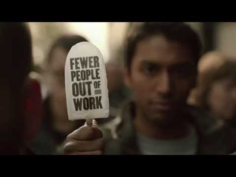
The Execution: The ad follows a classic Problem-Solution narrative structure. It opens by establishing the problem with a montage of somber vignettes: a queue at a job centre, an older woman at a physically demanding job, a crowded clinic, and a pregnant cashier. The desaturated colour palette and the melancholy opening chords of the 'I'll Be There' cover effectively set a tone of struggle. The 'Turn' is the ad's central creative device: the popsicle. At the moment of peak despair in each scene, the character turns to the camera, breaking the fourth wall and holding up a popsicle with a simple, aspirational message like 'MORE OF US ABLE TO RETIRE.' This unexpected visual is clever; it simplifies a complex policy goal into a digestible, almost childlike treat. It’s a moment of sweetness and relief cutting through the bleakness. The 'Payoff' comes in the final title cards, which explicitly name 'The labour movement' as the entity responsible for this 'fairer future' and provide a clear call to action to visit the campaign website. The music is the engine of the execution, perfectly mirroring the emotional journey from struggle to solidarity.
The Debrief: The key takeaway is the power of a strong creative device to simplify a complex message. The popsicle is memorable and highly effective at making abstract goals feel tangible and desirable. The ad demonstrates that for an advocacy campaign to succeed with a broad audience, it must connect its mission to the real, lived experiences of individuals. It successfully shifts the conversation from the politics of labour to the universal human desire for security and fairness, making the CLC’s brand more accessible and appealing. [2]
Theme Keywords
Brand Position
The indispensable champion for a fair economy that benefits all Canadians.
Brand Archetype
The Caregiver
Creative Game Plan
Connect the abstract goals of the labour movement to the personal economic anxieties of everyday Canadians using an unexpected visual metaphor.
Diagnosis: Issues & Solutions
Primary Issue: Strategic Sense
The Problem:
The ad's greatest strength—its gentle, hopeful tone—is also a potential weakness. It presents 'fairness' as a simple, sweet reward (a popsicle) and avoids any depiction of the conflict, struggle, and political action required to achieve these goals. This risks making the labour movement appear passive rather than as an active, fighting force.
The Solution:
Future campaigns could retain the hopeful outcome but hint more at the 'work' in 'Fairness Works.' A follow-up spot could show people not just receiving the benefit, but actively working together (e.g., community organizing, speaking at a rally) to achieve it, adding a layer of agency and empowerment to the message.
Secondary Issue: Emotional Connection
The Problem:
While emotionally resonant, the resolution feels slightly magical. A person is struggling, and then they present a popsicle that solves the problem. This can feel a bit too simplistic and may not fully land with a cynical audience who knows these problems aren't solved so easily.
The Solution:
Incorporate a 'middle step' that shows a moment of connection or solidarity *before* the solution is presented. For example, show the man in the unemployment line being offered a hand by another person before he reveals the popsicle, grounding the 'I'll be there' message in a human-to-human interaction.
Additional Notes
Related Links
Credits
Share this Analysis
More Canadian Labour Congress ad breakdowns
- The WatchCanadian Labour Congress
- Judy and Gary's storyCanadian Labour Congress
- 'Thanks!'—An Animated Trip to Holiday SlaughterPETA (People for the Ethical Treatment of Animals)
- SOLIDAR Video: Rights First!SOLIDAR
- Something is wrong - Rapunzel FailAPM - Aktionskreis gegen Produkt- und Markenpiraterie e.V.
- Boyfriend Went Vegan | PETAPETA (People for the Ethical Treatment of Animals)