Burns and Smiles - Awareness Campaign 2019 - Mathéo - #SeeDifferent - Ad Analysis

AI Editor notes
Straight from the gut!!
“This is smart. Really smart. For a moment, I was bracing for another sad, pity-play PSA. But the twist is clever and warm. It doesn't ask for pity; it asks for humanity. The insight that we should judge someone on their terrible sweater, not their scars, is funny, disarming, and lands perfectly. It's a solid lesson in how to do social commentary without being preachy.”
Quick Summary
This ad masterfully uses misdirection to reframe the viewer's perception of physical difference. By immersing us in a teenager's mundane school day, it makes the audience complicit in staring at his burn scars, only to reveal at the end that true connection sees past the surface to the person underneath—and their questionable fashion choices. It forces the audience to confront their own biases in a simple, memorable, and deeply human way.
Executive Summary
This campaign from Burns and Smiles, created by TBWA\Paris, is a sharp and effective piece of social commentary that sidesteps the typical tropes of public service announcements. [1, 2] It's a film about looking, both at others and at ourselves. The core insight is simple yet profound: we are not defined by our traumas or physical differences, but by the small, human, and sometimes quirky aspects of our personality—like a terrible taste in sweaters. The ad challenges the viewer to move beyond the instinctive stare, which often isolates survivors of trauma, and to instead engage with the whole person.
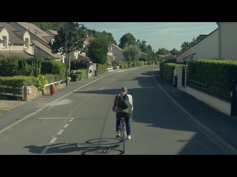
The execution follows a classic Setup-Turn-Payoff structure. The Setup meticulously builds a world around the protagonist, Mathéo. We follow him through a day at school, and the camera invites us to witness the social friction caused by his severe burn scars. We see the overt stares from classmates and feel his quiet endurance. This long setup makes the viewer hyper-aware of his physical difference, aligning our perspective with that of the ignorant onlooker. The Turn happens when a girl approaches him for a private conversation. The scene is pregnant with expectation; we anticipate a discussion about his scars, a moment of confrontation, or a grand declaration of acceptance. The narrative leans into the tropes of a teen romance, building tension. The Payoff is twofold and masterfully executed. First, she wordlessly kisses him, an act of pure connection that transcends appearance. Then, the on-screen text delivers the knockout punch: “The only thing you should find strange, is that jumper.” This line brilliantly subverts the entire narrative, forcing a re-evaluation of everything we've just seen. The focus is humorously shifted from his scars to his ugly sweater, a normal, trivial point of judgment among peers.
The key lesson from this campaign is the power of misdirection in communicating a sensitive message. Instead of lecturing the audience or inducing guilt, it makes them an active participant in the story's inherent bias. The payoff doesn't just resolve the plot; it provides a moment of self-realization for the viewer. It demonstrates that warmth and a touch of wit can be far more effective tools for fostering empathy than a direct appeal for pity. The ad doesn’t ask us to feel sorry for Mathéo; it asks us to see him, and in doing so, to see ourselves and our own prejudices more clearly.
Theme Keywords
Brand Position
The organization that champions seeing the person, not the scars.
Brand Archetype
The Everyman (focusing on a normal kid's life), with a touch of the Jester (the sweater twist).
Creative Game Plan
We'll tell a story that makes you stare at a boy's scars for a minute, only to make you laugh about his bad sweater in the end.
Diagnosis: Issues & Solutions
Primary Issue: Clarity of "What's Next?"
The Problem:
The primary call to action is cognitive ('Let's change the way we see...'), which is powerful for awareness but soft on converting emotion into tangible support. The URL is present but passive, missing an opportunity to guide the inspired viewer toward a concrete action that helps the organization.
The Solution:
Strengthen the final call to action with a more direct verb. Instead of just the URL, a prompt like 'Help us build a world where everyone can feel seen. Support us at burns-and-smiles.org' would better connect the film's emotion to the organization's mission.
Secondary Issue: Emotional Connection
The Problem:
The emotional connection to the character is strong, but the link back to the 'Burns and Smiles' organization itself could be more explicit. A viewer might remember the powerful story but forget the name of the association that created it.
The Solution:
After the final logo, add a brief title card that reads: 'Mathéo's story is one of thousands. Burns and Smiles provides a community for survivors to heal and reconnect.' This would ground the fictional narrative in the real-world work of the organization. [2]
Additional Notes
Related Links
Credits
Share this Analysis
More Burns and Smiles ad breakdowns
- Burns and Smiles - Awareness Campaign 2017 - Halloween - #SeeDifferentBurns and Smiles
- Burns and Smiles - Awareness Campaign 2018 - Cinema - #SeeDifferent the burns victimsBurns and Smiles
- Walk for Memories - RichardFederation of Quebec Alzheimer Societies
- Public Inc. x PERIOD. | Deck The StallsPERIOD.
- Mission Talita – Saving the Prostitutes of Los SantosTalita
- Animalife: The WalkAnimalife
- IsrA.L.S mannequin challengeIsrA.L.S (The Israel A.L.S Research Association)
- 100 years of... - Depaul FranceDepaul France