Birla Opus Paints - Duniya Ko Rang Do | Hindi | 60 sec - Ad Analysis

AI Editor notes
Straight from the gut!!
“This is a big, expensive swing for a launch. The animation quality is top-tier, clearly aiming for a Disney/Pixar feel to cut through the clutter. [11] But is it trying too hard? The 'child brings color to the world' trope is a bit worn. While beautifully executed, it feels safe. For a brand entering a market dominated by giants, I wonder if a safer, emotional play is enough to disrupt established buying habits.”
Quick Summary
As a major new entrant into India's crowded paint market, Birla Opus needed to make a memorable, high-impact debut. This animated film achieves that by sidestepping functional claims and instead selling a pure, universal emotion: the joy of color. The core idea is that paint isn't just a chemical product; it's a catalyst for happiness that can transform a dull, monochrome world into a vibrant, beautiful one.
Executive Summary
When a giant like Aditya Birla Group enters a hyper-competitive market like decorative paints, it can't just show up; it has to make a statement. The 'Duniya Ko Rang Do' launch film for Birla Opus is that statement. It’s a deliberate strategic choice to bypass the category's typical formula of product demos and celebrity endorsements in favor of a grand, emotional gesture. The core strategy is to associate the new brand not with paint, but with the feeling paint creates: happiness.
The Core Insight here is that color is fundamentally tied to emotion. A gray world is a sad world; a colorful world is a happy one. This isn't a new idea, but it's a powerful one. By personifying this transformation through an innocent, creative child, the brand positions itself as a simple, almost magical catalyst for joy. The choice of high-definition 3D animation, a first for the Indian paint industry, is the key tactical decision. [1] It elevates the film from a simple ad to a piece of entertainment, designed to be watched and shared, not skipped. It signals quality and a modern outlook, aiming to make legacy competitors feel dated.
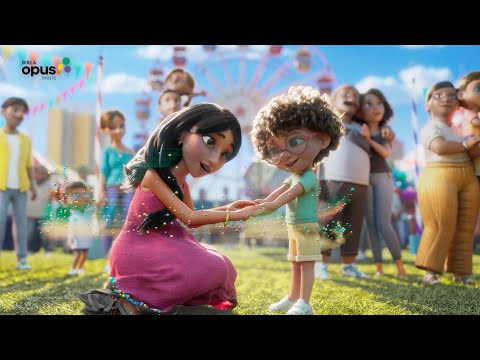
The execution follows a classic Setup-Turn-Payoff narrative. The Setup (0:00-0:16) establishes the problem: a world devoid of color and emotion, where everyone is despondent. The Turn (0:17-0:52) is initiated by the protagonist, a young boy who represents the brand's spirit. His 'magical touch' begins spreading color, first to his home and then to the wider community. This long middle act is a montage of transformation, showing various vignettes of life being infused with vibrancy and happiness. The music, a gentle anthem with the recurring line "Duniya ko rang do" (Color the world), drives the emotional momentum. [1] The Payoff (0:53-1:00) is the full realization of this colorful world—a joyous carnival scene—which culminates in the brand reveal: 'Introducing Birla Opus Paints. Banao life beautiful.'
The debrief for the team should be positive. The campaign successfully established an emotional territory for the brand. It looks and feels premium, justifying a premium position. However, the team must recognize that this is just the first step. The ad builds brand love, but it doesn't build brand logic. It creates awareness but doesn't provide a reason to choose Birla Opus over a trusted competitor like Asian Paints. The follow-up communication will need to bridge this gap, connecting the beautiful emotion of this film to tangible product benefits or a unique value proposition.
Theme Keywords
Brand Position
The paint that transforms life with beauty and joy.
Brand Archetype
Innocent
Creative Game Plan
Use stunning, feature-film quality animation to tell a universal story about how color transforms a sad world into a happy one, thereby associating the new brand with pure joy.
Diagnosis: Issues & Solutions
Primary Issue: Strategic Sense
The Problem:
The ad establishes a powerful emotional platform but doesn't create any rational preference. It's beautiful but generic. A competitor could easily swap their logo at the end, and the ad would work just as well. For a challenger brand, distinctiveness is paramount, and this film relies solely on execution quality, not a unique strategic idea.
The Solution:
Future campaigns must create a stronger, ownable link between the brand and the benefit. Instead of the generic 'color is happiness,' the next step could be to dramatize a unique aspect of Birla Opus—perhaps its specific color palettes, its durability, or a service innovation—while retaining the emotional warmth.
Secondary Issue: Clarity of "What's Next?"
The Problem:
The ad's objective is pure awareness, so the lack of a direct call-to-action is intentional. However, it misses an opportunity to guide curious viewers. There's no prompt to explore the color range, use a visualization tool, or find a local dealer, leaving the audience inspired but inactive.
The Solution:
Integrate a soft call-to-action in the digital versions of the ad. A simple end-card or description link inviting viewers to 'Discover your color' or 'See our palettes' would capitalize on the interest generated by the film without undermining its emotional tone.
Additional Notes
Related Links
Credits
Share this Analysis
More Birla Opus Paints ad breakdowns
- Birla Opus Paints | Celebrating Colours of India | Jaipur | Hindi | 30sBirla Opus Paints
- Birla Opus Paints | Special Mehmaan Aayenge? | Ganesh Chaturthi | HindiBirla Opus Paints
- Birla Opus Assurance | Painting Wapas Karke Dene ka Assurance | Politician | Hindi | 45sBirla Opus Paints
- Birla Opus Assurance | Painting Wapas Karke Dene ka Assurance | Rockstar | Hindi | 45sBirla Opus Paints
- Birla Opus Paints | Naye Zamane Ka Naya Paint | Style Interiors | Vicky K.|Saurabh S. | 45 sec HindiBirla Opus Paints
- Birla Opus Paints | Celebrating Colours of India | Mumbai | Hindi | 30 secBirla Opus Paints
- Celebrate the magic of Colours this Holi with Birla Opus PaintsBirla Opus Paints
- Birla Opus Paints - Duniya Ko Rang Do | Hindi | 30 sec (Exterior)Birla Opus Paints