Birla Opus Paints - Duniya Ko Rang Do | Hindi | 30 sec (Exterior) - Ad Analysis

AI Editor notes
Straight from the gut!!
“This is a classic 'big company' launch. You can feel the budget. It's beautiful, slick, and very safe. The Pixar-style animation is a smart way to scream 'premium quality' without saying a word. But is it distinctive? Asian Paints has owned the 'beautiful homes, beautiful moments' space for decades. This feels like a lovely tribute to that strategy, not a disruption of it. Who is the kid for? The homeowner or their child?”
Quick Summary
As a major new challenger in a crowded market, Birla Opus uses world-class animation to sidestep functional claims and establish an immediate, premium emotional position. The ad equates the brand with the universal joy of transforming a monochrome world into a colourful, beautiful life, aiming to build brand love before fighting on product features.
Executive Summary
Birla Opus's entry into the decorative paints market is a formidable challenge to established leaders, and its launch campaign, "Duniya Ko Rang Do," reflects a strategy of meeting the incumbents on their own turf: emotional, aspirational storytelling. The core insight driving this ad is that paint is never just about paint; it’s a tool for emotional and environmental transformation. The desire to add colour to one's surroundings is a fundamental expression of hope and the pursuit of happiness. The ad eschews technical specifications and price points to focus entirely on this human truth.
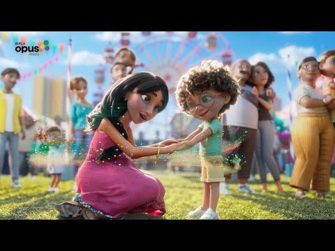
The execution follows a classic Hook-Value-Proof-Ask structure, amplified by its high-end animation. The hook is the stark, black-and-white world and the empathetic, Pixar-esque child protagonist, which immediately creates intrigue and an emotional anchor. The value proposition is introduced as the child discovers his magical ability to spread colour. This isn’t presented as painting, but as an innate power, cleverly associating the brand with a fundamental, almost magical force of change. The 'colour bubbles' serve as a unique visual device for this transformation. The proof stage scales the concept from a single toy to a home, a street, and finally, an entire community fair. This visual crescendo demonstrates the expansive impact of the brand's promise—it’s not just for your house, but for your entire world. The final ask is gentle and brand-focused. The voiceover introduces 'Birla Opus Paints' and the tagline 'Make Life Beautiful' crystallizes the entire film's message into a simple, positive mandate. The ad's primary job is to get the name 'Birla Opus' into the consumer's mind, wrapped in a warm, premium, and optimistic feeling.
The debrief for the marketing team would be positive but cautionary. The campaign successfully establishes Birla Opus as a high-quality, serious player. The investment in world-class animation from Zombie Studio pays off, creating a film that feels global and premium. However, the team must recognize that they've chosen to compete on the most difficult terrain: the emotional high ground that market leader Asian Paints has occupied for generations. While effective for a launch, this strategy's long-term success will depend on follow-up campaigns that either introduce tangible product differentiators or carve out a more unique emotional niche beyond the general promise of a 'beautiful life'.
Theme Keywords
Brand Position
The premium paint that provides the magical transformation to a more beautiful life.
Brand Archetype
The Magician
Creative Game Plan
Use globally benchmarked animation to visually represent the transformative power of colour, positioning Birla Opus as a magical catalyst for turning a dull life into a beautiful one.
Diagnosis: Issues & Solutions
Primary Issue: Strategic Sense
The Problem:
As a challenger brand, the ad is strategically safe, adopting the emotional-storytelling playbook of the market leader rather than creating a disruptive reason to switch. It establishes presence but doesn't provide a compelling argument for why a consumer should choose Birla Opus over their default brand.
The Solution:
Future campaigns must introduce a 'why'. This could be a unique product benefit (e.g., 'The only one-coat-coverage paint'), a service innovation (e.g., 'The fastest painting service'), or a sharper emotional angle ('The paint for bold choices') to differentiate from the competition's broader 'beautiful moments' narrative.
Secondary Issue: Brand Distinctiveness
The Problem:
The protagonist, while charming, feels like a generic animated character. Naming him 'Opus' isn't communicated in the ad, making him a temporary vehicle for the story rather than an ownable brand mascot that can build equity over time.
The Solution:
If the brand intends to use this character long-term, he needs to be integrated more deliberately. This could involve naming him in future ads or developing a narrative series around his adventures in 'making life beautiful', turning him into a recognizable brand asset like the Asian Paints mascot, Gattu.
Additional Notes
Related Links
Credits
Share this Analysis
More Birla Opus Paints ad breakdowns
- Birla Opus Paints | Celebrating Colours of India | Jaipur | Hindi | 30sBirla Opus Paints
- Birla Opus Paints | Special Mehmaan Aayenge? | Ganesh Chaturthi | HindiBirla Opus Paints
- Birla Opus Assurance | Painting Wapas Karke Dene ka Assurance | Politician | Hindi | 45sBirla Opus Paints
- Birla Opus Assurance | Painting Wapas Karke Dene ka Assurance | Rockstar | Hindi | 45sBirla Opus Paints
- Birla Opus Paints | Naye Zamane Ka Naya Paint | Style Interiors | Vicky K.|Saurabh S. | 45 sec HindiBirla Opus Paints
- Birla Opus Paints | Celebrating Colours of India | Mumbai | Hindi | 30 secBirla Opus Paints
- Celebrate the magic of Colours this Holi with Birla Opus PaintsBirla Opus Paints
- Birla Opus Paints - Duniya Ko Rang Do | Hindi | 60 secBirla Opus Paints