Birla Opus Paints | Celebrating Colours of India | Mumbai | Hindi | 30 sec - Ad Analysis

AI Editor notes
Straight from the gut!!
“This is a classic 'big bang' launch. The production value is top-notch, clearly signaling they have the money to compete. But is it smart? It feels very safe. The 'paint brings color to life' idea is the oldest trick in the book for this category. While executed beautifully, it feels like they're trying to out-Asian Paints Asian Paints. I'm left wondering what makes Birla Opus *different*, other than the fact they're the new guys with deep pockets.”
Quick Summary
Birla Opus uses high-end, Disney-esque animation to launch itself into the crowded Indian paint market, positioning the brand not as a mere seller of paint, but as a magical catalyst for transforming the mundane into the beautiful, starting with one of India's most iconic landmarks.
Executive Summary
Birla Opus has entered the Indian paint market not with a whisper, but with a roar, and this animated film is its opening statement. The core strategy is clear: bypass a rational, feature-based argument and instead make a direct deposit into the emotional bank account of the Indian consumer. It’s a brand-building play, through and through, designed to establish Birla Opus as a modern, high-quality, and emotionally resonant player from day one.
The Core Insight: The campaign is built on a simple, universal human truth: color is intrinsically linked to emotion. A world without color feels lifeless and mundane, while a world bursting with it feels joyful, vibrant, and full of stories. The insight is that people don't just buy paint to cover a wall; they buy it to change a feeling, to bring new energy into their lives. The brand, therefore, isn't selling paint; it's selling transformation.
The Execution: The ad uses a classic Setup-Turn-Payoff narrative structure, executed through high-quality animation—a deliberate choice to create a sense of magic and stand out from the live-action-dominated advertising of its competitors. [8, 17]
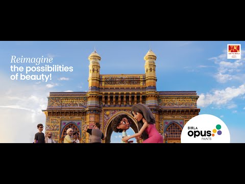
- Setup (0:00-0:10): The film opens with a problem: a black-and-white world. The iconic Gateway of India is rendered in monochrome, and the people around it are listless. The protagonist, a young boy, represents the audience's latent desire for something more vibrant. This establishes the emotional baseline—a world lacking joy.
- Turn (0:11-0:25): The 'Opus Boy' acts as the agent of change. His simple touch unleashes the product's magic. The dramatic, sweeping reveal of color across the monument is the film's centerpiece. This isn't just about paint; it's about the brand's power to 'Make Life Beautiful', as its philosophy states. The music swells, and the energy shifts from melancholic to ecstatic. This is the magical transformation, the core promise of the brand.
- Payoff (0:26-0:30): The final scenes connect this emotional uplift directly to the brand. The tagline, 'Duniya ko rang do' (Paint the world), provides a simple, memorable summary of the brand’s mission. The end slates for Birla Opus and the parent Aditya Birla Group serve to build credibility and trust, assuring the audience that this new, magical brand is backed by a powerful and reliable entity. [6, 7]
The Debrief: The team successfully launched a new brand with a film that feels premium, confident, and emotionally appealing. It establishes a broad, positive emotional territory. The primary challenge moving forward will be to build on this foundation with reasons to believe that are unique to Birla Opus. The 'Opus Boy' is a good start as a potential brand mascot, but he will need to do more in the future than just touch things. The brand must now prove that its beauty is more than skin deep by connecting this magical story to tangible product benefits or a differentiated service experience, otherwise it risks being perceived as just another pretty face in a very crowded market.
Theme Keywords
Brand Position
The paint brand that transforms everyday life with a touch of beauty and magic.
Brand Archetype
The Magician
Creative Game Plan
Establish Birla Opus as a major new brand by using premium animation to show how color can magically transform a cherished national icon, linking the brand to joy and beauty.
Diagnosis: Issues & Solutions
Primary Issue: Strategic Sense
The Problem:
The campaign is strategically sound for a launch but lacks a sharp competitive edge. It emulates the emotional storytelling playbook of market leaders like Asian Paints without establishing a clear point of difference. The core message of 'color brings joy' is a category benefit, not a unique brand proposition.
The Solution:
Future campaigns must pivot from establishing the category benefit to highlighting a unique Birla Opus benefit. This could be product innovation (e.g., 'the most durable paint'), a service difference (e.g., 'the easiest painting experience'), or a specific design niche (e.g., 'the most authentic Indian color palettes').
Secondary Issue: Emotional Connection
The Problem:
The emotion, while positive, is generic and distant. By choosing a grand public monument, the ad makes the transformation feel impersonal. It's a spectacle to be observed, not a personal story to be felt.
The Solution:
Bring the magic home. The next chapter for 'Opus Boy' should take place in a relatable home setting. Show him transforming a child's bedroom, a family's living room, or a kitchen, making the emotional payoff more intimate and directly relevant to the purchase decision.
Additional Notes
Related Links
Credits
Share this Analysis
More Birla Opus Paints ad breakdowns
- Birla Opus Paints | Celebrating Colours of India | Jaipur | Hindi | 30sBirla Opus Paints
- Birla Opus Paints | Special Mehmaan Aayenge? | Ganesh Chaturthi | HindiBirla Opus Paints
- Birla Opus Assurance | Painting Wapas Karke Dene ka Assurance | Politician | Hindi | 45sBirla Opus Paints
- Birla Opus Assurance | Painting Wapas Karke Dene ka Assurance | Rockstar | Hindi | 45sBirla Opus Paints
- Birla Opus Paints | Naye Zamane Ka Naya Paint | Style Interiors | Vicky K.|Saurabh S. | 45 sec HindiBirla Opus Paints
- Celebrate the magic of Colours this Holi with Birla Opus PaintsBirla Opus Paints
- Birla Opus Paints - Duniya Ko Rang Do | Hindi | 60 secBirla Opus Paints
- Birla Opus Paints - Duniya Ko Rang Do | Hindi | 30 sec (Exterior)Birla Opus Paints