Birla Opus Paints | Celebrating Colours of India | Jaipur | Hindi | 30s - Ad Analysis

AI Editor notes
Straight from the gut!!
“It’s charming and visually arresting. Using Pixar-level animation in the Indian paint category is a clever way to stand out. It feels premium, optimistic, and makes a simple, powerful point without a single word of dialogue. The metaphor is clear: our paint brings joy and beauty to the world, starting with the things we all share and cherish.”
Quick Summary
As a massive new entrant into a crowded market, Birla Opus needed to make a statement that was about more than just paint. This ad successfully positions them not as another can on the shelf, but as a force for large-scale, optimistic transformation. By using high-end animation to 'color in' a treasured national landmark, they equated their brand launch with a moment of collective joy and national pride, a smart way to buy emotional real estate that competitors have held for decades.
Executive Summary
This launch film for Birla Opus is a confident opening statement. It’s a declaration that a new, heavyweight player has entered the very competitive Indian paint market, and they aren't here to play by the old rules.
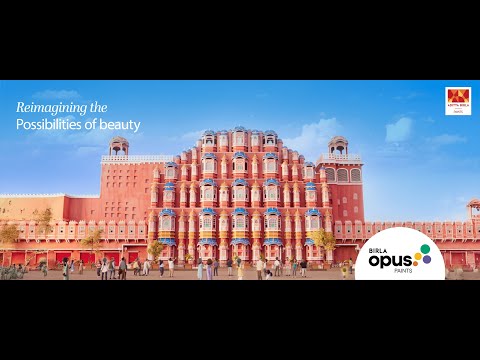
The core insight is simple but powerful: color isn't just a chemical in a can, it's a catalyst for emotion and transformation. The brand is tapping into a collective desire for optimism and renewal. The ad starts by showing us a familiar, iconic scene—Jaipur's Hawa Mahal—but rendered in a depressing, littered monochrome. This is the setup: the world as it can sometimes feel, drab and neglected.
The turn comes from the most innocent source: a small, curious child. He sees the potential for beauty, and with a simple touch, unleashes a wave of color that doesn't just paint the monument, but seems to heal the scene. The litter disappears as color spreads, subtly linking beauty with civic pride and cleanliness. This is the execution: a magical, wordless transformation that positions the brand as the agent of that positive change. The payoff is the fully realized, vibrant world, with the tagline 'Duniya ko rang do'—'Paint the world.'
Proof points are woven throughout. The choice of a globally recognized Indian landmark like the Hawa Mahal instantly gives the ad scale and cultural significance. The high-quality, Pixar-style animation is a deliberate choice to signal premium quality and stand apart from the live-action ads of competitors. [2, 5] The music, a gentle, melodic track that swells with the introduction of color and incorporates the brand name 'Opus', is doing heavy lifting for brand recall. [2]
The strategic takeaway is clear: this is how you make an entrance. Aditya Birla Group is a massive conglomerate, and this ad communicates that scale and ambition. [16] They are not just launching another paint brand; they are launching a new vision for the category, one based on widespread, joyful transformation. It's a classic brand-building play designed to create long-term positive associations.
The debrief for the team would be this: we successfully established our brand's purpose. We've anchored 'Birla Opus' to the idea of positive, large-scale change. The challenge now is to translate this grand, macro-level promise into tangible reasons for a homeowner to choose us for their living room. This ad opened the door; the next phase of communication has to invite the customer inside.
Brand Position
Birla Opus is positioning itself as 'The Catalyst for a More Vibrant India'—a premium, powerful brand that enables transformation on both a personal and a societal scale.
Brand Archetype
The brand embodies 'The Magician' archetype. It transforms a mundane reality into something extraordinary and awe-inspiring with a simple, magical touch, making dreams of a more beautiful world come true.
Creative Game Plan
The core creative idea was to use a grand visual metaphor—coloring a drab, monochrome India—to launch the brand as a powerful, positive force for change.
Diagnosis: Issues & Solutions
Primary Issue: Strategic Sense
The Problem:
The ad beautifully establishes a grand, emotional promise—'Paint the World'. However, the connection between this epic, public transformation and the personal act of painting a home is left entirely to the viewer's imagination. A competitor could argue, 'That's lovely, but what does it mean for my walls?' The link between the metaphor and the product's function is a bit too abstract.
The Solution:
The campaign could have benefitted from a subtle, final shot that grounds the epic narrative. After showing the Hawa Mahal in full color, a quick, elegant transition to a family's living room wall being painted with a Birla Opus roller, sharing the same vibrant color palette, would have bridged the gap between the grand 'why' (the brand's purpose) and the practical 'what' (the product's use).
Secondary Issue: Emotional Connection
The Problem:
The animated characters are charming, but they lack the specific relatability that live-action actors can provide. While the overall emotion is positive, it's a general, shared joy. It doesn't create the deep, personal emotional hook of seeing a family's specific story unfold in their home, a tactic competitors have used effectively for years.
The Solution:
To deepen the connection, the central child character could have been shown initially looking out from a window of his own home, which is also in monochrome. His act of coloring the world could then be reflected back in his own home becoming colorful, making the story's emotional core both public and personal.
Additional Notes
Related Links
Credits
Share this Analysis
More Birla Opus Paints ad breakdowns
- Birla Opus Paints | Special Mehmaan Aayenge? | Ganesh Chaturthi | HindiBirla Opus Paints
- Birla Opus Assurance | Painting Wapas Karke Dene ka Assurance | Politician | Hindi | 45sBirla Opus Paints
- Birla Opus Assurance | Painting Wapas Karke Dene ka Assurance | Rockstar | Hindi | 45sBirla Opus Paints
- Birla Opus Paints | Naye Zamane Ka Naya Paint | Style Interiors | Vicky K.|Saurabh S. | 45 sec HindiBirla Opus Paints
- Birla Opus Paints | Celebrating Colours of India | Mumbai | Hindi | 30 secBirla Opus Paints
- Celebrate the magic of Colours this Holi with Birla Opus PaintsBirla Opus Paints
- Birla Opus Paints - Duniya Ko Rang Do | Hindi | 60 secBirla Opus Paints
- Birla Opus Paints - Duniya Ko Rang Do | Hindi | 30 sec (Exterior)Birla Opus Paints