We Can Save Them #shinealight - Ad Analysis

AI Editor notes
Straight from the gut!!
“This is smart, artful work. It sidesteps the usual, often exploitative, imagery of suffering children and goes for a conceptual gut punch instead. The reveal of the shadow-sculpture is a genuine 'whoa' moment that makes you re-evaluate what you're seeing. It's unsettling and memorable. My only question is if it's too clever for its own good—does the artistry risk overshadowing the simple call to donate for a passive viewer? For an engaged one, though, it's impossible to forget.”
Quick Summary
This ad's power comes from a single, haunting creative device: transforming the innocent shadow of a child into a physical sculpture made of the very things that threaten their life—war, disease, and poverty. By making abstract dangers terrifyingly tangible, it creates an unforgettable and urgent emotional argument that cuts through typical charity ad clutter.
Executive Summary
In the crowded and often emotionally draining world of non-profit advertising, creating something that is both respectful and impactful is a monumental challenge. Human Appeal's '#ShineALight' campaign, executed by the agency Don't Panic, navigates this minefield with remarkable intelligence and artistic flair. [1] Instead of relying on the direct, often numbing, visuals of suffering that define the category, the ad opts for a powerful and haunting metaphor, proving that what you don't show can be more powerful than what you do.
The core insight driving this work is that to a comfortable viewer, the forces that cause child mortality—disease, dirty water, conflict, malnutrition—are abstract concepts. They are words on a screen or statistics in a report. To overcome donor fatigue, the ad must make these invisible threats feel terrifyingly real and immediate. The execution brilliantly achieves this through a classic Setup-Turn-Payoff structure.
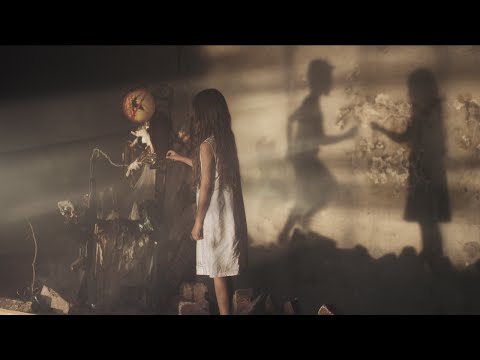
The Setup (0:00-0:18) establishes a familiar, if unsettling, scene. Two young children play in a dusty, derelict building. The soft piano and hazy light create an atmosphere of vulnerability, but their running and chasing casts familiar, innocent shadows on the wall. We are led to believe this is a story about children finding joy in difficult circumstances. This lulls the viewer into a state of passive observation.
The Turn (0:19-0:48) is the masterful centerpiece of the ad. The camera focuses on one of the shadows, and in a deeply disturbing reveal, we see it isn't a shadow at all. It is a physical, three-dimensional sculpture made of the very dangers the ad wants to highlight: rotting food, dirty medical equipment, and a hand constructed from bullets. [1] The music swells with tension, and quick cuts between the horrified faces of the children and the gruesome details of the sculpture make the threat visceral. The abstract has become concrete. A child's innocent silhouette is literally composed of the things that can kill them. This moment is the ad's genius; it transforms a fundraising appeal into a piece of installation art with a potent message.
The Payoff (0:49-1:07) provides emotional release and a clear path forward. The children embrace, their real shadow now a symbol of comfort and safety, starkly contrasting with the horror we just witnessed. As text overlays list the litany of threats and the staggering number of children affected, the message becomes undeniable. The final call to action—"Help #ShineALight in the darkness"—is no longer just a tagline; it's a direct response to the darkness the viewer has just been shown.
The debrief for the team that made this is simple: a single, powerful, and flawlessly executed creative idea is worth more than a dozen category conventions. By symbolizing the problem instead of showing it, they created something that is not only more memorable but also more respectful to the very people they aim to help. It's a masterclass in conceptual advertising for a social cause.
Theme Keywords
Brand Position
The intelligent, compassionate, and creative force in humanitarian aid.
Brand Archetype
The Sage (revealing a hidden, uncomfortable truth) combined with The Caregiver (compelled to protect the vulnerable).
Creative Game Plan
Make the invisible, abstract dangers that children face shockingly visible by creating their shadows out of the very objects that threaten them.
Diagnosis: Issues & Solutions
Primary Issue: Brand Distinctiveness
The Problem:
The creative concept is so powerful and universal that it almost overshadows the specific brand behind it. A viewer might remember the haunting shadow but forget that it was an ad for Human Appeal, potentially attributing it to a larger, more well-known NGO.
The Solution:
While disrupting the flow is risky, a subtle, early integration of the brand's logo or name—perhaps etched onto a wall in the background—could have helped seed brand attribution without compromising the artistic integrity of the reveal.
Secondary Issue: Clarity of "What's Next?"
The Problem:
The call-to-action, while clear, is generic for the category (donate here). The campaign's unique thematic handle, '#ShineALight', isn't fully leveraged in the final ask.
The Solution:
Connect the action directly to the theme. For example, change the final text to something like, "Shine a light for one child. Donate now at..." This would make the act of donating feel like a more direct fulfillment of the campaign's creative promise.