Tu lucha es nuestra lucha - Ad Analysis

AI Editor notes
Straight from the gut!!
“Okay, this is the classic hospital ad playbook, but done well. It's emotionally manipulative, of course, but it's effective. They're selling hope and companionship, not just treatment. The song choice is smart; taking a familiar anthem and making it a lullaby is a clever creative turn. It feels more like a short film than a commercial, which helps it sidestep the 'corporate healthcare' vibe, at least for a minute.”
Quick Summary
By focusing entirely on the human side of oncology—the shared struggle and empathy between staff and patients—Oncosalud positions itself not as a sterile medical facility, but as a deeply human partner in a patient's fight. The ad successfully shifts the brand promise from clinical outcomes to emotional companionship, making the tagline "Your fight, our fight" feel authentic and earned.
Executive Summary
This Oncosalud commercial is a strong piece of emotional brand building that understands a fundamental truth about healthcare, particularly in a field as fraught as oncology: patients are not just buying medical procedures; they are seeking a partner in their fight for life. The ad, titled "Tu lucha es nuestra lucha" (Your fight is our fight), effectively positions the brand as that essential partner.
The core insight is that the journey through cancer treatment is an intensely emotional and human one, shared by patients, families, and the medical staff. The ad reframes the narrative away from cold technology and sterile processes to focus on the moments of fear, hope, and connection. It recognizes that while clinical excellence is expected, the deciding factor for a brand in this space is often the perceived level of empathy and human support. [2] The tagline itself is a strategic evolution from their previous "tu lucha, mi lucha" (your fight, my fight), deliberately broadening the promise to encompass the entire team behind the patient. [2]
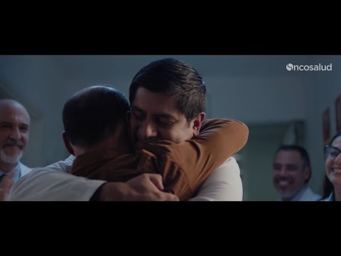
The execution follows a classic emotional arc: Setup–Turn–Payoff. The Setup (0:00-0:23) establishes the grim reality of a cancer diagnosis. The visuals are somber, with a cool, blue-ish color grade. We see the isolated, tense moments: a patient entering an MRI, a surgeon scrubbing in, a worried look between a doctor and patient. The sound is minimal, heightening the sense of anxiety. The Turn begins subtly around 0:24 with the introduction of the re-arranged Fito Páez song. The lyrics promise that "the shadows that were here will be gone" as we see the first flicker of a human connection—a nurse's gentle smile to a young patient. This turn gains momentum as the music builds, showing small acts of kindness and the staff's deep involvement. The Payoff (0:48-1:06) is the cathartic ringing of the end-of-treatment bell. The lighting is warmer, the mood is celebratory, and the entire medical team joins in, singing along. This moment powerfully visualizes the campaign's central promise: the patient's victory is the staff's victory, too. The voiceover at the end serves as the debrief, explicitly stating that technology is just the foundation; the real differentiator is their commitment to being there for the patient. [17]
The debrief for the marketing team is clear: in a category defined by fear, the most powerful position a brand can own is that of a trusted, empathetic ally. Oncosalud proves that you don't need to show futuristic machines to communicate excellence; showing the humanity of the people operating them is more effective. The choice to use a well-known rock anthem, deconstructed into a hopeful ballad, is a smart creative device that lends familiarity and emotional depth, making the message more resonant and memorable.
Theme Keywords
Brand Position
The dedicated, human-centered ally in the fight against cancer.
Brand Archetype
Caregiver
Creative Game Plan
Humanize cancer treatment by shifting the focus from the lonely patient journey to the collective fight shared with an empathetic medical team.
Diagnosis: Issues & Solutions
Primary Issue: Strategic Sense
The Problem:
The ad brilliantly establishes the 'why' (our empathy) and the 'how' (our team), but it could be slightly more effective at grounding this emotional promise in a tangible brand attribute. While it mentions having the best professionals and technology, this claim is delivered via voiceover and isn't as visually supported as the emotional narrative.
The Solution:
Integrate one or two brief, powerful shots that visually link the empathetic care to the advanced technology. For instance, as the doctors review the scans with concern (0:36), a quick, clear shot of the high-definition scan itself could subtly reinforce the 'best technology' claim without disrupting the emotional flow.
Secondary Issue: Brand Distinctiveness
The Problem:
While very well-executed, the ad runs the risk of being perceived as representative of 'good doctors everywhere' rather than uniquely 'Oncosalud'. The strongest ownable asset is the tagline, but the visual language, while beautiful, is not entirely unique in the healthcare advertising landscape.
The Solution:
Double down on the 'Nuestra Lucha' concept by showing the team collaborating outside of patient-facing moments—perhaps a quick shot of a late-night case conference or a shared moment of relief between two surgeons post-op. This would further differentiate their promise of a collective fight.
Additional Notes
Related Links
Credits
Share this Analysis
More Oncosalud ad breakdowns
- Oncosalud - Tu lucha, mi lucha.Oncosalud
- Move for Yourself. Move for India. | #FitIndiaFestival | MediBuddyMediBuddy
- SickKids 150: The CountSickKids Foundation
- Learn the secrets to read your skin - The real Fortune TellerPierre Fabre
- The Rarest Stars Shine Brightest—No One Has More Grit Than a Group of Kids with Rare DiseasesMontefiore Einstein
- Stigmavir – A Casey House InnovationCasey House
- This place is specialSunnybrook Hospital
- SickKids "Better Tomorrows"SickKids Foundation