SickKids 150: The Count - Ad Analysis

AI Editor notes
Straight from the gut!!
“This is how you do it. This isn't just an ad; it's a statement of purpose. It respects the kids by showing their strength, not just their sickness. The 'VS' platform could have gotten stale, but reframing it around birthdays is a smart evolution. It's intense, maybe too intense for some, but it earns every second of its runtime. It makes you uncomfortable in the best way possible.”
Quick Summary
This ad masterfully reframes the fight for life as the fight for the next birthday. By transforming sick children from objects of pity into fierce warriors, SickKids continues its powerful 'VS' brand platform, making the abstract struggle against illness a tangible, urgent, and incredibly moving call to action that's impossible to ignore.
Executive Summary
For years, the SickKids 'VS' platform has been a masterclass in shifting non-profit advertising from a plea for pity to a call to arms. 'The Count,' created for the hospital's 150th anniversary, is a powerful and intelligent evolution of this strategy. It takes the established 'fighter' ethos and anchors it to a universally understood, deeply human milestone: a birthday.
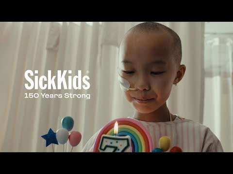
The core insight is devastatingly simple: for a seriously ill child, reaching their next birthday isn’t a guarantee, it's a goal. Each year is a round in a fight. The ad’s brilliance lies in its execution of this idea. We begin with a quiet, almost sterile birthday party, a scene that immediately establishes the tension between celebration and sickness. Then, the central device kicks in: a relentless count-up, voiced by a chorus of children. This isn't a game of hide-and-seek; it's a defiant tally of years fought for. The number grows, and so does the intensity. The visual storytelling, a hallmark of the 'VS' campaign, is exceptional. Director Clément Durou uses powerful athletic and combat metaphors—a boxing ring made of balloons, battle ropes of party streamers, a piñata shaped like a skull—to transform medical treatments into acts of heroic defiance. [2, 7] These are not passive patients; they are warriors training for their lives. The sound design is crucial, weaving the beeps of heart monitors and the hiss of oxygen into the percussive, driving score. [9] The climax, where the children roar their defiance, is a moment of pure, earned catharsis. By the time the screen reads 'WHEN EVERY BIRTHDAY IS A FIGHT,' the statement feels less like a tagline and more like an undeniable truth. The final count to 150 powerfully links the individual child's struggle to the institution's century-and-a-half legacy. [11] It positions SickKids not just as a hospital, but as a 150-year-old training ground for the toughest fighters on earth. The ad concludes by returning to the quiet moment of a single candle being blown out, a poignant reminder of the simple, precious victory at the heart of the epic struggle. This is advertising that builds a brand by revealing its soul.
Theme Keywords
Brand Position
The home of the world's toughest fighters, where every day is a battle and every birthday is a championship.
Brand Archetype
Hero & Caregiver
Creative Game Plan
Dramatize the relentless, year-by-year fight for life by reframing every birthday as a hard-won victory.
Diagnosis: Issues & Solutions
Primary Issue: Emotional Connection
The Problem:
The film's greatest strength—its raw emotional intensity—is also its biggest risk. The unflinching portrayal of the children's struggle could be overwhelming for a segment of the audience, potentially leading to ad avoidance or tune-out on platforms where skipping is easy.
The Solution:
Develop shorter, 15- and 30-second cutdowns that focus on a single patient's 'fight.' This allows the core message to land in a more contained, less emotionally taxing format, optimizing for social feeds and pre-roll where attention is scarce.
Secondary Issue: Strategic Sense
The Problem:
While the 'fight' metaphor is powerful for driving donations, it could subtly obscure the specific, tangible things donor money buys. The ad is heavy on the 'why' (to win the fight) but light on the 'how' (with what tools).
The Solution:
The landing page, FundTheFight.ca, must immediately bridge this gap. Upon arrival, donors should see clear, compelling modules that connect their donation to specific needs: 'Your $150 funds X hours of critical research' or 'helps purchase Y piece of equipment.' This translates the emotional impetus from the ad into a rational, tangible action.
Additional Notes
Related Links
Credits
Share this Analysis
More SickKids Foundation ad breakdowns
- Deadpool and Kidpool Help SickKidsSickKids Foundation
- SickKids "Better Tomorrows"SickKids Foundation
- Move for Yourself. Move for India. | #FitIndiaFestival | MediBuddyMediBuddy
- Learn the secrets to read your skin - The real Fortune TellerPierre Fabre
- The Rarest Stars Shine Brightest—No One Has More Grit Than a Group of Kids with Rare DiseasesMontefiore Einstein
- Stigmavir – A Casey House InnovationCasey House
- This place is specialSunnybrook Hospital
- Tu lucha es nuestra luchaOncosalud