No Child for Sale: Stop Child Labour in Sweatshops | World Vision Canada - Ad Analysis

AI Editor notes
Straight from the gut!!
“This is a gut punch, and it's supposed to be. The 'bait-and-switch' isn't new, but it's used effectively here. My first thought was, 'Okay, another heartwarming family ad.' Then the cut happens, and you're immediately implicated. It's uncomfortable. Is it too manipulative? Maybe. But for an issue this dire, you can't afford to be subtle. It makes the problem personal, which is the hardest thing for a global charity to do.”
Quick Summary
This ad's power comes from a single, brutal creative device: it makes the viewer an unwitting participant in a story of innocence, then rips that comfort away to reveal the hidden connection between our lives and the exploitation of children. It effectively transforms a familiar object of childhood security—a pink blanket—into a symbol of complicity, forcing the audience to confront an uncomfortable truth they can no longer ignore.
Executive Summary
This World Vision Canada spot is a textbook example of the 'bait-and-switch' narrative, executed with precision to deliver a difficult message. It's a tactic designed to bypass viewer apathy by first earning their emotional investment under false pretenses before confronting them with a harsh reality. The ad isn’t just showing you a problem; it’s arguing that you are connected to it, whether you know it or not.
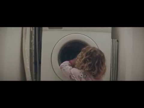
The creative execution follows a simple but powerful Setup–Turn–Payoff structure. The Setup (0:00-0:34) is a montage of idyllic childhood moments in a Canadian home, all connected by a single prop: a pink blanket. It's a cape, a comfort object, a part of a fort. The lighting is warm, the music is a gentle folk tune, and the camera feels like a parent’s loving gaze. This section builds a powerful sense of nostalgia, safety, and universal love for a child. It’s disarmingly familiar, designed to make the target audience of parents see their own children in the scenes.
The Turn (0:35) is a masterclass in editing and sound design. The cut is brutally abrupt. In a single frame, we move from a soft, warm bed to a cold, green-lit factory. The gentle music is violently replaced by the percussive, mechanical rhythm of sewing machines. The pink blanket is no longer a symbol of love; it’s a product on an assembly line. The visual language shifts from intimate and free-flowing to static and oppressive. A child is still at the center of the frame, but her expression is vacant, her movements robotic. This is the moment the ad’s true purpose is revealed, and it’s designed to induce shock and discomfort.
The Payoff (0:47-1:02) delivers the message and the solution. The on-screen text and voiceover don't accuse the viewer, but they do connect the dots: 'Children as young as 6 are being sold to sweatshops.' The ad concludes with a clear, low-friction call to action: 'Join the fight... Sign the petition at nochildforsale.ca.' This gives the viewer a way to resolve the intense cognitive dissonance and guilt the ad has just created. It turns a feeling of helpless anger into a potential action.
The Debrief for the team is clear: emotional whiplash works, but it must be earned and purposeful. The ad succeeds because the first 35 seconds are so genuinely heartwarming. Without that investment, the turn would feel cheap. The lesson is that to make a global issue feel personal, you must first ground it in the viewer's own world. The choice to follow an object—the blanket—is also a smart way to create a tangible link between two otherwise disconnected worlds. It’s a powerful piece of communication that sacrifices subtlety for gut-wrenching clarity.
Theme Keywords
Brand Position
The unflinching advocate for child protection.
Brand Archetype
The Caregiver, with the righteous anger of the Hero.
Creative Game Plan
Force a comfortable, first-world audience to confront their potential complicity in global child labor by revealing the dark story behind a familiar object of childhood innocence.
Diagnosis: Issues & Solutions
Primary Issue: Emotional Connection
The Problem:
The ad's primary risk is 'shock fatigue.' While highly effective on first viewing, the abrupt, distressing nature of the turn can cause viewers to look away or block the ad on subsequent exposures, potentially limiting the message's frequency and reach.
The Solution:
Develop campaign assets that explore the 'solution' side of the story more deeply. Create follow-up content that shows the positive impact of signing the petition or sponsoring a child, giving the emotionally-drained viewer a sense of hope and reinforcing the value of their action.
Secondary Issue: Strategic Sense
The Problem:
The ad brilliantly creates a personal connection to the problem but is less clear on how the proposed action (signing a petition) directly solves it. A viewer might feel the outrage but question if their signature truly impacts a child in a sweatshop.
The Solution:
On the campaign landing page, immediately explain the 'theory of change.' Use a simple graphic or short text to show how petition signatures lead to government pressure, which leads to corporate accountability, which leads to supply chain changes that protect children. This bridges the gap between the viewer's click and the real-world outcome.
Additional Notes
Related Links
Credits
Share this Analysis
More World Vision Canada ad breakdowns
- Feed a child. Feed a Childhood. | World Vision CanadaWorld Vision Canada
- No Child For Sale (2014) :60 Commercial - Chocolate | World VisionWorld Vision Canada
- Everything Viral in 45 Seconds | World VisionWorld Vision Canada
- Ronald McDonald House BC & Yukon: Feels Like FartherRonald McDonald House Charities British Columbia & Yukon
- ALZHEIMER'S FOUNDATION #THEUNFORGETTABLEACCOUNTFundación Alzheimer de Venezuela
- MoonAACD (Associação de Assistência à Criança Deficiente)
- Give Them Tomorrow 2017: LullacryMarch of Dimes