Moon - Ad Analysis

AI Editor notes
Straight from the gut!!
“It's a classic emotional bait-and-switch, but it's done so well you don't mind. They set you up for this huge, historical moment and then pivot to something deeply small and human. The visual of the kid's sneaker next to the astronaut's boot is the whole ad in one frame—a smart, lasting image. It manages to make a non-profit's mission feel epic without being overly sentimental. It's solid work.”
Quick Summary
This ad works by executing a single, brilliant metaphor with precision. It reframes a disabled child’s personal achievement—their first step—as an event as monumental as the moon landing, creating an immediate and powerful emotional connection that elevates the charity's mission from simple aid to history-making.
Executive Summary
This AACD spot is a textbook example of how to use a powerful metaphor to tell a story that's bigger than its runtime. It's built on a simple, effective structure that establishes a grand idea and then pivots to a deeply personal one, creating an emotional resonance that's hard to ignore.
The Core Insight: At its heart, the ad rests on a simple human truth: for a family and a child overcoming a physical disability, a personal milestone like a first step feels as significant and world-changing as any grand historical achievement. The challenge for any charity is to make outsiders feel the weight of these personal victories. This ad doesn't just tell us it's important; it shows us, using a universally understood symbol of a 'giant leap.'
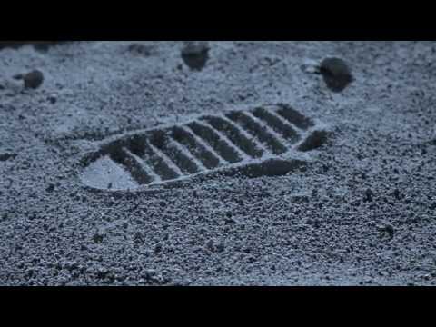
The Execution: The creative follows a classic Setup-Turn-Payoff narrative structure. The Setup (0:00-0:05) is the grand, familiar iconography of the Apollo moon landing. It opens by asking, "What was the most important step in history?" priming the audience to think about Neil Armstrong. The visuals are epic, and the score is cinematic, establishing a sense of awe. The Turn (0:06-0:10) is the critical moment of subversion. The camera finds the iconic footprint, but then a child's sneaker, attached to a prosthetic, makes a new impression beside it. The voiceover delivers the pivot: "For us at AACD, it was Rafael's first step." This is the ad's core creative idea, delivered in a single, surprising visual. The Payoff (0:11-0:28) shows us the joyous result of this step. We see a child, beaming with pride, bouncing around the lunar surface. The metaphor is now fully realized: through the work of AACD, this child is experiencing a moment of pure, untethered freedom and achievement. The ad connects this individual victory to the broader mission, reframing their work as nothing less than history-making. [11]
The Debrief: The key lesson here is the power of a strong, visual metaphor. The 'moon landing' is a creative shortcut that instantly communicates concepts like 'monumental achievement,' 'overcoming the impossible,' and 'a giant leap for mankind.' By borrowing the cultural weight of this event and applying it to a child's first step, the agency created an ad that is emotionally efficient and highly memorable. It proves that you don't need to show suffering to create a powerful ad for a cause; showing the triumph on the other side can be even more motivating.
Theme Keywords
Brand Position
AACD enables children with disabilities to take their own 'giant leaps.'
Brand Archetype
The Caregiver
Creative Game Plan
Visually equate the personal triumph of a disabled child taking their first step with humanity's historic first step on the moon.
Diagnosis: Issues & Solutions
Primary Issue: Clarity of "What's Next?"
The Problem:
The call to action, 'Come be part of the history of AACD's children,' is poetic and on-brand with the metaphor, but it's strategically vague. It doesn't tell the viewer what to do next, relying entirely on the emotion of the piece to inspire them to find the URL on screen and take the initiative themselves.
The Solution:
A stronger CTA would have maintained the emotional tone while providing a clear directive. For example: 'Help the next child take their giant leap. Donate at AACD.org.br.' This links the action directly to the creative idea and gives an unambiguous instruction.
Secondary Issue: Strategic Sense
The Problem:
The ad is so focused on the high-concept metaphor that it offers no tangible sense of what the organization does or what a donation might accomplish in practical terms. A viewer is left with a powerful feeling but no concrete understanding of the mechanics of the charity's work.
The Solution:
A simple, unobtrusive line of text on the final screen—such as 'R$50 provides one session of physical therapy'—could ground the epic emotion in a tangible, accessible reality, giving potential donors a clearer picture of their impact.
Additional Notes
Related Links
Credits
Share this Analysis
More AACD (Associação de Assistência à Criança Deficiente) ad breakdowns
- Ronald McDonald House BC & Yukon: Feels Like FartherRonald McDonald House Charities British Columbia & Yukon
- No Child for Sale: Stop Child Labour in Sweatshops | World Vision CanadaWorld Vision Canada
- ALZHEIMER'S FOUNDATION #THEUNFORGETTABLEACCOUNTFundación Alzheimer de Venezuela
- Give Them Tomorrow 2017: LullacryMarch of Dimes