IGA, at your service! - Ad Analysis

AI Editor notes
Straight from the gut!!
“This is a flex. Using Pixar-level animation for a regional grocery chain is a bold, expensive choice. It's visually memorable and definitely stands out from the competition's typical price-and-product ads. But the fantasy is so high, it risks creating a disconnect with the real-world, fluorescent-lit reality of a Tuesday night grocery run. It's selling a feeling, but that feeling might be hard to find in aisle four.”
Quick Summary
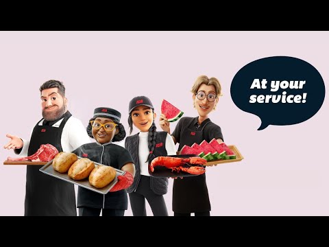
IGA uses high-end, feature-film-quality animation to transform the mundane grocery trip into a magical theme park ride. The strategy is to elevate its key differentiator—expert human service—by making it feel as wondrous and special as the food itself, positioning IGA as an experience, not just a store.
Executive Summary
In a category defined by price wars and weekly flyers, IGA’s “At Your Service!” campaign makes a deliberate choice to compete on a different plane: experience. The core insight is that for many shoppers, particularly families who care about food quality, grocery shopping isn't just a transaction; it's an act of nurturing. However, the process can feel like a chore. The simple human truth this ad leverages is the desire for expertise to make that chore feel less overwhelming and more inspiring. IGA isn't just selling ingredients; it's selling the confidence that comes from expert guidance.
The execution uses a classic 'brand myth' approach, transforming the physical store into a fantastical world. Structurally, it follows a simple montage pattern, leading the viewer on a tour through reimagined departments. The ad opens with an immediate hook: a child's face, full of wonder, on a shopping cart that behaves like a theme park ride. This establishes the central metaphor—shopping at IGA is an adventure. We then visit three key 'lands' in this park: the Boucherie, the Poissonnerie, and the bakery. In each, an archetypal artisan (the strong butcher, the skilled fishmonger, the joyful baker) performs their service with magical flair. The animation is the hero here; it’s lush and detailed, creating a world that feels premium and delightful. The branding is woven in naturally through the signature red on the carts and the logos on employee uniforms, culminating in the final logo lockup and tagline. The final line from the employee, "And so is service," feels a bit tacked on but serves to explicitly land the campaign's message.
The key takeaway for the brand team is that high-end animation can be an incredibly powerful tool for differentiation. [2] It allowed IGA to visualize an abstract concept—service—in a concrete and memorable way. The risk, however, is creating a promise the real-world experience cannot fulfill. If a customer, inspired by this magical vision, walks into a standard IGA and finds stressed-out staff and a messy aisle, the ad creates a brand-damaging perception gap. The debrief should focus on aligning in-store operations and staff training with the aspirational vision this campaign so effectively builds. The campaign successfully makes the brand feel special; now the store has to deliver on that feeling.
Theme Keywords
Brand Position
The supermarket that transforms grocery shopping from a chore into an inspiring culinary experience through expert, passionate service.
Brand Archetype
The Magician
Creative Game Plan
Transform the grocery shopping experience into a magical journey to dramatize how IGA's expert service makes the everyday extraordinary.
Diagnosis: Issues & Solutions
Primary Issue: Emotional Connection
The Problem:
The ad creates a sense of spectacle and wonder but stops short of forging a genuine, human emotional connection. The characters are charming archetypes, but their interactions are performative, lacking a moment of quiet, relatable humanity that would make the 'service' promise feel more personal and less like a corporate slogan.
The Solution:
In a future spot, ground the fantasy with one small, authentic moment. For instance, after the butcher magically prepares the roast, show him sharing a genuine smile with the customer or giving the child a friendly wink. This would bridge the gap between the magical 'what if' and the real-world feeling of being cared for.
Secondary Issue: Clarity of "What's Next?"
The Problem:
The ad does a brilliant job of building brand perception but fails to give the inspired viewer a tangible next step. The generic URL in the description is a passive and easily missed call-to-action, leaving the energy generated by the ad to dissipate without direction.
The Solution:
Integrate a more concrete call-to-action in the end frame. Instead of just the logo, add a line like: "Ask our experts for a taste of something new today" or "Discover our artisans' weekly picks at IGA.net." This guides the audience from passive viewing to active engagement with the very services being promoted.
Additional Notes
Related Links
Credits
Share this Analysis
More IGA ad breakdowns
- BBQ time is sacred!IGA
- Paulo’s wishIGA
- IGA - Mr Beaver's Yule Log ❤️🐿️🦝🐼IGA
- The Story of Generosity - IGA's Busy BeaversIGA
- BILLA - TURN TRASH INTO CASH (EN)BILLA
- SMART HOUSE – ENGLISH VERSION – REMA 1000REMA 1000
- Be Super Ready For Summer With LidlLidl
- Tesco | Aldi Price Match | Can't Argue with ThatTesco