Your Logo Here - Ad Analysis

AI Editor notes
Straight from the gut!!
“This is a punch to the gut. It's not subtle, but it doesn't need to be. The 'Your Logo Here' concept is brutally simple and effective. It takes a complex legal ruling and makes the stakes feel incredibly personal and offensive. Is it over the top? Absolutely. But for an advocacy group on a limited budget trying to cut through the noise in 2012, this is a smart, efficient, and angry piece of communication.”
Quick Summary
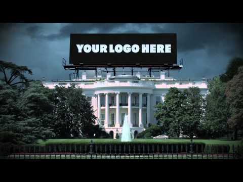
This ad turns an abstract political issue—corporate campaign finance—into a visceral threat by visually desecrating America's most sacred national symbols. It uses a simple, powerful creative device, 'Your Logo Here,' to argue that the country's democracy has been put up for sale to the highest bidder, channeling public distrust of corporations into a clear call to action.
Executive Summary
This ad from Free Speech For People is a textbook example of effective advocacy advertising, using a Problem-Solution framework to distill a complex issue into a 30-second polemic. It doesn't persuade with data; it provokes with emotion, aiming to mobilize a base rather than convert skeptics.
The Core Insight here is that for many Americans, patriotism is tied to the physical symbols of the nation. While the intricacies of the Citizens United Supreme Court ruling are abstract, the idea of the Lincoln Memorial being sold for ad space is a concrete, offensive violation. The ad leverages this feeling of proprietary patriotism, suggesting that something personal—'our' democracy—has been stolen and commodified by a faceless, menacing 'other': corporations.
The Execution follows a classic fear-appeal structure. The Setup establishes the villain and the crime: ominous shots of the Supreme Court and corporate towers are paired with a grim voiceover explaining the 2010 ruling. The Turn is the introduction of the creative concept at the 10-second mark: the Washington Monument, White House, Statue of Liberty, and even the American flag are visually desecrated with the placeholder text 'Your Logo Here'. This is the ad's masterstroke, making the threat tangible. The Payoff is the explicit conclusion delivered by the voiceover—'We the people have been sold out'—followed by a direct call to action. The desaturated color palette, the stormy skies, and the tense, pulsing soundtrack all work in concert to create a consistent mood of dread and urgency. It’s a style reminiscent of a political thriller, designed to make the viewer feel that the nation is in peril.
The Debrief for any team looking at this work is about the power of a simple, potent metaphor. 'Your Logo Here' is a genius piece of creative shorthand. It requires no explanation. The campaign demonstrates that when dealing with abstract, politicized topics, finding a visceral, visual representation of the core conflict is paramount. It’s a lesson in sacrificing nuance for impact. This ad isn't trying to have a conversation; it's sounding an alarm, and its effectiveness lies in the clarity and volume of that alarm.
Theme Keywords
Brand Position
The uncompromising guardian of American democracy against the corrupting influence of corporate money.
Brand Archetype
The Rebel: challenging the established order and fighting for the 'little guy' ('We the people').
Creative Game Plan
Visually desecrate America's most sacred symbols to make the abstract threat of corporate political spending feel like a tangible, personal assault on the nation's integrity.
Diagnosis: Issues & Solutions
Primary Issue: Strategic Sense
The Problem:
The ad's greatest strength—its raw, unfiltered anger—is also a strategic limitation. By framing the issue in such stark, dystopian terms, it effectively energizes its base but does little to persuade anyone in the middle, potentially alienating those who might be receptive to a more nuanced argument about campaign finance reform.
The Solution:
Develop a parallel creative track that moves beyond outrage. Create content that explains the *specific consequences* of the ruling with relatable human stories, shifting the emotional focus from pure anger to a more constructive desire for fairness and a level playing field.
Secondary Issue: Clarity of "What's Next?"
The Problem:
The call to action, 'Go to FreeSpeechForPeople.org,' is clear but generic. It answers 'where' but not 'why' or 'to do what?' A viewer lands on the site without a specific, immediate action to take, which can lead to drop-off.
The Solution:
Make the call to action more specific and tangible within the ad itself. For example: 'Go to FreeSpeechForPeople.org to sign the petition to amend the Constitution.' This gives the user a clear mission before they even click.
Additional Notes
Related Links
- freespeechforpeople.org✓ Validated9/10AI Source