Vitra: Chair - Ad Analysis

AI Editor notes
Straight from the gut!!
“This is how you sell a chair. It’s pure product, pure design. No fluff. The first half is the 'why'—the ergonomic benefit. The second half is the 'wow'—the hypnotic dance. It feels like something you'd see at MoMA, not on YouTube. For the target audience of architects and designers, this is catnip. It respects their intelligence and aesthetic sensibilities. It’s confident, not shouty.”
Quick Summary
This film successfully transforms a potentially dry product demonstration into a captivating piece of design cinema. By splitting the ad into two halves—a clinical demonstration of the ergonomic benefit, followed by a whimsical, stop-motion ballet of chairs—Vitra makes its core product innovation (the forward-tilt) understandable and its design ethos memorable. It's a confident, artful launch that speaks directly to the design community.
Executive Summary
In the world of high-end furniture, you don't sell a chair; you sell an idea. Vitra's 2011 film for the 'Tip Ton' chair is a textbook example of this principle, executing a flawless product launch that is as much a piece of art as it is an advertisement.
The film employs a simple two-act structure: Demonstration followed by Celebration.
The Setup (Demonstration): The first 25 seconds are dedicated to pure, unadulterated product demonstration. We see a woman in a minimalist setting, and the chair subtly tilts forward with her as she leans into tasks at a table. There is no voiceover, only quiet, ambient sound. This is the 'reason to believe.' The core insight is that modern life involves dynamic movement even when seated, and traditional static chairs don't support this. Vitra presents a simple, mechanical-free solution: a nine-degree forward tilt built into the skids. [2, 5] The message is delivered with clinical precision, establishing the chair's ergonomic benefit without a single superfluous word or image.
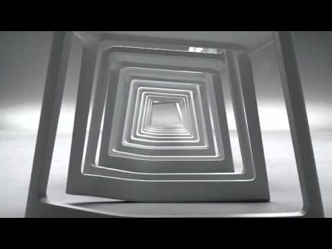
The Turn (Celebration): Just as the viewer understands the function, the film pivots dramatically. The music shifts to a percussive, energetic track, and we cut to an overhead shot of multiple chairs. What follows is a mesmerizing stop-motion ballet. The chairs, now characters in their own right, perform a synchronized dance. This sequence serves no practical purpose in demonstrating function. Its goal is to celebrate the form. It elevates the chair from a mere object of utility to an object of design, worthy of being admired for its shape, color, and movement. It's playful, hypnotic, and makes the product unforgettable.
The Payoff (Desire): The ad concludes by showing the chair in its various colorways, cementing it not just as a functional tool, but as a desirable piece of interior design. By this point, Vitra has made its case completely. It has appealed to both the rational brain (the ergonomic benefit) and the emotional, aesthetic sensibility (the beautiful design). The final cards credit the designers and the brand, reinforcing the idea of a product born from a thoughtful, creative process. It doesn't need to shout; it has earned the viewer's attention and respect. This film knows its audience—design-savvy professionals and consumers—and speaks their language fluently.
Theme Keywords
Brand Position
The intersection of engineering-led ergonomic innovation and world-class aesthetic design.
Brand Archetype
The Creator
Creative Game Plan
Demonstrate a single, groundbreaking product feature with scientific clarity, then elevate the product into an object of art through mesmerizing animation.
Diagnosis: Issues & Solutions
Primary Issue: Emotional Connection
The Problem:
The ad's clinical and cerebral approach, while perfect for its core design-world audience, creates a barrier for a broader consumer base. It's admirable and cool, but not necessarily warm or relatable, potentially limiting its reach beyond the industry bubble.
The Solution:
A parallel social media campaign could feature short clips of the chair in more varied, 'lived-in' environments—a colorful kids' room, a chaotic home office, a vibrant cafe—to show its versatility and add a layer of human warmth without compromising the main film's purity.
Secondary Issue: Strategic Sense
The Problem:
The product's origin story—designed to improve student concentration in educational settings—is a powerful and relatable insight that is completely absent from the film. [1, 8] The ad focuses purely on the object, missing an opportunity to ground its innovation in a compelling human-centric narrative.
The Solution:
A short companion documentary or web content could tell the story of the design process with Barber & Osgerby, focusing on the initial brief for a school and the research into movement and learning. This would add a layer of purpose and social good to the product's image.
Additional Notes
Related Links
Credits
Share this Analysis
More Vitra ad breakdowns
- Proudly Made in India. This Independence Day, bring home furniture worth celebrating.Pepperfry
- Are you buying a table, or a tabla? #BeFurniSureFlipkart
- The Robot | Never Normal | BurrowBurrow
- Möbel Kraft | Echt starke Möbel - Sumos Sofa | lawinenstiftMöbel Kraft
- Get House Proud: What Kids? | west elmWest Elm
- Not like any other chairIKEA
- Dream Home Fiesta | Godrej Interio | HindiGodrej Interio
- 1985-90: Godrej Storwel TV ads (Godrej Storewell Steel Almirah Wardrobe)Godrej Storwel