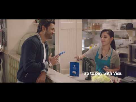
Tap to pay with Visa. Just like that. - Ad Analysis

AI Editor notes
Straight from the gut!!
“This is a really solid, no-nonsense piece of educational advertising. It's clean, rhythmic, and gets the point across in 30 seconds without wasting a frame. Is it going to win a Lion for pure creativity? Probably not. But for the business goal of getting an entire country to understand and adopt a new payment habit, it's hard to beat this kind of clarity. It feels less like an 'ad' and more like a helpful, modern tip.”
Quick Summary
This ad's success hinges on a single, smart insight: reframing the new, potentially unfamiliar action of contactless payment as the familiar, everyday behavior of 'tapping.' By linking the product to existing, positive muscle memory—tapping to a beat, tapping in a game, tapping a 'like' button—Visa makes the technology feel intuitive and effortless, lowering the barrier to adoption.
Executive Summary
In the world of financial services, changing a consumer's payment habit is one of the hardest things to do. Visa's 'Tap to pay' campaign for the Indian market is a textbook example of how to do it right by focusing on one simple, powerful idea.
The Core Insight: The foundational insight is that the physical action of 'tapping' is already deeply embedded in our daily lives and carries positive associations. [8] We tap our feet to music, tap a game piece to make a move, tap a screen to show approval. The agency, Isobar India, recognized that they didn't need to invent a new behavior, but simply re-contextualize an existing one. [4] This insight allows Visa to bypass the consumer's natural hesitancy towards new technology by framing 'Tap to Pay' not as a foreign concept, but as an intuitive extension of something they already do every day. [4, 6]
The Execution: The ad uses a classic Hook-Value-Proof-Ask structure, executed with rhythmic precision. The Hook is immediate, using the first few seconds to establish a quick-cut montage of different people 'tapping' in various scenarios—a classical dancer, a carrom player, kids playing hopscotch. The sound design is crucial here, creating a beat that pulls the viewer in. The Value is communicated through the vignettes themselves: tapping is associated with joy, tradition, community, and being current ('Tap to the trends'). This builds a positive emotional foundation. The Proof comes in the final act, where a man at a cafe uses his Visa card. The camera zooms in on the 'tap' action on the terminal, providing a clear demonstration of the product. The Ask is two-fold: the explicit voiceover, "Tap to pay with Visa. Just like that," and the functional on-screen text specifying, "No PIN or Signature required for transactions up to ₹2000." This final piece of information is critical, as it addresses a specific user question and provides a tangible reason to use the feature for small, everyday purchases. [6]
The Debrief: The key takeaway is the power of a mnemonic device in advertising, especially for educational campaigns. The word and action 'tap' becomes the central organizing principle for the entire spot. This creates high recall and simplifies a potentially complex message about NFC technology into something anyone can understand instantly. For a market leader like Visa, the goal isn't just to be preferred, but to drive category adoption. This campaign effectively teaches the market a new way to interact with the entire category, while ensuring Visa owns the initial lesson.
Theme Keywords
Brand Position
The simplest, fastest, and most intuitive way to handle everyday payments.
Brand Archetype
The Magician: It makes a complex process (payment authorization) disappear with a simple, magical gesture (a tap).
Creative Game Plan
Make the new behavior of 'Tap to Pay' feel instantly familiar by linking it to the universal, positive cultural action of tapping.
Diagnosis: Issues & Solutions
Primary Issue: Emotional Connection
The Problem:
The ad is highly effective but emotionally sterile. By using a rapid montage of disconnected vignettes, it misses the opportunity to tell a mini-story that could have made the feeling of 'joy' or 'convenience' more potent and memorable.
The Solution:
Instead of four fleeting scenes, focus on two. For example, follow the dancer from her practice to a cafe where she taps to pay for a coffee afterward. This would have created a narrative thread and a more resonant emotional payoff, linking the 'tap' of her passion to the 'tap' of her payment.
Secondary Issue: Strategic Sense
The Problem:
The ad successfully demonstrates the 'how' but is light on the 'why.' While simplicity is a benefit, it doesn't strongly communicate the core advantage over competing digital payments like UPI wallets, which were already gaining massive traction in India.
The Solution:
A subtle visual cue could have addressed this. For example, showing someone fumbling with their phone to open a QR code scanner in the background, while the Visa user effortlessly taps and goes. This would have positioned 'Tap to Pay' as not just simple, but faster than the main digital alternative.
Additional Notes
Related Links
Credits
Share this Analysis
More Visa ad breakdowns
- Everything is a Tap In with VisaVisa
- TypewriterVisa
- Visa celebrates Team Visa Athletes at the Olympic Games Paris 2024Visa
- OSTRICH ON HOVER BOARD IN DUBAI - #UnbelievableVisa
- BABY SOLVES A RUBIKS CUBE! (VISA)Visa
- Visa The Carpool to Rio featuring Team Visa OlympiansVisa
- UNCOMMON TRUTHS: FLOWERSVisa
- I Fight For VietnamVisa