M&S: The art of - Ad Analysis

AI Editor notes
Straight from the gut!!
“It's all sizzle, very little steak. The VFX are slick and the energy is high, but it feels like M&S is wearing a costume. It's trying to look like its cooler, fast-fashion competitors. Does anyone really believe the journey from a sheep to a sweater at M&S looks like a surrealist art film? It's memorable, but I'm not sure it's believable for this particular brand.”
Quick Summary
This campaign is a high-voltage attempt to shed Marks & Spencer's staid, dependable image and re-introduce it as a dynamic, high-fashion destination. Using explosive, artistic visuals, the ad equates the brand's design process with high art, aiming to convince style-conscious consumers that M&S possesses unique fashion credentials.
Executive Summary
In 2015, Marks & Spencer faced a familiar problem for a legacy retailer: a reputation for reliability that often overshadowed any perception of style. 'The Art Of' campaign was its answer, a full-frontal assault on fashion irrelevance. This wasn't a gentle nudge, but a loud, vibrant declaration of creative intent. The core insight is simple: to convince people of your artistry, you must show it to them, literally. The campaign hinges on the belief that consumers, particularly those fatigued by the disposability of fast fashion, crave a story of craftsmanship, but they need that story told in a modern, dynamic language.
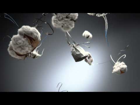
The execution is a pure lifestyle and aspirational montage, driven by a repeated visual formula: Deconstruct-to-Construct. The ad doesn't bother with a traditional narrative. Instead, it hooks you with the title card 'THE ART OF' and then launches into a series of vignettes. Each sequence begins with a raw material—wool from a sheep, colorful paint, spools of thread—exploding in a beautifully chaotic, slow-motion spectacle. This visual 'turn' is the core of the idea, transforming the mundane process of sourcing into a moment of high art. The payoff comes as these abstract elements resolve into a finished product worn by a stylish model. A sheep's fleece explodes and reforms into a cozy turtleneck; splashes of red paint coalesce into a chic coat. This visual metaphor—that M&S products are born from artistic explosions of creativity—is hammered home again and again. The upbeat funk track provides a relentless, confident energy, making the 41-second runtime feel breathless. The campaign uses this structure to showcase a breadth of products, from menswear and lingerie to denim, all under the same artistic halo.
The debrief for the team would be a lesson in trade-offs. The campaign absolutely succeeded in creating a visually striking and memorable piece of content that looked nothing like the M&S of old. It was a necessary shock to the system. However, the strategy was built on a borrowed aesthetic. By mimicking the language of high-fashion advertising, it failed to create a visual identity that was uniquely M&S. The tagline, 'Only one store does it like this,' feels hollow because the execution itself feels familiar. The key learning is that while a radical change in style can grab attention, it must be grounded in an authentic brand truth to build long-term equity. Otherwise, it's just a fleeting, albeit beautiful, performance.
Theme Keywords
Brand Position
The destination for accessible, stylish, and impeccably crafted fashion.
Brand Archetype
The Creator
Creative Game Plan
Visually equate the M&S design and sourcing process with high art to reposition the brand as a credible fashion leader.
Diagnosis: Issues & Solutions
Primary Issue: Strategic Sense
The Problem:
The ad's biggest failing is that its core message of unique artistry isn't believable because the execution is generic. The claim 'Only one store does it like this' is directly contradicted by an aesthetic that could have been used by Zara, H&M, or any other fashion retailer trying to appear premium.
The Solution:
Instead of borrowing the visual language of 'art' in general, the campaign should have found 'the art' in something specific and ownable to M&S. For example, dramatize a unique fabric technology, the heritage of a specific supplier relationship, or a design detail that competitors can't replicate.
Secondary Issue: Emotional Connection
The Problem:
The film is a showcase of cool, stylized visuals but is devoid of human warmth. The models are props for the clothes and the VFX. The audience is left impressed by the spectacle, but not emotionally moved or connected to the brand.
The Solution:
Incorporate a human element that feels genuine. This could mean featuring the real designers, tailors, or artisans behind the products, showing their passion and skill, rather than relying solely on abstract CGI to convey craftsmanship.
Additional Notes
Credits
Share this Analysis
More Marks & Spencer ad breakdowns
- OUR FAVOURITE DUO ARE BACK | MARK & SPENCERMarks & Spencer
- M&S: Adventures in which came firstMarks & Spencer
- Marks & Spencer: Adventures in ChristmasMarks & Spencer
- Get Trends With Benefits Starting Rs. 299 | RoadsterThe Roadster Life Co.
- H&M Now On Myntra Ft. Aditi Rao Hydari, Diana Penty & Amyra Dastur | #HMOnTheGoMyntra
- Tu Khul Tu Khil Har Pal | #HarPalFashionable | Amazon IndiaAmazon
- Many Many Me ft. Ananya Panday | Fashion on AmazonAmazon
- Amazon | Wardrobe Refresh Sale | 9th - 14th DecemberAmazon Fashion