M&S: Adventures in which came first - Ad Analysis

AI Editor notes
Straight from the gut!!
“This is textbook M&S Food advertising, and it's as effective as ever. The 'which came first?' hook is a bit flimsy, but the execution is so confident and visually delicious that it doesn't matter. It's pure sensory overload. They know exactly who they are: the place you go for food that feels special. No fluff, just gorgeous product, shot beautifully. It's a formula, but it's their formula, and it works.”
Quick Summary
This ad cements Marks & Spencer's position as the premier destination for high-quality, innovative seasonal treats by transforming its Easter eggs into works of art. Using its signature 'food porn' cinematographic style, the campaign bypasses traditional storytelling to create pure, unadulterated desire for the product itself, making the food the undisputed hero.
Executive Summary
The Core Insight: The simple human truth at the heart of this M&S campaign is that seasonal food is more than just sustenance; it's a form of entertainment and a status symbol. For holidays like Easter, consumers—particularly those shopping at a premium retailer like M&S—are looking for treats that feel special, innovative, and worthy of being a centerpiece. They are buying an experience, a conversation starter, and an indulgence. This ad leans into the idea that the craftsmanship and quality of the food itself is the main event.
The Execution: This ad is a masterclass in the 'Product as Hero' creative style, a hallmark of the long-running and award-winning 'Adventures in Food' campaign platform it belongs to. It forgoes a traditional narrative arc in favor of a hypnotic visual montage that prioritizes sensory appeal above all else.
-
Hook: The ad opens with a playful title card, "Adventures in Which Came First?", set to quirky, percussive music. This immediately frames the experience as whimsical and clever, differentiating it from more staid, generic food advertising.
-
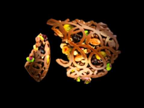
Value & Proof: The bulk of the ad is a relentless, 40-second demonstration of quality, creativity, and desirability. Through extreme close-ups and luxurious slow-motion, we see the products deconstructed and constructed. We see glistening liquid chocolate, tumbling nuts and berries, and intricate filigree work. Each shot serves as proof of the premium ingredients and artistry involved. The stamping of the chocolate seal at 0:16 is a powerful semiotic cue for bespoke quality, akin to a heritage brand's seal of approval. The explosion of the egg at 0:18 is visually arresting and showcases the abundance of the filling.
-
Payoff: The ad resolves its opening riddle with a charming, animated yellow chick at 0:37, providing a moment of lighthearted brand personality. The final taglines, "Chickens, Eggs and all things Easter" and the definitive "Only M&S," anchor the entire spectacle. The message is clear: this level of food innovation and quality can only be found at one place. The strategy is to make the product so visually compelling that it becomes its own argument.
The Debrief: The key lesson from this execution is the power of a consistent and ownable creative platform. M&S established this 'food porn' style and has used it consistently, building a powerful memory structure in consumers' minds. Any time a viewer sees this type of food cinematography, they are likely to associate it with M&S. The team proved that for a premium food brand, investing in world-class cinematography and sound design to hero the product can be more effective than complex narratives or celebrity endorsements. The success of this approach demonstrates that when your product is genuinely innovative, the best strategy is often to simply show it off in the most beautiful way possible.
Theme Keywords
Brand Position
The home of accessible, everyday luxury and food innovation that makes any moment feel special.
Brand Archetype
The Creator: Emphasizing imagination, skill, and the creation of new and beautiful things.
Creative Game Plan
Make M&S Easter eggs the most desirable holiday treat by showcasing their superior ingredients and artistic construction with hypnotic, hyper-stylized 'food porn' visuals.
Diagnosis: Issues & Solutions
Primary Issue: Emotional Connection
The Problem:
The ad is visually stunning but remains emotionally cool and distant. By focusing exclusively on the product as an object of art, it misses the opportunity to connect the food to the human experience of sharing and enjoyment that is central to a holiday like Easter.
The Solution:
Incorporate a single, equally stylized shot of a person's reaction—perhaps a child's eyes widening in awe or friends laughing as they share a piece. This would bridge the gap between the product's artistry and its ultimate purpose: bringing people joy.
Secondary Issue: Strategic Sense
The Problem:
The 'which came first?' creative frame is clever but feels slightly underdeveloped. The payoff—a simple animated chick—is stylistically jarring compared to the hyper-realistic, gourmet eggs featured throughout the rest of the spot.
The Solution:
Either fully commit to the paradox by integrating the chick/egg transformation throughout the ad or drop the conceit and focus purely on the "Adventures in Easter" theme, allowing the food's beauty to be the sole focus without a conceptual gimmick.
Additional Notes
Related Links
- marksandspencer.com✓ Validated9/10AI Source
Credits
Share this Analysis
More Marks & Spencer ad breakdowns
- OUR FAVOURITE DUO ARE BACK | MARK & SPENCERMarks & Spencer
- Marks & Spencer: Adventures in ChristmasMarks & Spencer
- M&S: The art ofMarks & Spencer
- Ask Your Butcher - Hokey PokeyOntario Beef
- Ramadhan With Sunrice #ShareTheTableSunrice
- A Table for Two Against Loneliness- OmaOma's Soep
- اعلان | الكسيح في كل مكان 🌍Kasih
- Have an Emotional Support Pizza… Loser. 7-Eleven