Mental Health Awareness Week 2022 - Loneliness - Ad Analysis

AI Editor notes
Straight from the gut!!
“This is a solid, if safe, piece of non-profit communication. The isometric animation style feels very 'of the moment' for 2022, which risks it feeling dated quickly, but it gets the job done. It's gentle, it's clear. But does it have teeth? It feels a little too quiet. It explains the problem well but doesn't quite land a powerful emotional punch that would make me stop scrolling and share it immediately. It's competent, but not unforgettable.”
Quick Summary
This film effectively uses simple, relatable animation to destigmatize the universal feeling of loneliness, transforming an abstract concept into a shared, manageable problem. Its core strength is making the viewer feel understood rather than lectured, positioning the Mental Health Foundation not just as an authority, but as a compassionate ally in a collective effort to foster connection.
Executive Summary
The Mental Health Foundation's 2022 film for Mental Health Awareness Week is a measured and strategically sound piece of brand communication that prioritizes clarity over creative theatrics. By focusing on the theme of loneliness, the foundation addresses a universally understood, yet often unspoken, aspect of mental health. The choice of a minimalist, isometric animation style is a deliberate one, creating a clean, non-threatening visual world that allows the message to take center stage without the complexities and potential alienation of live-action casting.
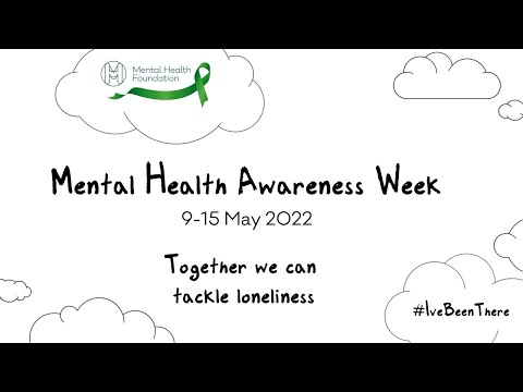
The core insight is simple: loneliness is a common human experience, not a personal failing, and it has a real impact on our mental health. The ad’s execution follows a classic Problem-Solution narrative structure. The first half of the film (0:02-0:30) is dedicated to defining the problem. It starts by normalizing the experience ('Any one of us can feel lonely'), showing isolated figures in various settings. The visuals cleverly use the brand's green only on the isolated individuals, making them the focal point in a monochrome world. The voiceover then escalates the problem, linking it to anxiety, depression, and the stigma that prevents people from speaking out. The turning point occurs at 0:45, where the script shifts from problem to solution: 'It can be hard, but there are things we can do.' From this moment, the animation begins to show connection. The isolated fisherman is joined by another. The single apartment building becomes part of a connected community. The individual protestor with a sign becomes part of a diverse march. This visual metaphor of connection is the ad's strongest creative element, elegantly illustrating the payoff of the campaign's call to action. The final section (1:14 onwards) serves as the call to action, explicitly branding the message within the context of 'Mental Health Awareness Week' and introducing the #IveBeenThere hashtag, inviting participation.
The debrief for the team behind this would be positive. The campaign successfully establishes the problem, provides a sense of hope and agency, and clearly links the solution back to the brand's mission and its specific event. While it may not win awards for groundbreaking creativity, its effectiveness lies in its quiet confidence and accessibility. It meets the audience where they are, offering understanding and a path forward, which is precisely what a trusted foundation in this space should do. It builds brand equity through usefulness and empathy.
Theme Keywords
Brand Position
The approachable, authoritative, and preventative resource for the UK's mental health.
Brand Archetype
Caregiver
Creative Game Plan
Visually depict loneliness as a shared human state that can be overcome by turning individual isolation into collective connection.
Diagnosis: Issues & Solutions
Primary Issue: Emotional Connection
The Problem:
The ad is so focused on normalizing loneliness that it neutralizes the very real pain of the emotion. Its gentle, calm tone, while accessible, misses an opportunity to create a more powerful, gut-level resonance that would drive urgency and sharing.
The Solution:
Introduce a brief, more emotionally potent moment early on. For example, a 2-3 second sequence where the minimalist animation style is momentarily broken by a more expressive, raw visual of isolation before returning to the calm aesthetic. This would validate the severity of the feeling before moving to the hopeful solution.
Secondary Issue: Clarity of "What's Next?"
The Problem:
The final call to action is somewhat diffused between 'make change happen,' '#IveBeenThere,' and 'Share your stories.' It’s not immediately clear what the single most important thing the viewer should do next is.
The Solution:
Consolidate the final call to action into one dominant, tangible request. For example, end with a strong graphic: 'Feeling lonely? Talk to one person today. #IveBeenThere' to give a concrete, immediate, and achievable next step.
Additional Notes
Related Links
Credits
Share this Analysis
More Mental Health Foundation ad breakdowns
- The Monster Who Came to TeaWomen's Aid
- Closer to You | Ronald McDonalds House CharitiesRonald McDonald House Charities Netherlands
- The Moment You Stand | Stand Up To CancerStand Up To Cancer UK
- Proud Mistletoe 2021| #ProudMistletoeStonewall
- It's Time to Even It Up | Oxfam GBOxfam GB
- Tommy's - Projecting LifeTommy's
- #DontSayDontSend cyber bullying campaignKidscape
- #ViolenceIsViolence: Domestic abuse advert MankindManKind Initiative