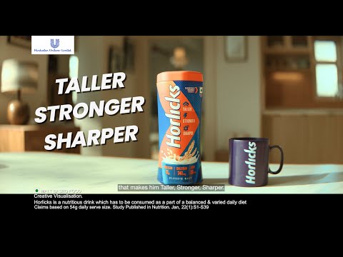
Horlicks makes your child Taller, Stronger, Sharper. - Ad Analysis

AI Editor notes
Straight from the gut!!
“It's a classic FMCG play that's smart and safe. The central idea of 'mischief is a sign of growth' is a solid insight. [2, 3] However, connecting a kid's prank of ringing doorbells to him heroically saving the entire building from a fire feels like a huge logical leap. The strategy works, but the creative execution is a bit of a stretch. It's perfectly on-brand for a market leader reinforcing its position with a reassuring message for moms.”
Quick Summary
This ad cleverly reframes a common parenting pain point—a child's mischief—into a celebrated sign of cognitive growth ('sharpness'), positioning Horlicks as the essential fuel for that positive development. It shifts the brand conversation from a simple physical growth claim to a more emotionally resonant benefit of nurturing a clever, quick-thinking child.
Executive Summary
Horlicks, a legacy brand in the Indian health food drink market, uses its 'Mischief is a Sign' campaign to reinforce its relevance with modern parents. The ad moves beyond the category's traditional focus on physical milestones to celebrate a more nuanced aspect of child development: cognitive sharpness, cleverly disguised as mischief. By tapping into this insight, Horlicks positions itself not just as a provider of nutrition, but as a partner that understands and nurtures the bright, curious minds of today's children.
The Core Insight: The foundational truth of this ad is that parents hold a secret pride in their children's spirited, sometimes mischievous, nature. [4] While mischief can be frustrating, it is also a sign of an active, creative, and problem-solving mind. The campaign directly addresses the cultural pressure on Indian parents to raise high-achieving, rule-following children, offering a counter-narrative that celebrates fearless thinking and curiosity. [2, 3]
The Execution (Setup–Turn–Payoff): The ad's narrative follows a simple and effective structure. The Setup introduces a relatable problem: a mother's voiceover describes her son, Rohan, as 'mischievous,' showing him pranking neighbors by ringing their doorbells. This establishes a familiar parental frustration. The Turn happens when the mother's tone shifts from exasperation to pride. She smiles and says, "mischief is a sign... that Rohan is growing just fine!" This line is the strategic heart of the ad, reframing the negative as a positive. The Payoff then elevates this concept to a heroic level. We see the same action—ringing doorbells—but in a new context: Rohan is alerting the building to a fire. His 'mischief' is now 'sharpness.' The grateful neighbors praise him, and the mother connects this positive outcome directly back to the product: she gives him Horlicks every day to nurture this growth. The ad ends with the long-standing 'Taller, Stronger, Sharper' tagline, reinforcing the brand's core promise.
The Debrief: The key takeaway for the brand team is the power of reframing. Instead of inventing a new benefit, the campaign re-contextualizes an existing one ('Sharper') around a powerful human insight. However, the execution's weakness is its dramatic leap in logic. The connection between a random prank and a life-saving act is tenuous and slightly undermines the credibility of the story. While effective for a 30-second spot, future iterations could explore more believable examples of 'sharp mischief' to make the strategic link feel more authentic and earned.
Theme Keywords
Brand Position
The trusted nutritional partner for a child's complete physical and cognitive development.
Brand Archetype
The Caregiver
Creative Game Plan
Reframe the negative perception of childhood mischief into a positive sign of intelligence that Horlicks nurtures.
Diagnosis: Issues & Solutions
Primary Issue: Emotional Connection
The Problem:
The creative leap from a boy being a neighborhood nuisance to a heroic fire marshal is too wide. The initial act of mischief (ringing doorbells for fun) doesn't logically connect to the 'sharp' act of using the same method to save lives. This strains credibility and makes the emotional payoff feel manufactured rather than earned.
The Solution:
Create a more direct and believable link between the 'mischief' and the 'sharpness.' For example, show the child curiously taking apart an old toy and then using that knowledge to fix a genuinely important household item. The cause and effect would be clearer and the parent's pride more authentic.
Secondary Issue: Strategic Sense
The Problem:
The ad reinforces the 'Sharper' claim but does little for 'Taller' and 'Stronger'. While focusing on one attribute is effective, the other two pillars of the brand's famous tagline feel like an afterthought tacked on at the end, potentially weakening their long-term equity.
The Solution:
Subtly weave in visual cues of physical energy and health. For instance, the boy could be shown quickly climbing stairs during his mischievous act, visually hinting at the 'Stronger' benefit before the 'Sharper' reveal, making the final tagline feel more integrated.
Additional Notes
Related Links
Credits
Share this Analysis
More Horlicks ad breakdowns
- Horlicks - Tum Kab Itne Bade Ho GayeHorlicks
- 1989: Horlicks biscuitsHorlicks
- Horlicks Milkshake: No Guilty, Only PleasureHorlicks
- Bournvita: Built Not BornCadbury Bournvita
- 1986: Active 25 - PT UshaSapan
- How Bournvita Supports Daily Nutrition | Behind the Scenes at the Factory!Cadbury Bournvita
- 1991: Complan - Shahid Kapoor & Ayesha TakiaComplan