1989: Horlicks biscuits - Ad Analysis

AI Editor notes
Straight from the gut!!
“This is a classic for a reason. The 'kids as experts' bit is clever and gets the point across without a single boring nutritional claim. It's funny, charming, and a little goofy. Who is this for? Clearly, it's for the moms who grew up trusting Horlicks, but the ad cleverly uses the kids as the Trojan horse to get the biscuits into the shopping cart. It feels very much of its time, but the core idea is solid.”
Quick Summary
This ad successfully launches Horlicks Biscuits by extending the core brand equity of 'health and nourishment' from the malt drink to a new category. It uses the charming and memorable creative device of children as 'experts' to communicate taste and quality, directly appealing to both kids (the consumers) and parents (the purchasers) in a single, efficient message.
Executive Summary
This 1989 ad for Horlicks Biscuits is a textbook example of a successful brand extension. The core challenge for Horlicks, a brand synonymous with a nutritional malted milk drink, was to enter the crowded biscuit market without diluting its established identity. The ad tackles this by leaning directly into the brand's heritage of trusted nourishment, reframing it for a new format. The strategy is built on a simple, powerful insight: kids are the ultimate experts on what tastes good, and parents are the experts on what's healthy. This ad cleverly merges these two perspectives into a single, cohesive narrative.
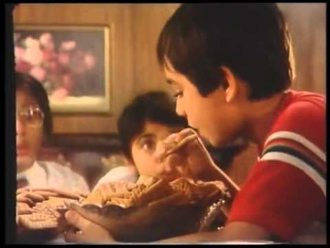
The execution uses a simple 'Problem-Solution' or, more accurately, a 'Test-Approval' structure. The setup introduces the 'experts'—a panel of children humorously dressed in official-looking lab coats. This immediately establishes a playful, tongue-in-cheek tone. The 'test' involves these children authoritatively sampling the new biscuits. Their verdict delivers the key product attributes: 'tastier', 'milkier', and filled with 'real Horlicks goodness'. This script is efficient, communicating the dual appeal of taste for kids and nutrition for parents. The payoff is the chaotic, joyful 'approval' from a larger group of children who rush in to devour the biscuits, visually confirming the experts' findings. The final tagline, 'Approved by experts', neatly summarizes the entire creative concept. The production, though dated by today's standards with its grainy film and 4:3 aspect ratio, effectively supports the concept. The stuffy boardroom setting provides a comedic backdrop for the miniature scientists, and the upbeat jingle is catchy and reinforces the core message.
The key takeaway from this campaign is the power of leveraging existing brand equity. Horlicks didn't try to be a cool, trendy snack. Instead, it positioned its biscuits as a wholesome, trustworthy choice, just like its flagship drink. By making children the arbiters of taste and using the Horlicks name as a signifier of 'goodness', the brand created a compelling argument that resolved the classic parent-child conflict over snacks. It's a smart, focused piece of communication that understands its audience and its own brand strengths perfectly.
Theme Keywords
Brand Position
The tasty biscuit that provides the trusted nourishment of Horlicks.
Brand Archetype
Caregiver
Creative Game Plan
Convince parents that Horlicks Biscuits are a wholesome snack by showing that even the toughest critics—children—approve of their taste.
Diagnosis: Issues & Solutions
Primary Issue: Emotional Connection
The Problem:
The ad is high on charm but low on genuine emotional depth. The joy feels staged and generalized, typical of the era's advertising, rather than stemming from a relatable, story-driven moment.
The Solution:
A modern version could focus on a small, authentic story between a parent and child, where the biscuit becomes a small moment of connection, rather than a large-group free-for-all. This would build a more resonant emotional territory.
Secondary Issue: Strategic Sense
The Problem:
The reliance on 'Horlicks goodness' is vague. While effective in an era of high brand trust, today's parents demand more specific nutritional information. The ad doesn't articulate what 'goodness' actually means in terms of ingredients.
The Solution:
Incorporate a subtle visual cue or a single line of voiceover that grounds the 'goodness' in a tangible benefit (e.g., 'with the goodness of malt and milk'), making the health claim more concrete without sacrificing the ad's playful tone.
Additional Notes
Credits
Share this Analysis
More Horlicks ad breakdowns
- Horlicks - Tum Kab Itne Bade Ho GayeHorlicks
- Horlicks makes your child Taller, Stronger, Sharper.Horlicks
- Horlicks Milkshake: No Guilty, Only PleasureHorlicks
- ब्रिटानिया खाओ, पेरिस जाओ* - India is #HungryForGold | हिंदी | @BritanniaIndustriesINBritannia
- Aamir Khan says Make one Good Choice with NutriChoice Digestive | HindiBritannia NutriChoice
- Happy Tamil Nadu Day | A Love Letter from Milk Bikis ❤️Britannia Milk Bikis
- Britannia 5050 - Chief Selector | Shape The Future of Biscuits & Stand a Chance To Win Rs.10,00,000Britannia 5050
- Salamat Biscuits - Single productsSalamat Biscuits