For Your Breast Safety - Ad Analysis

AI Editor notes
Straight from the gut!!
“This is smart. Really smart. They took a format everyone ignores—the flight safety video—and made it the hook. The creative concept is strong and the execution is clean. My only question is whether the super-stylized, 'Barbie-jet' aesthetic risks feeling too light for such a heavy topic. For the intended audience, it probably works by cutting through the usual somber PSA clutter. It's designed to be shared, not feared.”
Quick Summary
This campaign cleverly reframes the intimidating process of a breast self-exam into the familiar, routine, and non-threatening format of an in-flight safety demonstration. By using a highly stylized, retro aesthetic, it disarms the viewer, making a scary topic approachable and turning a clinical duty into a memorable, almost chic, monthly habit.
Executive Summary
In the crowded landscape of public service announcements, where the default is often fear or solemnity, McCann Riga’s work for the Pink Train foundation is a breath of fresh, pressurized cabin air. The campaign, “For Your Breast Safety,” isn’t just an ad; it’s a masterclass in reframing. It takes a subject fraught with anxiety—breast cancer—and makes it not only approachable but also memorable and shareable by wrapping it in a brilliantly executed creative concept.
The Core Insight: The simple human truth at the center of this ad is that women know they should perform monthly self-exams, but the task feels clinical, scary, and is easily forgotten or procrastinated. Conversely, people are conditioned to passively absorb routine safety instructions, like those on an airplane, without fear or a second thought. The ad’s genius lies in connecting these two behaviors: what if a self-exam could be taught with the same mundane, procedural calmness as buckling a seatbelt?
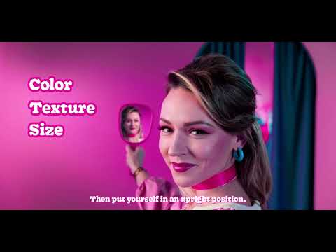
The Execution: The ad uses a classic Setup-Turn-Payoff structure. The Setup is flawless. From the opening shot, we are transported into a 1960s-era airline commercial, complete with a smiling flight attendant, saturated pink decor, and upbeat lounge music. The line, “Welcome aboard, ladies!” establishes the familiar trope. The Turn is the ad’s pivotal moment. The safety instructions pivot from the airplane to the body. A seatbelt is buckled for “vigilance.” A life vest becomes the stand-in for the torso during the exam demonstration. The metaphor is extended beautifully: “turbulence” is the feeling of a lump, and the emergency oxygen masks are replaced by a telephone to call a doctor. This direct mapping of concepts is what makes the instruction so clear and sticky. The Payoff is twofold. The primary message, “Perform a breast self-exam once a month,” lands as a simple, logical conclusion to the demonstration. The secondary payoff is the branding for Pink Train, positioning them as a clever, modern, and helpful resource, which is reinforced by the final donation request.
The Debrief: The key takeaway for any team working on a difficult subject is the power of the right metaphor. Instead of showing the frightening consequences of inaction, this ad chose to show the reassuring simplicity of action. It proves that you don't need to scare an audience to get them to pay attention. By using a disarming, stylish, and familiar framework, the campaign bypasses the viewer's natural defense mechanisms against fear-based messaging. It transforms a dreaded task into a simple routine, and in doing so, makes the message far more likely to be absorbed, remembered, and acted upon.
Theme Keywords
Brand Position
The approachable, culturally-savvy guide to demystifying breast health for the modern woman.
Brand Archetype
The Caregiver, expressed through the personality of The Jester.
Creative Game Plan
Reframe the intimidating breast self-exam as a familiar and routine airline safety demonstration to make it less scary and more memorable.
Diagnosis: Issues & Solutions
Primary Issue: Emotional Connection
The Problem:
The ad's high-concept, stylized execution is its greatest strength, but it also creates a subtle emotional distance. The viewer admires the cleverness but may not feel the raw, human stakes of the issue.
The Solution:
Consider adding a single, brief shot that breaks the fourth wall of the metaphor. For example, after the turbulence sequence, a 1-2 second cut to a real woman’s face—pensive but resolved—could ground the concept in reality without disrupting the overall tone.
Secondary Issue: Clarity of "What's Next?"
The Problem:
The ad has two distinct calls to action: a behavioral one ('check yourself') and a transactional one ('donate'). The donation ask appears only on the final card and feels secondary to the main creative idea.
The Solution:
To strengthen the donation CTA, the voiceover could have included a line that bridges the two actions, such as: 'And to ensure every woman has the support she needs for a safe journey, please consider donating.'
Additional Notes
Credits
Share this Analysis
More Pink Train (Roza Vilciens) ad breakdowns
- Pick Up Your PoopFuck Cancer
- Purple September 2018 - Cystic Fibrosis Awareness MonthInstituto Unidos pela Vida
- Fondation Recherche Cardio Vasculaire - Institut de France - "Nathalie" VAFondation Recherche Cardio-Vasculaire
- Rhian Touches Herself HDMale Cancer Awareness Campaign (MCAC)
- Euphejisms - Get Your Prostate CheckedEuphejisms