British Heart Foundation: Conditions - Ad Analysis

AI Editor notes
Straight from the gut!!
“This is brutally effective. It's so simple it hurts. There are no special effects, no dramatic music, just the plain, uncomfortable truth. Using real kids makes it impossible to look away. The turn from 'hard to say' to 'harder to live with' is a masterstroke of copywriting. It doesn't plead or preach; it just lays out the reality in a way that's impossible to ignore. A perfect example of less-is-more.”
Quick Summary
This ad's effectiveness hinges on a single, powerful pivot. It draws the viewer in with the endearing sight of children struggling to pronounce complex medical terms, then lands an emotional gut punch by reframing their difficulty: the words are hard to say, but the conditions are infinitely harder to live with. This simple, stark contrast transforms a charming moment into a devastatingly clear call for help.
Executive Summary
The British Heart Foundation’s 'Conditions' ad is a textbook example of how a simple, authentic insight can be more powerful than the most elaborate production. In the crowded, often emotionally draining, world of charity advertising, this spot cuts through the noise not by shouting, but by whispering a difficult truth.
The core insight is devastatingly simple: there is a profound and tragic disconnect between our expectation of a carefree childhood and the clinical, burdensome reality of chronic illness. We are conditioned to see children stumble over spelling words, not the polysyllabic names of their own life-threatening heart conditions. The ad doesn't need to manufacture emotion; it simply exposes this raw, existing tension.
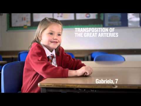
The execution follows a classic Setup-Turn-Payoff structure. The Setup (0:00-0:17) establishes an environment of complete normalcy: a school classroom. We meet several young children, identified by name and age, who are asked to pronounce a word. Their earnest, slightly hesitant attempts are endearing, and the viewer is led to believe this is perhaps a lighthearted piece about education or childhood quirks. The entire scene is shot with a warm, naturalistic feel, reinforcing the sense of innocence.
The Turn arrives not with a sudden event, but with the dawning realization that the words they are struggling with—'Aortic Regurgitation', 'Ventricular Septal Defect'—are not vocabulary words, but medical diagnoses. This slow turn creates a growing sense of unease and empathy. We are watching children carry a weight they can't even verbalize properly.
The Payoff (0:18-0:28) is delivered with stark simplicity. The visuals are replaced by a solid red screen and plain white text: 'It's hard to say, but even harder to live with.' This line is the strategic and creative core of the entire campaign. It crystallizes the preceding 17 seconds of footage into a single, unforgettable thought. It reframes the children's struggle from a trivial speech challenge into a profound daily battle. The final call to action, 'Wear red... and raise money', feels like a necessary and urgent release valve for the emotion the ad has built.
The debrief for the creative team would be clear: authenticity is your most powerful tool. By using real children and stripping away all artifice, the ad achieves a level of emotional truth that actors and scripts rarely can. The campaign confirms that when you have a powerful human insight, the most effective strategy is often to present it as directly and honestly as possible.
Theme Keywords
Brand Position
The compassionate leader in the fight against heart disease, powered by public donations for life-saving research.
Brand Archetype
The Caregiver
Creative Game Plan
Juxtapose the innocence of children with the harsh clinical reality of their heart conditions to create an undeniable emotional imperative to donate.
Diagnosis: Issues & Solutions
Primary Issue: Strategic Sense
The Problem:
The primary weakness is its reliance on a specific, time-sensitive event ('Wear red on 6 February'). This limits the ad's lifespan and makes it less effective for evergreen fundraising outside of that narrow window.
The Solution:
Create an alternate end-card with a more general call to action, such as 'Donate today to fund life-saving research.' This allows the powerful core creative to be used year-round, maximizing the return on the asset.
Secondary Issue: Emotional Connection
The Problem:
The ad's emotional punch is so direct that it risks being perceived as emotionally manipulative or too distressing for some viewers, potentially leading to tune-out.
The Solution:
While the directness is a strength, subsequent campaign materials could balance this by showing the positive outcomes of the research being funded. Featuring the same children, healthy and thriving years later, would close the emotional loop and demonstrate the impact of donations.
Additional Notes
Related Links
Credits
Share this Analysis
More British Heart Foundation ad breakdowns
- British Heart Foundation: SkypeBritish Heart Foundation
- British Heart Foundation - Ramp Up The Red TV advertBritish Heart Foundation
- Move for Yourself. Move for India. | #FitIndiaFestival | MediBuddyMediBuddy
- SickKids 150: The CountSickKids Foundation
- Learn the secrets to read your skin - The real Fortune TellerPierre Fabre
- The Rarest Stars Shine Brightest—No One Has More Grit Than a Group of Kids with Rare DiseasesMontefiore Einstein
- Stigmavir – A Casey House InnovationCasey House
- This place is specialSunnybrook Hospital