Welcome to Emplify Health - Ad Analysis

AI Editor notes
Straight from the gut!!
“It's a sweet, well-executed piece of animation that feels more like a tech startup's launch than a regional hospital network's. The 'Little Empathy' character is ownable, but is the idea? Every healthcare system claims to be empathetic. This feels like a soft promise that avoids the hard realities of healthcare—cost, access, and outcomes. It's memorable, but feels a bit lightweight.”
Quick Summary
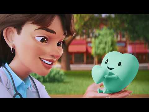
This ad establishes the Emplify Health brand not by showing doctors or patients, but by personifying its core value—empathy—as a lovable animated character searching for a home. It's a classic brand-building play designed to create an immediate emotional connection and differentiate the company in a healthcare market often perceived as cold and impersonal. [1]
Executive Summary
This campaign for Emplify Health, a new entity formed from the merger of Bellin and Gundersen Health System, is a textbook example of using emotional, narrative-driven animation to launch a brand. [3, 4] Instead of following the tired industry tropes of smiling doctors and pristine hospital hallways, agency Cramer-Krasselt opted for a modern fable. [1] The core strategy is to distill the brand's entire philosophy into a single, tangible concept: a small, personified heart named 'Little Empathy.' This move sidesteps the challenge of showing the complex reality of a healthcare network and instead focuses on communicating a feeling.
The execution follows a simple and effective narrative structure: Setup-Turn-Payoff. The Setup (0:01-0:12) establishes the problem: 'Little Empathy' is lost and unappreciated in the world. It’s ignored on city streets and farmyards, a clever visual metaphor for how patients can feel unseen in the broader healthcare landscape. The melancholy music and lonely visuals create a sense of pathos. The Turn (0:13-0:19) occurs when the character is finally seen and valued by a kind doctor. This is the pivotal moment where the brand's solution is introduced, not as a service, but as a person who understands. The Payoff (0:20-0:28) brings the character to its new home, an Emplify Health facility, where it's surrounded by others just like it. This visually resolves the initial conflict, promising the viewer that this is where empathy lives and thrives. The final tagline, "A little empathy changes everything," reinforces the central theme.
The choice of a lifestyle/aspirational format, executed through high-quality 3D animation, is a smart one. It allows the brand to feel modern, approachable, and distinct from its legacy competitors. [1] It creates an emotional high ground. The debrief for the marketing team should be positive: they successfully created a memorable brand mascot and a clear, emotional position in the market. The challenge, however, will be connecting this beautiful, abstract promise to the concrete realities of patient care in subsequent marketing efforts.
Theme Keywords
Brand Position
The healthcare system that delivers clinical excellence through a foundation of genuine empathy.
Brand Archetype
The Caregiver
Creative Game Plan
Establish Emplify Health as the place where empathy, the missing ingredient in modern healthcare, has finally found its home.
Diagnosis: Issues & Solutions
Primary Issue: Strategic Sense
The Problem:
The ad's greatest strength is also its potential weakness: it relies entirely on the abstract concept of 'empathy' without connecting it to a tangible benefit or service. While emotionally appealing, 'empathy' is a claim every competitor makes. The ad doesn't answer *how* Emplify Health's empathy leads to better outcomes, easier processes, or more affordable care.
The Solution:
Future spots in the campaign should show the 'Little Empathy' character actively helping a patient navigate a specific, challenging part of the healthcare journey—like understanding a bill, getting a quick appointment, or receiving difficult news—to ground the abstract promise in a real-world service.
Secondary Issue: Clarity of "What's Next?"
The Problem:
The ad successfully makes you feel good about Emplify Health but fails to provide any clear direction on what to do next. For a regional health system, the goal must eventually be to acquire patients. The ad lacks a simple, direct call-to-action like 'Find a doctor near you' or 'See why our patients feel the difference.'
The Solution:
Add a simple, action-oriented graphic and voiceover at the end, such as 'Visit EmplifyHealth.org to find your doctor.' This bridges the gap between brand love and consumer action without undermining the emotional tone.
Additional Notes
Credits
Share this Analysis
More Emplify Health ad breakdowns
- Emplify Health: A Little Empathy Changes EverythingEmplify Health
- Apollo Hospitals | What are the benefits of COVID-19 Vaccination?Apollo Hospitals
- Big Fucking DealCasey House
- Apollo Hospitals | Covid Vaccine - Can women go for vaccination during or post menstruation?Apollo Hospitals
- Because with you, care goes beyond medicine, thank you, nurses. | International Nurses DayApollo Hospitals
- #PioneersOfHealthcare | Apollo Hospitals | Celebrating 39th Anniversary of Apollo HospitalsApollo Hospitals
- HonorHealth | Inner UniverseHonorHealth
- Fortis Hospitals Mumbai Asks: “Helmet Pehna Kya?” This World Brain Day, Think Again!Fortis Healthcare