VH1: CPR - Ad Analysis

AI Editor notes
Straight from the gut!!
“This is a gutsy, self-aware piece of work. It’s basically saying, 'Our content is brain candy, not brain food, and you love it.' It’s so refreshing to see a brand be this honest. The contrast between the life-or-death panic and the oblivious viewer is fantastic. The Spanish punchline is a smart, targeted wink, telling me they know exactly who they're talking to. It's confident and memorable.”
Quick Summary
VH1 uses sharp, dark humor to brilliantly position itself as deliciously useless, addictive pop culture. The ad argues that while other things in life might make you a better, more capable person, VH1's programming is pure, unapologetic entertainment—a trade-off its target audience is more than willing to make.
Executive Summary
This VH1 spot is a masterclass in using self-deprecation to build a powerful brand identity. At its core, the ad operates on a simple, resonant human truth: we know some media is 'good for us,' but often we just want to be entertained. VH1 isn't here to teach you CPR; it's here to provide an escape. The campaign embraces this perceived weakness and reframes it as its greatest strength: unapologetic, addictive fun.
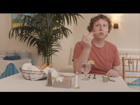
The execution uses a classic Setup-Turn-Payoff structure. The Setup (0:00-0:12) is a deliberately bland restaurant scene, lulling the viewer into a state of normalcy. The Turn (0:13-0:57) is the choking incident, but the creative genius lies in making the wife's escalating panic the focus, not the man's suffering. Her pleas, descending from a 'doctor' to someone who has merely 'read a first-aid poster,' form the ad's comedic engine. This slow, agonizing build of dark humor is perfectly juxtaposed with the oblivious young man in the background, a stand-in for the target viewer who is happily disengaged from the 'important' things happening around them. The Payoff (0:58-1:12) delivers the final punchline with brutal efficiency. We see the young man on his couch, happily consuming VH1 content while the man from the restaurant is, presumably, no longer with us. The Spanish tagline, 'Mira y no aprendas' (Watch and don't learn), removes any ambiguity. [2] It’s a direct, confident statement of purpose.
The key lesson from this campaign is the power of brand honesty. In a media landscape where every network was vying for prestige, VH1 zigged where others zagged. They didn't pretend their reality shows were culturally significant documentaries. Instead, they celebrated their role as the purveyor of pop culture candy. This act of radical self-awareness creates a stronger, more authentic connection with an audience that doesn't want to be preached to; they just want to watch.
Theme Keywords
Brand Position
VH1 is the definitive destination for addictive and unapologetically fun pop culture.
Brand Archetype
The Jester
Creative Game Plan
Dramatize the absolute uselessness of our content in a real-world crisis to prove how addictively entertaining it is.
Diagnosis: Issues & Solutions
Primary Issue: Strategic Sense
The Problem:
The ad is a pure brand piece and does little to drive tune-in for specific programming. While excellent for long-term equity, it misses the opportunity to convert the high engagement into immediate viewership for a new or tentpole show.
The Solution:
Develop 15-second and 6-second cutdowns of this concept. Use the same choking setup but have the payoff be the oblivious man watching a *specific* new VH1 show, ending with a clear tune-in message and date.
Secondary Issue: Clarity of "What's Next?"
The Problem:
The ad effectively makes you remember the VH1 brand but gives you nowhere to go. The final screen is just a logo, offering no digital or social destination for the viewer to continue their engagement.
The Solution:
In a modern context, the end card should include a simple URL like 'VH1.com' or a social handle. This provides a low-friction next step for viewers whose interest has been piqued to explore the channel's offerings.
Additional Notes
Credits
Share this Analysis
More VH1 ad breakdowns
- "I will survive" - VH1 - Del Campo Saatchi & SaatchiVH1
- Kiss TV » Songs without music - LMFAOKiss TV
- Actors - Paramount ChannelParamount Channel
- SYFY - CEMETERYSYFY
- Eeny, meeny, miny, moe.AXN
- 13th Street: Kings' cake13th Street (Calle 13)
- Comedy Central : HawksComedy Central
- chan100%charaUniversal Channel