Uluruff CSA - Ad Analysis

AI Editor notes
Straight from the gut!!
“That Uluru-to-dog morph is a smart, sticky creative trick. It’s the kind of idea you remember. The production feels very expensive for a non-profit, which could be a double-edged sword. It commands respect, but does it signal that they're a grassroots organization that desperately needs my $20? Maybe not. It feels more geared toward landing corporate partners or major donors than toward shaking the tin.”
Quick Summary
This ad uses a powerful and memorable visual metaphor—transforming Australia's iconic Uluru into a dog—to elevate the cause of animal welfare in remote communities from a niche issue to one of national importance. It's a clever bait-and-switch that forces the viewer to equate the cultural significance of the landscape with the often-overlooked animals that inhabit it.
Executive Summary
This Community Service Announcement for AMRRIC is a masterclass in using a single, powerful visual metaphor to carry an entire strategic message. The work bypasses the typical non-profit playbook of evoking pity through images of suffering. Instead, it opts for a tone of reverence and national pride, a much more ambitious and difficult creative task.
The Core Insight: The ad operates on a simple but potent human truth: people often revere symbols more than they do the living things those symbols represent. In Australia, Uluru is a sacred, protected icon at the 'heart of our country.' The ad brilliantly posits that the dogs living in remote communities are just as central to the lives of their human companions and, by extension, to the nation's soul, yet they are 'sometimes overlooked.' This insight allows the creative to reframe the issue from one of simple animal welfare to one of national identity and responsibility.
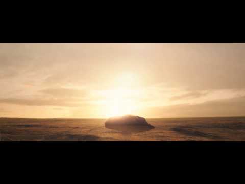
The Execution: The ad follows a classic Setup-Turn-Payoff structure. The setup (0:00-0:07) uses majestic, cinematic shots of the outback at dawn, leading the viewer to believe this might be a tourism ad. The grave voiceover and epic score establish a sense of importance. The Turn (0:08-0:14) is the ad's centerpiece: the iconic shot of Uluru, which then visually transforms into a sleeping dog. This is the pivot where the ad's true intention is revealed, perfectly timed with the voiceover line '...that's sometimes overlooked.' The abstract has become concrete; the symbol has become a living creature. The Payoff (0:15-0:30) connects this powerful image directly to the brand. We see the dog running free, and AMRRIC is introduced as the organization that cares for these animals. The initial awe inspired by the landscape is successfully transferred to the dog, and by extension, to the organization's mission. The final, clear call-to-action provides the logical next step.
The Debrief: The key lesson here is that for a non-profit, building dignity and importance can be a more powerful long-term strategy than soliciting a quick, pity-based donation. By associating their cause with a revered national symbol, AMRRIC's pro-bono agency team gave them instant gravitas. It proves that a challenger or niche player doesn't need to shout louder than the market leaders; they just need a smarter, more resonant idea. This is how you make a small cause feel big.
Theme Keywords
Brand Position
The essential caregivers for the animals at the living heart of Australian culture.
Brand Archetype
Caregiver
Creative Game Plan
Equate the overlooked importance of dogs in remote Indigenous communities with the revered status of Australia's most iconic natural landmark.
Diagnosis: Issues & Solutions
Primary Issue: Emotional Connection
The Problem:
The ad is so visually clever and majestic that it creates an emotional distance. We are impressed by the idea but not necessarily moved by the plight of the animals, as the dog shown is beautiful and healthy. This intellectual admiration doesn't create the urgency needed for donations.
The Solution:
Intersperse one quick, 1-second shot that grounds the story in reality. A shot of a veterinarian gently treating a dog, or a child from the community hugging their pet, would inject a dose of humanity and warmth without undermining the ad's epic tone.
Secondary Issue: Clarity of "What's Next?"
The Problem:
The call-to-action is generic and lacks the power of the preceding film. 'To donate or find out more...' is a polite suggestion, not a compelling request that capitalizes on the emotion and gravitas the ad has just built.
The Solution:
Sharpen the language to be more direct and empowering. Change the voiceover to: 'Help us care for the heart of our country. Donate at amrric.org.' This reframes the ask from a simple transaction to an act of national importance.
Additional Notes
Credits
Share this Analysis
More AMRRIC (Animal Management in Rural and Remote Indigenous Communities) ad breakdowns
- four paws | project 2040 | tvcFour Paws
- Fondation 30 Millions d'Amis - The Cry for HelpFondation 30 Millions d'Amis
- Kristin Bauer van Straten for No-Kill Los AngelesNo-Kill Los Angeles (NKLA)
- The World's Worst SportKeep The Ban
- Kevin Nealon for No-Kill Los AngelesNo-Kill Los Angeles (NKLA)
- Spot | PETA | Animals Are Not Christmas GiftsPETA
- America's wild horses are under attackFriends of Animals