Ugly Betty - Ad Analysis

AI Editor notes
Straight from the gut!!
“This is smart. Really smart. It's a TV promo that’s better than most brand ads. Instead of just mashing clips together, they created a piece of communication *about* the show's theme. It tells you everything you need to know about the central conflict and character in 30 seconds. It respects the audience's intelligence. This is how you launch a show with a challenging title and turn it into a must-see event.”
Quick Summary
This is a brilliantly strategic piece of advertising that uses the very tools of the fashion industry—the photoshoot and digital manipulation—to deconstruct its own artificial standards of beauty. By 'reverse-photoshopping' a generic model into the unconventional heroine, the ad perfectly encapsulates the show's core premise without needing a single line of dialogue, proving that the concept itself is the hook.
Executive Summary
In the world of television promotion, which is often a frantic montage of 'best bits,' this 2006 spot from Channel 4 for the launch of 'Ugly Betty' stands apart as a piece of high-concept advertising. It succeeds not by showing the product, but by embodying its core philosophy. The ad is a confident, intelligent Trojan horse, using the glossy language of fashion to sneak in a message of subversive disruption.
The core insight is a powerful one, especially for the mid-2000s when digital photo manipulation was becoming a mainstream controversy: manufactured beauty is a lie, and true personality is more compelling than generic perfection. The ad doesn't just say this; it proves it by taking the audience behind the curtain.
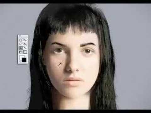
The execution follows a clean Setup-Turn-Payoff structure. The Setup (0:00-0:12) establishes the familiar world of high fashion. We see a magazine cover, a photoshoot, and a model being prepped. This is the baseline, the sterile world the show is about to disrupt. The Turn (0:13-0:22) is the ad's central genius. The action moves to a Photoshop-like interface, but the process is inverted. Instead of slimming a nose or removing a blemish, the tools are used to add character: thick eyebrows, glasses, and a brace-filled smile. This is the crucial moment of surprise and intrigue; it re-frames the narrative from one of conformity to one of creation. The Payoff (0:23-0:30) delivers the thesis. The transformed face of Betty Suarez lands back on the magazine cover under the show's title. The tagline, 'Fashion has a new face,' now makes perfect sense. [2, 3] The final card with the tune-in information isn't just an instruction; it's the answer to the question the ad has just posed.
The key debrief for any marketing team watching this is the power of conceptual alignment. The ad's creative idea isn't just related to the show; it is the show's premise in miniature. It demonstrates that when your product has a strong, disruptive point of view, your advertising should be equally disruptive. It chose to sell the 'why' (the cultural critique) before the 'what' (the plot), trusting that a smart audience would be compelled by the idea alone.
Theme Keywords
Brand Position
Channel 4: The home of thought-provoking, unconventional, and culturally disruptive entertainment.
Brand Archetype
The Jester/Sage
Creative Game Plan
Visually deconstruct the myth of manufactured beauty to introduce the unconventional heroine who defines a new standard.
Diagnosis: Issues & Solutions
Primary Issue: Emotional Connection
The Problem:
The ad is exceptionally clever and conceptual, but it operates on an intellectual level. By focusing entirely on the visual transformation, it misses an opportunity to hint at the warmth, humor, and heart that made the character of Betty so beloved. It introduces the concept of Betty, but not the person.
The Solution:
Incorporate a brief audio clip of Betty's infectious laugh or a single, warm line of dialogue over the final transformation. This would add a layer of human personality to the visual gimmick without disrupting the clean concept.
Secondary Issue: Strategic Sense
The Problem:
The creative is so strong that it almost entirely overshadows the branding until the final seconds. While effective as a hook, an audience member who tunes out for even a moment might remember the cool 'reverse Photoshop' idea but forget it was an ad for a Channel 4 show.
The Solution:
Subtly integrate the iconic Channel 4 block logo as a watermark or a tool icon within the photo editing software sequence. This would reinforce the brand throughout the core creative conceit, not just at the end.
Additional Notes
Credits
Share this Analysis
More Channel 4 ad breakdowns
- Super. Human. | Tokyo 2020 Paralympic Games TrailerChannel 4
- Considering What? | Paris 2024 Paralympic GamesChannel 4
- Gay Mountain | Channel 4Channel 4
- Complaints WelcomeChannel 4
- Short Shorts | Channel 4 #shortshorts | Channel 4 ShortsChannel 4
- PSA | Spoiled Rotten PetsNat Geo Wild
- Finding Carter | 'Upside Down' Official Promo | MTVMTV
- Strange Empire: Watch This Awesome Trailer | CBCStrange Empire (CBC)