Transfer funds swiftly through BHIM SBI Tap & Pay. - Ad Analysis

AI Editor notes
Straight from the gut!!
“This is a pure utility play. Zero creativity, zero emotion, but maybe that's the point? It feels like a help-desk video, not an ad. It’s so dry it could be an internal training video. It's not compelling enough to persuade a competitor's customer to switch. It just... exists.”
Quick Summary
This is a straightforward, no-frills 'how-to' video designed to educate existing SBI customers on using the Tap & Pay feature, aiming to increase adoption and normalize NFC payments within their ecosystem. Its value is purely functional, not emotional or persuasive.
Executive Summary
The core insight behind this ad is that for many bank customers, new payment technologies like NFC can be intimidating due to a lack of familiarity with the process. This ad from the State Bank of India attempts to address this friction by demystifying its 'Tap & Pay' feature, aiming to build user confidence and drive adoption through pure education.
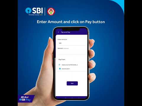
The execution is a classic Product Demo. It forgoes any narrative or emotional arc in favor of a direct, linear instructional format. The structure is simple and logical: it begins by stating the value proposition ('effortless payments'), then walks the user through each necessary step—launching the app, logging in, selecting the feature, enabling NFC, entering the amount, and completing the transaction. Each key action is reinforced with a clear text overlay. The final 'Payment successful' screen acts as the payoff, confirming the simplicity and success of the process. The entire execution is contained within a clean, corporate visual environment that is functional but sterile.
The key takeaway for the team is that while clarity is essential for a tutorial, it is not a substitute for persuasion in an advertisement. The ad successfully explains how to use the feature but provides no compelling reason why a user should choose this method over established habits like scanning a QR code or using a competitor's app. By removing all human context, it misses the opportunity to make the benefit of 'effortless' feel tangible and desirable. This asset works as a support tool for interested users but fails as a piece of marketing intended to generate new demand or change behavior.
Theme Keywords
Brand Position
The Banker to Every Indian.
Brand Archetype
The Ruler. Its personality is traditional, secure, and authoritative.
Creative Game Plan
Demystify the 'Tap & Pay' process with a simple, step-by-step visual guide to build user confidence.
Diagnosis: Issues & Solutions
Primary Issue: Emotional Connection
The Problem:
The ad is completely sterile. By showing a disembodied hand using an app in a digital void, it fails to connect the feature to any real-world human benefit or feeling, such as the relief of a quick payment in a busy queue.
The Solution:
Frame the demo within a short, live-action, relatable scenario. Show a person in a realistic situation (e.g., a bustling cafe) benefiting from the speed of Tap & Pay. This connects the function to a tangible human outcome.
Secondary Issue: Strategic Sense
The Problem:
The ad is stuck between being a tutorial for existing users and a promotion for new ones. It is too basic for tech-savvy users but not compelling enough to attract customers from dominant competitors like Google Pay or PhonePe.
The Solution:
Sharpen the targeting. If this is for educating existing users, deploy it through in-app prompts or CRM channels. For new user acquisition, create a benefit-led ad (e.g., 'Stop scanning, start tapping') instead of a feature-led demo.
Additional Notes
Credits
Share this Analysis
More State Bank of India (SBI) ad breakdowns
- Get the convenience of opening a Savings account from anywhere with Video KYC.State Bank of India (SBI)
- Make international payments easily by enabling the international transactions on your Debit CardState Bank of India (SBI)
- How to Add Money to your Paytm Account? [Hindi]Paytm
- Alia meets an ace multitasker | PhonePe | Karte Ja Badhte JaPhonePe
- Inspector Desai’s cross-examination leads to a big reveal | PhonePePhonePe
- Paytm IPL 2021 Ad - The Salon (English)Paytm
- Achaar Paytm karna possible?Paytm
- Inspector Desai hosadannu kalitiddare | PhonePe (Kannada)PhonePe