Tipping Pot (Guinness Spoof) - Ad Analysis

AI Editor notes
Straight from the gut!!
“This is a masterstroke of tactical, reactive advertising. Instead of pretending to be some high-minded product, Pot Noodle leans directly into its 'slag of all snacks' reputation and owns it. It’s a cheeky, two-fingers-up to the self-serious world of premium ads. The casting and grungy set dressing are perfect. It knows exactly who it is, who it's for, and lands the joke perfectly.”
Quick Summary
Pot Noodle brilliantly hijacked the epic, high-production-value narrative of Guinness's famous 'Tipping Point' ad. By replacing premium aspiration with low-fi, working-class ingenuity, it created a memorable parody that perfectly reinforced its own brand identity: quick, easy, and refreshingly unpretentious.
Executive Summary
Pot Noodle’s 'Tipping Pot' is a textbook example of parasitic advertising, a clever strategy where a challenger brand latches onto a market leader's campaign and subverts it. Released in March 2008, it was a direct and rapid response to Guinness’s epic and expensive 'Tipping Point' ad from late 2007. [1, 3] Where Guinness celebrated patience, community, and craftsmanship in a picturesque Argentinian village, Pot Noodle celebrated speed, convenience, and cheeky resourcefulness in a gritty British housing estate. This juxtaposition is the engine of the ad's success.
The Core Insight: The simple human truth at the heart of this ad is that while we may admire elaborate, time-consuming perfection, we often secretly prefer a quick, clever, and 'good enough' shortcut. Pot Noodle positions itself as the champion of that shortcut, transforming its brand perception from merely 'cheap' to 'smartly efficient'. It taps into a particularly British, working-class cynicism towards pretentiousness, suggesting that building an elaborate domino run to get a beer is absurd, but building one to make your instant noodles is hilarious and ingenious.
The Execution: The ad follows a classic Setup-Turn-Payoff structure, amplified by its parody format.
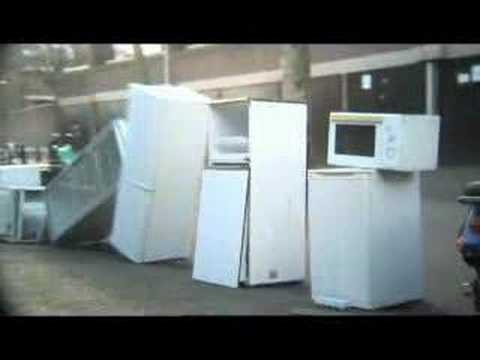
- The Setup (0:00-0:15): The film perfectly mimics the visual and auditory language of the Guinness original. We get sweeping shots of an urban landscape, set to a pensive, emotive guitar score. [3, 9] Residents gather seemingly random objects—old monitors, fridges, tires—with a shared, mysterious purpose. To anyone who had seen the inescapable Guinness ad, the setup is immediately recognizable, creating anticipation for the twist.
- The Turn (0:16-1:07): The turn is the gradual reveal of the low-fi, junk-based nature of the chain reaction. While the Guinness ad featured artfully arranged books and pristine objects, Pot Noodle uses cigarette packs, a wheelchair, wheelie bins, and even a blow-up doll. The contrast between the dramatic, building music and the cobbled-together reality of the machine creates a sustained, comedic tension. It's a slow-burn joke that replaces the original's sense of wonder with a growing sense of amusement.
- The Payoff (1:08-1:16): The grand finale is the ultimate subversion. The entire, complex contraption results in an electric kettle pouring hot water into a Pot Noodle cup. The product is the punchline. This is immediately followed by a woman shouting, "Oi! Where's my f***ing microwave?", which completely shatters any remaining dramatic tension and grounds the ad firmly in the brand's irreverent world.
The Debrief: The key lesson from 'Tipping Pot' is that a brand can build enormous equity not by creating a new narrative from scratch, but by cleverly inserting itself into an existing cultural conversation. AKQA, the agency, understood that Pot Noodle's strength was its very lack of pretension. [1] By defining itself as the polar opposite of a revered 'quality' brand like Guinness, it made its own values of speed and simplicity feel more distinct and appealing. It was a high-impact, low-cost (relative to the original) strategy that generated buzz far beyond what a standard campaign could have achieved.
Theme Keywords
Brand Position
The champion of quick, easy, and satisfyingly simple solutions in a world that overcomplicates things.
Brand Archetype
Jester / Everyman
Creative Game Plan
Parody the most epic 'patience and quality' ad of the year to prove that 'instant and simple' can be just as satisfying and far more clever.
Diagnosis: Issues & Solutions
Primary Issue: Strategic Sense
The Problem:
The parody is so effective and the production so authentically 'lo-fi' that it risks being mistaken for user-generated content or a fan-made spoof, which could slightly undermine the brand's official ownership of the clever idea.
The Solution:
While preserving the reveal, a subtle, almost subliminal placement of the brand's iconic yellow and red colors on one of the key objects in the middle of the chain reaction could have reinforced brand ownership earlier without telegraphing the punchline.
Secondary Issue: Emotional Connection
The Problem:
The ad's humor is almost entirely dependent on the audience's familiarity with the original Guinness 'Tipping Point' commercial. For viewers who hadn't seen it, the ad might just appear to be a strange and somewhat slow sequence with a weak payoff.
The Solution:
To mitigate this, the editing in the first 20 seconds could have been slightly punchier, with quicker cuts to more absurd objects earlier on. This would establish a comedic tone from the start, even for those missing the parody context.
Additional Notes
Related Links
Credits
Share this Analysis
More Pot Noodle ad breakdowns
- Pot Noodle: The RingPot Noodle
- A Pot Noeldle Christmas - by Pot NoodlePot Noodle
- Russian Black Hole experimentPot Noodle
- Pot Noodle "WAG"Pot Noodle
- Rollton on Fire. EnglishRollton
- BTS Jin’s Jinjja Love StoryJin Ramen
- BigBon! Tastes better than waiting for delivery!BigBon
- How to cook BigBon Tien Shan RAMEN?BigBon