Three Chefs SUPER PANE "AFTERSHAVE" - Ad Analysis

AI Editor notes
Straight from the gut!!
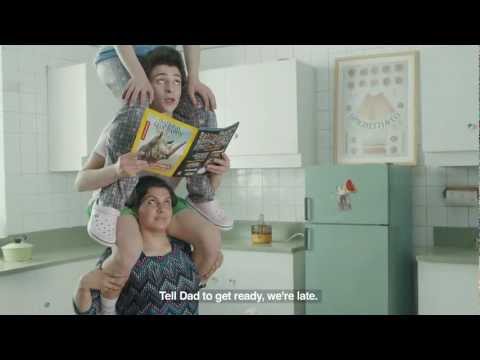
“Okay, a human totem pole. It's weird, it's memorable. I get the insight instantly: Mom carries everyone. It's a great gag for a 20-second spot, but the connection between the epic problem (literally carrying your family) and the simple solution (a box of frozen chicken) is a bit of a stretch. Smart, funny idea that slightly oversells the payoff.”
Quick Summary
The ad uses a brilliantly simple, absurd visual metaphor—a family totem pole—to instantly communicate the crushing weight of household responsibility on mothers, positioning Three Chefs' convenience products as the perfect release valve. [4, 10]
Executive Summary
This Three Chefs ad is a textbook example of how to execute a simple, powerful human insight with creative excellence. It operates on a single, relatable truth: in many families, the mother is the foundation, carrying the weight of everyone else's needs. The ad's brilliance lies in its decision to stop telling and start showing, transforming this emotional weight into a literal, physical burden.
The core insight is that modern mothers feel like they are literally carrying the entire family on their shoulders. [10, 14] This feeling of being the default parent, the planner, and the operational manager is a deeply resonant pain point for the target audience of busy, middle-class moms. Instead of showing a montage of a stressed woman juggling tasks, KAIRO and director Ali Ali created a single, unforgettable visual metaphor: the human totem pole.
The execution follows a clean Setup-Turn-Payoff structure, perfect for its 20-second runtime. The Setup introduces the surreal world in a deceptively casual way. We see a mother carrying her son, and then a father carrying his daughter. The deadpan delivery of the dialogue ('Tell Dad to get ready, we're late') normalizes the absurdity and establishes the premise. The Turn is the wide shot reveal of the full totem pole, a comedic and slightly tragic tableau of family dynamics with the mother at the bottom. This is where the on-screen text, 'You carry the team on your back,' lands the insight with perfect clarity. The Payoff is the introduction of the Three Chefs product as the antidote. The text 'we create meals to ease' positions the brand not just as food, but as a form of relief and support.
The debrief for the creative team here is clear: a single, bold, visual idea can be more effective than a dozen product features. This ad doesn't talk about ingredients, taste, or price. It sells an emotion: understanding. It tells the target consumer, 'We see you. We get it.' In a crowded market of convenience foods, that emotional connection, delivered through standout creative, is a significant competitive advantage. The ad trusts the audience to be smart enough to connect the dots between the problem and the product, and in doing so, it creates a far more memorable and endearing brand impression.
Theme Keywords
Brand Position
The empathetic solution for easing the daily burden of family mealtime.
Brand Archetype
The Jester (primary) and The Caregiver (secondary).
Creative Game Plan
Dramatize the overwhelming weight of family responsibility in a literal, unforgettable visual to make our product's convenience feel like a genuine rescue.
Diagnosis: Issues & Solutions
Primary Issue: Strategic Sense
The Problem:
The ad presents an enormous, systemic problem (the crushing weight of family responsibility) and offers a very small, tactical solution (a box of frozen chicken). This disconnect risks making the brand's promise feel thin or even glib.
The Solution:
Soften the tagline from the absolute 'we create meals to ease' to something more realistic and humble, like 'One less thing to carry.' This reframes the product as a helpful tool, not a magic bullet, making the brand's role more believable.
Secondary Issue: Clarity of "What's Next?"
The Problem:
The ad does a brilliant job of building brand affinity but provides zero guidance on the next step. It relies solely on the viewer remembering the brand later in a store, leaving a significant gap between impression and potential conversion.
The Solution:
Add a simple, final 1-second shot showing the product in a supermarket freezer aisle. This would bridge the conceptual world of the ad to the physical world of the purchase, planting a visual cue for the shopping environment.