The dot | Fundação Dorina (English) - Ad Analysis

AI Editor notes
Straight from the gut!!
“This is beautiful, intelligent work. It sidesteps the usual, often patronizing, charity ad tropes entirely. Instead of a direct emotional plea, it offers a sophisticated, artful metaphor that respects the viewer's intelligence. It feels more like a piece from a design festival than a fundraising video, and that's its core strength. It makes you *think* about the issue, which is a much taller, and more respectable, order.”
Quick Summary
This ad masterfully uses the simple metaphor of a 'dot' to explain the profound power of Braille, transforming an abstract concept into a tangible, emotional story about inclusion for the visually impaired. It reframes a simple punctuation mark as the beginning of a universe for those who cannot see, elevating the foundation's work from simple charity to profound empowerment.
Executive Summary
This film from the Dorina Nowill Foundation is a lesson in the power of a single, perfectly executed idea. It operates not by showing you a problem, but by reframing your entire understanding of the solution. The ad's brilliance lies in taking the most fundamental element of its cause—the Braille dot—and turning it into a protagonist on a dramatic journey.
The Core Insight: The simple human truth at the heart of this ad is that perspective changes everything. To the sighted world, a dot is a minor piece of punctuation, often an endpoint. But for a person with a visual impairment, that same dot is the genesis of language, imagination, and connection. It’s not an end, but a beginning.
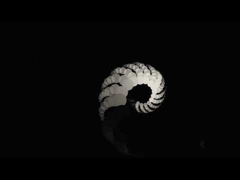
The Execution: The creative follows a classic Setup-Turn-Payoff structure. The Setup (0:00-0:27) introduces the dot in a familiar context for a sighted audience: as a 2D graphic representing abstract concepts like a period or a question mark. The visuals are stark, clean, and minimalist, accompanied by a contemplative voiceover. This phase cleverly builds a shared understanding before challenging it.
The Turn arrives precisely at 0:28 with the line, “But the story doesn’t end here.” This is where the ad pivots from philosophy to purpose. The crucial action is when the narration mentions adding “volume,” and the flat, 2D dots physically push through a surface to become 3D, tactile bumps. This is the 'aha!' moment, where the visual metaphor reveals its true meaning. We aren't just talking about graphics anymore; we are talking about Braille. It’s a stunningly effective and simple reveal that communicates the entire concept without a single word of exposition.
The Payoff (0:46-1:11) explores the consequences of this transformation. The raised dots become a language, forming letters and then ideas, visually represented by the shadow of a face. The film explicitly connects this newfound world to the foundation's 70 years of work. The brand is positioned not as a caregiver for the disabled, but as the facilitator of this magical transformation from a simple dot into an entire universe of thought.
The Debrief: What the team should learn here is that the most powerful creative doesn't always need to be loud or emotionally overwrought. By focusing on a single, intelligent metaphor and executing it with immense craft, they created something that feels more like art than advertising. It builds respect for both the cause and the audience. This film proves that you can build a brand and serve a social cause by inspiring awe rather than soliciting pity.
Theme Keywords
Brand Position
The indispensable key that unlocks a world of knowledge and imagination for the visually impaired.
Brand Archetype
Sage
Creative Game Plan
Transform the mundane 'dot' into a profound symbol of language, imagination, and inclusion for the blind.
Diagnosis: Issues & Solutions
Primary Issue: Clarity of 'What's Next?'
The Problem:
The ad is masterful at building intellectual and emotional investment, but the final call to action—'the more people help, the more we can do'—is too vague. It inspires a desire to help but fails to provide a clear, immediate channel for that impulse, leaving the motivated viewer without a next step.
The Solution:
In the final five seconds, a clean, simple graphic with the foundation's URL (e.g., 'Help us turn dots into dreams. Donate at dorina.org.br') should appear. This would convert the powerful brand feeling into a tangible action without cheapening the film's artistic integrity.
Secondary Issue: Emotional Connection
The Problem:
The film's abstract, highly cerebral nature is its greatest strength but also a potential weakness. While it resonates deeply with a design- and intellectually-minded audience, it may feel too distant for viewers who connect more with direct human stories. The emotion is awe, which is powerful but can be less activating than direct empathy.
The Solution:
A single, beautifully shot macro shot of a real child's finger tracing a line of Braille, inserted for just two seconds before the final logo, could have grounded the entire abstract concept in a tangible human reality. This would bridge the gap between the metaphor and the people it serves, adding a layer of warmth without disrupting the ad's elegance.
Additional Notes
Related Links
Credits
Share this Analysis
More Fundação Dorina Nowill para Cegos ad breakdowns
- SAY & @BBDOGroup Premiere :60 PSA to Raise Stuttering Awareness - 'IN THE SPOTLIGHT'SAY: The Stuttering Association for the Young
- Forget Me Not FarmForget Me Not Farm Children's Services
- UNEMPLOYED CHEF'S KITCHENSociedade Civil Solidária
- Norwegian association of the blind -- Could have been worseNorwegian Association of the Blind
- CATALYST "Office" 90 Sec.Catalyst
- Spot akcji "Powrót do szkoły"SOS Wioski Dziecięce
- YMCA 'A World Without Y'YMCA of Greater Toronto
- Cap48 - ‘Your ad on my prosthesis’ Case StudyCap48