Tesco Ireland: Big can be good - Ad Analysis

AI Editor notes
Straight from the gut!!
“This is a smart, defensive play. The tilt-shift miniature world is a visually sticky gimmick that makes a corporate behemoth feel quaint and charming. It’s disarming. But it feels like an answer to a question no one asked out loud: 'Why should we trust you, the big British corporation?' The ad is all heart and promises, but it’s so broad it feels like a corporate manifesto, not a conversation.”
Quick Summary
Tesco directly confronts the negative perception of its corporate size by reframing 'big' as a positive commitment to things Irish consumers value: local produce, community support, and affordability. It uses a charming 'miniature world' visual style to make the global giant feel personal and approachable, cleverly turning a potential weakness into a statement of purpose.
Executive Summary
In 2015, Tesco Ireland faced a classic market leader's dilemma: its scale, a key business advantage, was becoming a reputational liability. Competitors, particularly those emphasizing local connections, made 'big' synonymous with 'faceless' and 'foreign.' This ad, 'Big Can Be Good,' is a direct and clever response, a masterclass in strategic repositioning that tackles a negative perception head-on rather than ignoring it.
The core insight is that while shoppers are wary of corporate giants, they simultaneously desire the benefits that only scale can provide: lower prices, wide selection, and consistent quality. Rothco’s strategy was to resolve this tension by showing that Tesco’s size is not a threat to Irish values, but a servant of them. It's a humble acknowledgment of their size, followed by a pivot to prove how that size benefits the individual shopper and the wider community. [6]
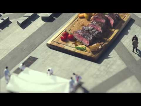
The execution uses a Setup-Turn-Payoff structure, built around a striking visual concept. The setup establishes the problem: an ominous, oversized shopping bag dwarfs a miniature Irish town as the narrator admits, "Being big… people sometimes see it as a bad thing." This single shot visualizes the core brand challenge. The 'Turn' is the ad's main body, a series of whimsical vignettes where the narrator reframes the narrative: "But we’re not just big. We’re big on the things that matter to you." The tilt-shift photography transforms Ireland into a charming model village. Here, 'big' is visualized as a positive force: a giant loaf of bread promising freshness, a huge steak representing 100% Irish sourcing, and a massive school chalkboard signifying community investment. This is where the ad's creative brilliance lies; it doesn't just tell you its promises, it shows you through a delightful, metaphorical lens. [7] The 'Payoff' returns to the initial scene. The shopping bag, once empty and imposing, is now full of wholesome groceries, symbolizing the positive outcome of Tesco's scale. The line "Maybe it’s not such a bad thing" provides a humble conclusion, perfectly complemented by the brand’s classic tagline, "Every little helps," which gains new meaning in this context.
The debrief for the team is that when faced with a negative perception, deflection isn't the only answer. Directly addressing the criticism, with humility and creativity, can be far more powerful. This ad didn't run from being big; it owned it and redefined it on its own terms. The creative team successfully married a clear strategic purpose with a unique and memorable visual execution, proving that even a corporate manifesto can be made to feel warm and human.
Theme Keywords
Brand Position
The supermarket that uses its scale to deliver big on the things that matter most to Irish life: value, quality, and community.
Brand Archetype
Caregiver
Creative Game Plan
Visually shrink the world to make Tesco's 'big' contributions feel charming and personal, turning a corporate negative into a consumer positive.
Diagnosis: Issues & Solutions
Primary Issue: Emotional Connection
The Problem:
The ad is visually charming but emotionally distant. The 'miniature people' are anonymous figures in a diorama, preventing the audience from connecting on a human level. It's a beautiful concept, but it lacks a hero.
The Solution:
Keep the tilt-shift style but elevate one or two vignettes into mini-stories. For instance, focus on a tiny farmer proudly standing by his giant lettuce, or a family having a picnic on a massive loaf of bread. This would ground the grand promises in a relatable, human moment.
Secondary Issue: Strategic Sense
The Problem:
The campaign is fundamentally defensive, reacting to the perception of being a 'big, bad corporation'. [2, 3] While effective, it cedes the first move to the critics and spends its time justifying its existence rather than proactively leading the conversation.
The Solution:
A more confident framing could have been 'The Power of Big', focusing entirely on the positive outcomes without the apologetic preamble. Start with the benefits and let the audience connect the dots that only a large-scale operation could deliver them.