Raley's Shelf Guide - Ad Analysis

AI Editor notes
Straight from the gut!!
“Okay, this is useful. It's not trying to be cool or funny; it's just trying to solve a real, nagging problem for shoppers who are tired of squinting at labels. The animation is a bit generic, but it gets the job done without being preachy. Smart move to acknowledge that 'healthy' isn't one-size-fits-all. Feels like a genuine tool, not just marketing fluff.”
Quick Summary
This ad's job is to demystify healthy eating. It takes the confusing, often conflicting, world of dietary tribes—keto, plant-based, gluten-free—and positions Raley's not as a judge, but as a helpful navigator with its 'Shelf Guide' icon system. It’s a simple, smart utility play that turns the complexity of modern wellness into a reason to shop at Raley's.
Executive Summary
Raley's 'Shelf Guide' ad is a case study in effective utility marketing. In just 30 seconds, it tackles a significant modern consumer pain point—the overwhelming and often contradictory nature of 'healthy eating'—and presents a clear, branded solution. The campaign opts for a friendly, animated 'explainer video' style, which works well to simplify a potentially dry topic like a product labeling system.
The core insight is that 'healthy' is no longer a monolithic concept; it's a deeply personal and fragmented landscape of diets like keto, plant-based, grain-free, and low-sugar. The ad wisely avoids taking a side. Instead, it positions Raley's as an impartial, helpful facilitator. The opening montage, which rapidly contrasts these different dietary needs, shows an understanding of the customer's world. This builds credibility before the solution is even presented.
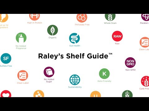
The execution follows a classic Problem-Solution framework. The first 20 seconds are dedicated to outlining the 'problem': the confusion and diversity of dietary needs. Vignettes like a woman celebrating on a haystack of wheat versus a cloud raining to grow 'grain-free' plants, or a strip of bacon relaxing in a keto-labeled frying pan, quickly and charmingly illustrate the conflict. The pivot at 21 seconds is clean: 'That's why we made it easier...' The 'solution' is the Raley's Shelf Guide, a system of simple icons. The ad concludes by showing the grid of these icons, providing tangible proof of how the system works and connecting it to the brand's purpose-driven tagline, 'Helping Healthy Happen.' The team should recognize this as a successful translation of a functional store feature into a compelling brand message. It demonstrates that advertising doesn't always need high emotion or drama; sometimes, just being genuinely helpful is the most powerful strategy of all.
Theme Keywords
Brand Position
The helpful, non-judgmental grocery partner that makes personalized healthy eating simple.
Brand Archetype
Sage/Caregiver
Creative Game Plan
Visually demonstrate that we understand the chaos of modern diets and introduce our simple icon system as the calm, easy solution.
Diagnosis: Issues & Solutions
Primary Issue: Emotional Connection
The Problem:
The ad is highly functional and lacks a distinct, ownable creative personality. The flat, vector animation style, while clean, is generic and feels interchangeable with countless other corporate explainer videos from that era, preventing a deeper emotional bond with the brand.
The Solution:
Develop a recurring, animated brand character or family to guide viewers through Raley's wellness features. A consistent, relatable character would provide a human anchor, making the brand's helpfulness feel more personal and less like a corporate system.
Secondary Issue: Strategic Sense
The Problem:
The ad effectively serves existing or potential health-conscious shoppers but may lack the punch to convert customers whose primary drivers are price or convenience. It successfully preaches to the wellness choir but doesn't frame its benefit in a way that might appeal to a broader audience.
The Solution:
Connect the Shelf Guide to a universal benefit beyond just diet-specific shopping. Frame the tool as a time-saver ('Finish your shopping 10 minutes faster') or a stress-reducer ('Shop with confidence for your family'). This broadens the appeal from niche health goals to universal life improvements.