Telstra | Wagga Wagga is better on a better mobile network - Ad Analysis

AI Editor notes
Straight from the gut!!
“This is solid, charming work. It's short, doesn't overstay its welcome, and the animation craft is top-notch. The 'better better' joke is a deliberate dad joke, but the 'never mind' at the end saves it with self-awareness. It feels authentically Australian, not like a corporation trying to act cool. The only question is whether its quiet charm is strong enough to be truly memorable or just a pleasant blip in a user's feed.”
Quick Summary
This 15-second ad uses high-craft stop-motion animation and quintessentially Australian dry humor to reinforce Telstra's core message of superior regional network coverage. It’s a piece of pure brand-building that smartly trades a hard sell for a memorable, ownable character and tone that cuts through the category's noise.
Executive Summary
In the hyper-competitive Australian telecommunications market, often defined by a shouting match over data allowances and price points, Telstra's 'Wagga Wagga' spot takes a quiet, confident turn. It's one of a series of 26 short films that represent a strategic pivot back to a core brand truth: Telstra’s network superiority in regional Australia. [2] The ad eschews technical jargon and retail offers for something far more disarming: a 15-second, stop-motion animated vignette radiating with understated Australian charm.
The core insight driving this work is that for regional Australians, a reliable network isn't a lifestyle accessory, it's a fundamental utility. This audience appreciates being spoken to with a sense of shared identity and humor, not patronizing marketing. By grounding the campaign in real, specific places like Wagga Wagga, Telstra signals that it understands and serves the entire country, not just the bustling metro centers.
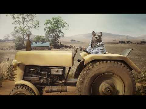
The execution, using a simple Hook-Value-Payoff structure, is perfectly tailored for short-form video platforms. The Hook (0-3s) is immediate and visually arresting: a beautifully crafted, stop-motion dog in a shirt driving a tractor. The aesthetic, reminiscent of Wes Anderson's work thanks to animation director Tobias Fouracre, signals quality and commands attention. [9] The Value (3-11s) is delivered through the simple, direct message, 'Wagga Wagga is better on a better mobile network,' followed by the central 'better better' joke. This moment does double duty: it lands the key brand message while establishing the campaign's dry, self-aware personality. The Payoff (11-15s) is the quiet 'Never mind' and the appearance of the Telstra logo. This ending solidifies the brand's persona as confident and unpretentious, leaving the viewer with a warm, positive brand association rather than a sales pitch.
The debrief for the team is clear: high-craft creative and a consistent, ownable tone can transform a simple network claim into powerful, memorable branding. In an era of fleeting attention, short-form advertising doesn't need to be loud and aggressive. As this spot demonstrates, being quiet, confident, and charming can be a far more effective way to cut through the noise and build lasting brand equity.
Theme Keywords
Brand Position
Telstra is Australia's most extensive and reliable mobile network, the essential thread connecting every corner of the country.
Brand Archetype
Ruler (dominant, leader of the category) with Everyman (down-to-earth, relatable) undertones.
Creative Game Plan
Use charming, distinctly Australian stop-motion characters to make our network superiority feel warm and familiar, not corporate and cold.
Diagnosis: Issues & Solutions
Primary Issue: Clarity of "What's Next?"
The Problem:
The ad is entirely focused on brand building and offers no path forward for an interested customer. While strategically sound for an awareness play, it completely forgoes any opportunity to convert interest into consideration, leaving potential engagement on the table.
The Solution:
Incorporate a subtle, non-intrusive on-screen text overlay in the final two seconds, such as 'See our coverage at telstra.com.au'. This would provide a simple, logical next step for viewers without disrupting the ad's charm or tone.
Secondary Issue: Emotional Connection
The Problem:
The ad successfully generates warmth and charm but remains emotionally light. It creates a smile but doesn't tap into a deeper feeling about the power of connection that a mobile network enables for communities, families, or businesses in regional areas.
The Solution:
A future spot in the series could show the character using the 'better network' to solve a problem or share a meaningful moment. For example, the dog could be video-calling family, adding an emotional purpose that reinforces the functional benefit.