Silly Office Stories S01E04 - Paper planes, Cacti and Hippies - Ad Analysis

AI Editor notes
Straight from the gut!!
“Finally, a B2B ad that doesn't feel like a B2B ad. This is basically a fan film of 'The Office.' It’s a solid strategy—make people laugh, and they might remember your name. But is it memorable enough to stand out from the show it's imitating? The product pitch at the end feels a little abrupt, like they remembered at the last second they had to sell something. Still, for a challenger brand, making your audience smile is a good first step.”
Quick Summary
This is a smart B2B brand-building play that uses entertaining, relatable content to sell a typically dry product. By creating a shareable mockumentary sketch about the pains of office miscommunication, CAKE.com makes its Pumble software feel like a necessary and approachable solution, effectively building brand personality in a crowded market.
Executive Summary
CAKE.com’s 'Silly Office Stories' is a textbook example of modern B2B content marketing that understands its audience. Instead of leading with product features, it leads with a relatable human truth: that office life is often absurdly inefficient. The campaign positions CAKE.com not just as a software provider, but as a brand that 'gets it.'
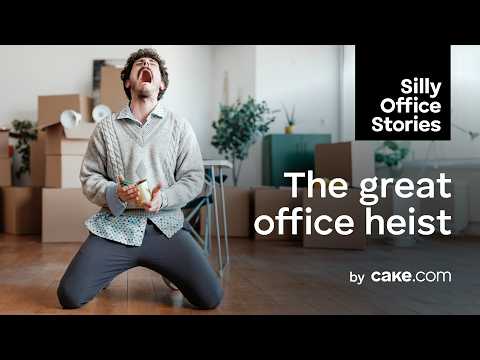
The core insight is that the biggest obstacles to productivity are rarely complex; they are simple, human-scale failures of communication. A missed memo leads to an entire office losing its furniture. This exaggeration is the comedic engine of the spot, transforming a mundane problem into a farcical 'robbery.' The choice of a mockumentary format is critical. It borrows a visual and comedic language made globally popular by shows like The Office, instantly signaling to the target audience—likely Millennials and Gen X office workers—that this is entertainment, not a traditional ad. This builds goodwill before the product is ever mentioned.
The execution follows a clean Problem-Solution structure. The first two minutes are dedicated entirely to establishing the problem. We see the chaos through character vignettes: the annoyed salesman, the melodramatic plant-lover, and the confused employees. The situation escalates until Mike, the HR manager, serves as the voice of reason. His direct-to-camera explanation acts as the turn. He diagnoses the issue not as a crime, but a 'nightmare' of a communication problem, before pivoting directly to the solution: 'Pumble by cake.com.' This reveal is the ad's most direct sales moment, functioning as the punchline to the entire setup. The payoff is the final video call, a visual representation of order restored from chaos.
The debrief for this campaign is that brand-building in B2B doesn't have to be boring. By investing in narrative and humor, CAKE.com creates an asset that is more shareable and memorable than a standard demo video. It's a long-term play that prioritizes building an audience and brand personality over immediate lead generation. It’s a smart trade-off for a challenger brand looking to carve out a niche based on relatability and simplicity.
Theme Keywords
Brand Position
The simple, no-nonsense solution to everyday office chaos.
Brand Archetype
The Jester/Everyman hybrid: using humor to connect with common, everyday frustrations.
Creative Game Plan
Dramatize the absurd, comical pain of poor office communication to make our simple solution feel like a necessary relief.
Diagnosis: Issues & Solutions
Primary Issue: Strategic Sense
The Problem:
The ad's greatest strength—its similarity to 'The Office'—is also a potential weakness. It risks feeling derivative and may struggle to establish a truly unique brand voice if the series doesn't evolve beyond the well-worn mockumentary tropes.
The Solution:
Introduce a unique, recurring comedic element or character quirk that is specific to the 'Silly Office Stories' world. This would help the series build its own identity and become more than just a tribute.
Secondary Issue: Clarity of "What's Next?"
The Problem:
The transition from the comedic sketch to the product pitch is slightly jarring, and the final call to action is vague. The ad successfully makes you aware of the problem and the solution but is less effective at guiding the viewer's next step.
The Solution:
Refine the final end card to include a clearer, low-friction call to action, such as 'See how it works at CAKE.com' or 'Start your free Pumble trial.' This can be done without sacrificing the comedic tone.
Additional Notes
Related Links
Credits
Share this Analysis
More CAKE.com ad breakdowns
- Stop burning your money | CAKE.comCAKE.com
- Vampire Influencer Shows You How to Work Inside the BoxCAKE.com
- Set work-free environments | Organize efficiently with CAKE.comCAKE.com
- I now pronounce you inefficient - Choose the right tool | CAKE.comCAKE.com
- Don’t overpay productivity tools | Get started with CAKE.comCAKE.com
- Better planning, better results | Manage time efficiently with CAKE.comCAKE.com
- Tricks won’t cut it | Work smarter with CAKE.comCAKE.com
- There’s a smarter way to track productivity | Try CAKE.com insteadCAKE.com