Set work-free environments | Organize efficiently with CAKE.com - Ad Analysis

AI Editor notes
Straight from the gut!!
“It's a solid concept. The work-haunting-you-at-home thing is a universal feeling for their target audience, and the visual execution is clever. It's memorable. But does it make me want CAKE.com specifically? Not really. It could be an ad for Asana, Slack, or any competitor. It builds category awareness more than brand preference. It's a good first handshake, but they'll need a follow-up to explain *why* them.”
Quick Summary
This ad effectively dramatizes the anxiety of work invading personal life through a smart, surreal visual metaphor. It doesn't sell product features; it sells the feeling of reclaiming your private space, positioning CAKE.com as the simple tool to build that boundary.
Executive Summary
This CAKE.com ad is a well-executed piece of top-of-funnel marketing that focuses entirely on establishing a problem and positioning the brand as the philosophical solution. It’s a classic challenger brand move: instead of getting bogged down in feature comparisons, it elevates the conversation to the emotional benefit, aiming to build brand salience around the concept of work-life balance.
The Core Insight here is potent and timely: the modern professional feels perpetually haunted by work, with the boundaries between office and home having completely collapsed. This isn't just an inconvenience; it's a source of genuine anxiety and exhaustion. The ad zeroes in on this feeling, not the logistical challenge.
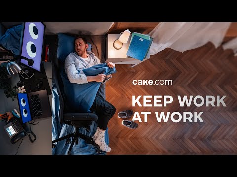
The Execution follows a classic Problem-Solution narrative structure. It opens by establishing the Problem with a relatable voiceover and a weary protagonist. The ad’s creative masterstroke is making this abstract problem visually literal. The top-down shot revealing the bedroom seamlessly merged with the office is a powerful, immediate metaphor. The details—the googly eyes on the monitors, the struggle with the duvet and the office chair—build a surreal, almost horror-like tension. The climax of this tension is the piercing ring of an old-fashioned office phone, a sound that feels violently out of place in the sanctity of a bedroom. This makes the problem visceral. The Solution is delivered with stark simplicity: the tagline 'Keep work at work.' This isn't a product feature; it's a mantra. The final branding, 'with cake.com,' positions the software as the key that enables this ideal state. It’s a confident execution that is light on details and heavy on feeling.
The Debrief for the creative team is that they successfully created a memorable and visually distinctive ad on a common theme. [1] The decision to avoid feature-talk was strategically sound for an awareness play. However, this approach has a short shelf-life. The ad makes a promise of separation and peace but provides zero evidence of how CAKE.com achieves this. It has built a beachhead on an emotional insight, but the next step must be to fortify that position with rational reasons-to-believe.
Theme Keywords
Brand Position
The all-in-one productivity suite that restores the boundary between your work and your life.
Brand Archetype
The Caregiver
Creative Game Plan
Dramatize the modern worker's anxiety about work-life boundaries with a surreal visual metaphor to make our brand synonymous with the solution.
Diagnosis: Issues & Solutions
Primary Issue: Strategic Sense
The Problem:
The ad is generic. While the problem is universal, the solution presented is so high-level that any productivity tool could have run this exact spot. It creates awareness for the category, but fails to build a distinctive brand preference for CAKE.com.
The Solution:
In the final shot, instead of just the URL, briefly visualize the CAKE.com interface bringing together different workstreams (chat, tasks, time) into one clean, simple dashboard. This would connect the emotional promise to a tangible product differentiator, even for a second.
Secondary Issue: Clarity of "What's Next?"
The Problem:
The call-to-action is nonexistent beyond brand recall. The audience understands the problem and sees the brand name, but has no direction on what to think, feel, or do next, other than a passive 'visit our website.'
The Solution:
Change the final voiceover and super from 'with cake.com' to something more active that primes the user for the benefit. For example: 'See how at cake.com' or 'Get your slice of life back at cake.com.' It's a small change that reframes the URL from a label to a destination.
Additional Notes
Credits
Share this Analysis
More CAKE.com ad breakdowns
- Stop burning your money | CAKE.comCAKE.com
- Vampire Influencer Shows You How to Work Inside the BoxCAKE.com
- I now pronounce you inefficient - Choose the right tool | CAKE.comCAKE.com
- Don’t overpay productivity tools | Get started with CAKE.comCAKE.com
- Better planning, better results | Manage time efficiently with CAKE.comCAKE.com
- Tricks won’t cut it | Work smarter with CAKE.comCAKE.com
- There’s a smarter way to track productivity | Try CAKE.com insteadCAKE.com
- Silly Office Stories S01E04 - Paper planes, Cacti and HippiesCAKE.com