Rhode Island Department of Health | StayingHome™ - Ad Analysis

AI Editor notes
Straight from the gut!!
“This is a solid, clever idea. It's exactly what a government agency with a small budget should do. Instead of a preachy, boring PSA, they made something witty that respects the audience's intelligence. It uses a universally understood format—the pharma ad—to make its point without wagging a finger. It's resourceful, funny, and the message lands perfectly. Good, smart work.”
Quick Summary
This ad cleverly reframes the mundane advice of 'stay home when sick' into a desirable, branded product called 'StayingHome™'. By perfectly parodying the tropes of a pharmaceutical commercial, it delivers a memorable public health message with humor and wit, making a low-budget, stock-footage-based concept feel smart and highly effective.
Executive Summary
The Rhode Island Department of Health’s 'StayingHome™' campaign is a masterclass in strategic resourcefulness. In a world saturated with overwrought, preachy public service announcements, this ad succeeds by going in the opposite direction: it’s a sharp, witty parody that treats its audience like they’re in on the joke. The core insight is simple yet potent: people are tired of being told what to do, but they are fluent in the language of advertising. By adopting the universally recognized—and frequently mocked—tropes of a direct-to-consumer pharmaceutical ad, the campaign disarms the viewer and makes its message feel less like a mandate and more like a clever life hack.
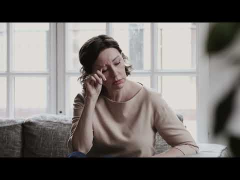
The execution follows a classic Problem-Solution framework, perfectly mirroring its source material. It opens with the 'Problem': relatable scenes of people suffering from common cold and flu symptoms, set to gentle, vaguely uplifting music. The 'Solution' is then introduced not as simple advice, but as a breakthrough product: 'StayingHome™'. The ad commits fully to the bit, complete with a pseudo-Latin name, a slick logo, and a laundry list of 'proven' benefits. The testimonial from a user who 'got back to the things I love to do' and the '10 out of 10 doctors recommend' claim are pitch-perfect. The true genius lies in the 'side effects' sequence. The fast-talking voiceover lists benefits that are both communal ('protecting grandmas, healthy coworkers') and selfishly appealing ('comfy sweatpants, finishing that show you’ve been meaning to watch'). This blend of altruism and personal reward is the emotional core of the ad, making the desired behavior feel like a win-win. The final on-screen text, 'Seriously. Just stay home, Rhode Island,' breaks the parody just enough to land the message with absolute clarity.
The key takeaway from this campaign is that creativity is not contingent on budget. The use of stock footage is not a weakness but a strategic choice that reinforces the generic, placeless feel of the very ads it’s parodying. Nail Communications delivered a campaign that is more memorable and effective than many PSAs with ten times the budget. It proves that a strong, culturally relevant creative idea is the most valuable asset in advertising. The team should learn that when you respect your audience's intelligence and use humor as a vehicle for your message, the message is far more likely to be heard, remembered, and acted upon.
Theme Keywords
Brand Position
The Rhode Island Department of Health as the source of pragmatic, witty, and common-sense health advice.
Brand Archetype
Caregiver (with a Jester personality)
Creative Game Plan
Parody a pharmaceutical ad to reframe 'staying home when sick' as a revolutionary, desirable new medicine.
Diagnosis: Issues & Solutions
Primary Issue: Emotional Connection
The Problem:
The ad's greatest strength—its witty parody—is also a minor limitation. By prioritizing cleverness, it creates intellectual appreciation rather than a deep, visceral emotional response about the importance of protecting the vulnerable.
The Solution:
Intersperse the humorous 'side effects' with one genuinely poignant, quick shot—perhaps a healthy baby in the arms of a parent, or an elderly person smiling—to briefly ground the 'why' in a more powerful emotional context without killing the comedic tone.
Secondary Issue: Strategic Sense
The Problem:
The ad's use of generic stock footage, while thematically appropriate for a pharma parody, misses an opportunity to create a stronger local bond. The final 'Rhode Island' text feels slightly tacked on.
The Solution:
Subtly replace one or two of the generic stock shots with footage that feels authentically local to Rhode Island—even a simple shot of a recognizable landmark through a window—to make the message feel more personal to the target geography.
Additional Notes
Related Links
Credits
Share this Analysis
More Rhode Island Department of Health ad breakdowns
- A Hope Story | Lung Cancer ScreeningAmerican Lung Association
- Vaccinate Already? | 您打疫苗没?(Chinese)Gov.sg
- "Reflections" UU4VE Vaccination PSAUrologists United For Vaccination Education
- The Breath HolderThe Cancer Society of Finland
- AFCON 2023 TV spot to promote routine immunization and COVID-19 vaccination (Nigeria, Pidgin)Team Vaccine
- Fall in with an active crowd.ParticipACTION
- Size MattersFuck Cancer
- CNCT national commitee against tobacco: The weight of tobaccoCNCT (Comité National Contre le Tabagisme)