Renovate Your Pantry with LesserEvil - Ad Analysis

AI Editor notes
Straight from the gut!!
“It's slick and visually sticky. The Toy Story-meets-Queer Eye vibe for your pantry is a clever way to stand out. It feels very premium, almost too premium. I wonder if the high-concept visual metaphor connects strongly enough to the simple act of eating popcorn, or if it's trying a bit too hard to be profound for a snack food.”
Quick Summary
This ad uses a whimsical 'pantry renovation' metaphor, powered by animated characters, to position LesserEvil not just as a better-for-you snack, but as an accessible lifestyle upgrade that replaces chaos with joy and mindfulness.
Executive Summary
LesserEvil's 'Renovate Your Pantry' campaign is a smart, stylish effort to carve out a distinct space in the crowded 'better-for-you' snack category. The brand is betting that for its target audience—health-conscious millennials—snacking isn't just about sustenance, but about values, aesthetics, and self-care. The core insight is that small, manageable upgrades in daily life can provide a disproportionate sense of joy and control. By framing the choice of snack as a 'renovation,' the brand elevates its product from a simple purchase to a deliberate act of improvement.
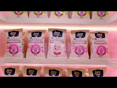
The execution uses a classic Problem-Solution framework, brilliantly visualized through mixed media. The 'problem' is established immediately: a woman stands in a dark, messy pantry, a relatable image of domestic chaos and uninspired choices. The VO, 'Your pantry deserves better,' immediately frames the issue. The 'turn' is the ad's most creative element: a team of whimsical 3D animated characters descends to 'fix' the problem. [1] This fantastical intervention is key; it allows the brand to literally throw out the competition and replace it with its own products, an act that would be jarring in live-action but is charming in animation. The 'payoff' is the transformed pantry—a bright, impossibly clean, pink-tiled space that looks like it belongs on a Pinterest board. This isn't just a pantry; it's an aspirational space symbolizing order and joy. The final scene of the mother and son sharing popcorn grounds the fantasy in a relatable, warm moment, connecting the brand's promise to a real-world benefit.
The team should take away that building a brand can be done with charm and visual metaphor rather than overt health claims. They successfully translated the feeling of 'upgrading' into a compelling narrative. The challenge going forward will be to ensure this premium, high-concept branding also communicates tangible product benefits, like taste and ingredients, without losing the magic.
Theme Keywords
Brand Position
The snack that transforms a simple choice into a joyful act of self-care.
Brand Archetype
The Innocent
Creative Game Plan
Visualize the feeling of upgrading your life by showing a magical transformation of the pantry, turning a mundane space into a joyful sanctuary.
Diagnosis: Issues & Solutions
Primary Issue: Emotional Connection
The Problem:
The ad creates a world of charm and whimsy but keeps the viewer at a slight emotional distance. The 'joy' presented is highly aestheticized—embodied by the pink pantry—rather than a deeply felt human emotion from the main character.
The Solution:
Before the big reveal, insert a brief, quiet shot of the mother looking at her renovated pantry with a genuine expression of relief or peace. This would better link the brand's 'solution' to an internal emotional state, not just an external makeover.
Secondary Issue: Strategic Sense
The Problem:
The ad is so focused on the aspirational metaphor that it nearly forgets the product itself. Viewers see the packaging, but the ad misses an opportunity to make the snacks look as appealing and delicious as the pantry they now live in.
The Solution:
Incorporate a single, elegant macro shot of the popcorn—perhaps one of the animated characters diving into a fluffy kernel—to bridge the gap between the high-concept fantasy and the tangible, delicious reality of the product.
Additional Notes
Related Links
Credits
Share this Analysis
More LesserEvil ad breakdowns
- Four footballers looking for a bar…but not just any bar 👀#NoWalkersNoGameWalkers
- A Spicy But Not Too Spicy PlumberDoritos
- Cheetos Pizza CouncilCheetos
- Day Of The Dead — Doritos [ English subs ] LGBT+ Día de MuertosDoritos
- NFL Focus Groups - Doritos Crash the Super Bowl 2025Doritos
- Surprisingly Snackable Pecans: Squirrel Tested, Dad ApprovedEat Pecans
- Kettle | DavidKettle Chips
- Lay's x Goats for MessiLay's