Power a Brighter World with Inspire Clean Energy - Ad Analysis

AI Editor notes
Straight from the gut!!
“It’s a clean energy explainer that looks and sounds like every other direct-to-consumer brand ad from the last five years. The animation is fine, if generic. The message is clear, but the concept of 'matching' dirty energy feels a bit like an accounting trick, not a real-world solution. It’s too safe to be memorable and feels more like it’s checking a box for 'socially conscious marketing' than truly trying to connect.”
Quick Summary
This ad's entire strategy is to distill the overwhelming, abstract problem of climate change into a single, tangible consumer action. It reframes a feeling of powerlessness as an opportunity for personal empowerment by making the simple choice to switch energy providers, effectively turning a utility bill into a vote for a cleaner planet.
Executive Summary
Inspire Clean Energy’s “Power a Brighter World” is a textbook example of modern, direct-response advertising designed to convert, not necessarily to captivate. The strategy is built on a solid foundation: identify a widespread anxiety and present your product as the simple, accessible solution. Here, the anxiety is the existential dread of climate change, a problem so large it often induces paralysis. The brand’s core insight is that people crave a sense of agency and want to feel they are making a positive contribution without fundamentally altering their lives. Inspire positions itself not just as a utility provider, but as a vehicle for empowerment.
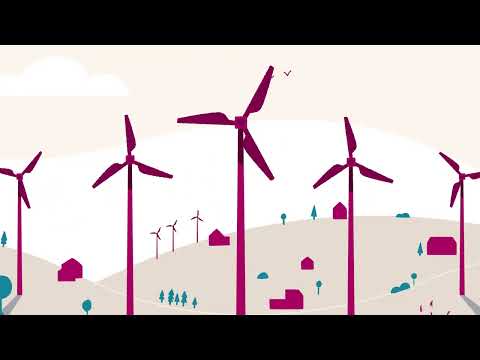
The execution follows a classic Problem-Solution framework, delivered through clean, 2D vector animation. The ad opens by acknowledging the problem—a shared feeling of powerlessness, visualized by two tiny figures dwarfed by a melting iceberg. This immediately validates the viewer's feelings. The pivot is swift: the dark, cold scene transforms into a bright, vibrant world powered by wind turbines, introducing Inspire as the hero. The narrative then explains the 'how': the service 'matches' the fossil fuel energy a home uses with clean energy put back into the grid. This is cleverly shown as a direct replacement of a polluting factory with solar panels. The payoff elevates the individual action to a collective movement, showing a continent of homes powered cleanly and explicitly telling the viewer, 'the power is in your hands.'
While strategically sound, the creative execution is where the ad falters. The animation style, often called 'corporate Memphis,' is so prevalent that it renders the ad visually generic. It’s safe, clean, and utterly forgettable. It lacks the unique aesthetic or emotional grit needed to stand out in a crowded media landscape. The ad is effective in its role as a functional piece of marketing—it clearly explains the service and provides a compelling call to action. The team should learn, however, that while clarity is crucial for direct response, a lack of creative distinction means the brand builds no long-term equity. It's an ad that serves a purpose but is unlikely to be remembered once the screen goes dark.
Theme Keywords
Brand Position
The simplest, most accessible way for anyone to power their home with 100% clean energy.
Brand Archetype
The Everyman
Creative Game Plan
Turn the overwhelming feeling of climate powerlessness into a simple, empowering action you can take from your couch.
Diagnosis: Issues & Solutions
Primary Issue: Brand Distinctiveness
The Problem:
The ad's greatest weakness is its visual conformity. The flat, 2D animated style has been used by countless tech and service startups, making Inspire's visual identity completely interchangeable with other brands and preventing it from building any unique brand memory.
The Solution:
Develop a more ownable visual style. This could involve a more textured, hand-drawn animation, using a more unique color palette, or incorporating a distinctive character or visual metaphor that goes beyond generic landscapes to make the brand instantly recognizable.
Secondary Issue: Emotional Connection
The Problem:
The use of faceless, generic animated characters prevents any real emotional connection. The viewer understands the concept of feeling 'powerless' intellectually but doesn't feel it from the characters on screen, which dampens the emotional reward of the 'hopeful' solution.
The Solution:
Even within animation, find ways to inject more humanity. A single, more detailed character's journey, or even a voiceover with more authentic emotional texture, could create a stronger bond with the audience and make the final message of empowerment feel more earned and resonant.
Additional Notes
Related Links
Credits
Share this Analysis
More Inspire Clean Energy ad breakdowns
- A taste of fossil freedomVattenfall
- We go faster with the power of windEDP
- Tata Power launches ‘SOLAROOF’ campaign - 'Ab aapka Ghar Kamayega'Tata Power Solaroof
- United for a wonderful world [Full version]EDP
- Advert for Kraftringen – Förnybar Energi (Renewable Energy)Kraftringen
- EDP - Giving TreeEDP
- Geothermal — Energy We Can All Agree OnGeothermal For All
- SolarCity: OilSolarCity