Advert for Kraftringen – Förnybar Energi (Renewable Energy) - Ad Analysis

AI Editor notes
Straight from the gut!!
“It’s cute, quick, and gets the point across. The ants are a nice, simple creative vehicle. But it feels a bit like a checklist. Sun, check. Wind, check. It's solid and inoffensive, which is fine for a pre-roll, but it doesn't have a spark that would make me remember Kraftringen over any other utility talking about renewables. It's forgettable.”
Quick Summary
This ad uses simple, charming animation to quickly list Kraftringen's portfolio of renewable energy sources. It’s a classic brand awareness play designed to make a complex topic feel friendly and accessible, positioning the company as a comprehensive provider of fossil-free energy for a broad audience.
Executive Summary
This Kraftringen spot is a textbook example of a simple, product-focused awareness ad. The core strategic decision is to demystify the concept of renewable energy by breaking it down into a visual checklist. In a category that can be technical and dry, the choice to use charming, 3D-animated ants as the creative vehicle is a smart one. It makes the topic friendly and accessible to a broad, multi-generational audience.
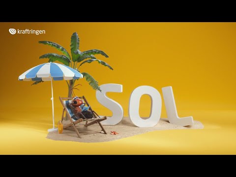
The execution follows a straightforward 'Product Demo' structure, though it's demonstrating a portfolio rather than a single item. The setup is an ant enjoying the sun, which neatly introduces the theme and the first energy source, 'SOL'. The ad then briskly moves through a series of vignettes for 'VIND' (wind), 'BIOMASSA' (biomass), and 'VATTEN' (water), each visually represented by the ants interacting with the element in a playful way. The slight comedic turn with the 'BIOGAS' reveal—a bubble in the pool—is a clever touch that adds a bit of personality and humor. The consistent yellow background and clean animation style create a cohesive and ownable visual world for the brand.
The primary strength of this 16-second ad is its efficiency. It communicates its key message—that Kraftringen offers a comprehensive suite of renewable energy options—with absolute clarity and speed. This makes it well-suited for its likely media placement as a skippable pre-roll ad where attention is fleeting. The payoff, with the logo and the tagline 'Fossil-free energy already today,' reinforces the brand's positioning as a current and capable provider.
However, the ad's simplicity is also its weakness. While effective at listing services, it fails to build any significant emotional connection or brand preference. The line 'Energy for future generations' is a powerful sentiment, but it's just an opening statement that the creative never emotionally pays off. The ad tells us what Kraftringen does, but not why we should choose them over another provider. It’s functional and pleasant, but it lacks the creative spark needed to be truly memorable or persuasive.
Theme Keywords
Brand Position
The friendly, all-in-one provider of fossil-free energy for today and tomorrow.
Brand Archetype
Everyman
Creative Game Plan
Use simple, charming animated ants to list our full range of renewable energy sources, making the brand feel friendly and comprehensive.
Diagnosis: Issues & Solutions
Primary Issue: Strategic Sense
The Problem:
The biggest missed opportunity is the failure to differentiate. The ad communicates a category-level benefit ('we do renewables') rather than a brand-specific one. Any energy company can make this claim, making the ad feel generic despite the unique animation style. The ants are charming, but they're carrying a message that doesn't set Kraftringen apart from competitors like Vattenfall or E.ON.
The Solution:
Incorporate a proof point that is unique to Kraftringen. For example: 'From sun, wind, and biomass, all produced here in Skåne.' This would root the generic benefit in a specific, local, and more tangible reality, giving customers a reason to choose Kraftringen specifically.
Secondary Issue: Emotional Connection
The Problem:
The ad opens with the powerful line 'Energy for future generations' but then immediately pivots to a functional list. The creative doesn't connect the energy sources to the benefit for those future generations, leaving the emotional premise unexplored and unfelt.
The Solution:
Instead of just showing ants relaxing, depict them using the energy to build a better, safer, or more prosperous home for their young. This would visually and emotionally link the product (energy types) to the promise (a better future).
Additional Notes
Credits
Share this Analysis
More Kraftringen ad breakdowns
- A taste of fossil freedomVattenfall
- We go faster with the power of windEDP
- Power a Brighter World with Inspire Clean EnergyInspire Clean Energy
- Tata Power launches ‘SOLAROOF’ campaign - 'Ab aapka Ghar Kamayega'Tata Power Solaroof
- United for a wonderful world [Full version]EDP
- EDP - Giving TreeEDP
- Geothermal — Energy We Can All Agree OnGeothermal For All
- SolarCity: OilSolarCity