Orange Lovenames - Babycakes, Sweetheart, Honey Bear... - Ad Analysis

AI Editor notes
Straight from the gut!!
“This is a really solid piece of brand work. It's warm, funny, and feels authentic. Instead of shouting about data plans or network coverage, it tells a human story. The Pan-African casting and context make it feel specific and real, not like a generic global ad. The airport scene is the perfect comedic payoff. It’s the kind of ad that makes you smile and feel good about the brand without feeling like you're being sold to.”
Quick Summary
By focusing on the universal, and often embarrassing, experience of pet names, Orange successfully shifts its brand perception from a functional utility to an emotional facilitator of love and connection. The ad's charm lies in its simple, relatable human insight: the private language of love is powerful, no matter how silly it sounds to the outside world.
Executive Summary
This Orange campaign is a smart example of how to advertise a utility service by focusing entirely on the human benefit. In the hyper-competitive telecommunications sector, where advertising often devolves into a shouting match about price and data, "Lovenames" takes a step back. It doesn’t mention a single product feature. Instead, it builds its entire narrative around a simple, powerful human insight: the private, often silly, nicknames we give our loved ones are a fundamental expression of our connection.
The ad uses a documentary-style interview as a framing device, which gives it an air of authenticity. A man recounts the history of his names, starting with his mother's embarrassing-but-loving baby talk. The structure follows a clear Setup-Turn-Payoff model. The Setup introduces the core idea through a series of charming and funny vignettes: the mother cheering at a football game, the fleeting teenage romance on a bus. Each scene reinforces the central theme while showcasing different stages of life and love. The casting and settings feel distinctly Pan-African, grounding the universal story in a specific cultural context that resonates with its target market. [1]
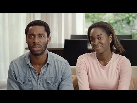
The Turn is the escalation of the concept, culminating in the hilarious airport scene where "Mr. Chickie-Doodle-Doo" is paged over the PA system. This is the comedic peak, perfectly capturing the public embarrassment that often accompanies private affection. The Payoff arrives when the protagonist returns to the present, sitting next to his wife. His line, "the most important names are not the ones we are given, but the ones we give," masterfully reframes the entire narrative. The embarrassing names are no longer a burden, but a badge of honor—a testament to being loved. When he affectionately calls his wife "my lovely, sweetie, lovely, lover lamp," the brand's role becomes clear without ever being explicitly stated: Orange is the network that carries these messages of love. The final tagline, "There are millions of ways to express your love," links the variety of nicknames to the services Orange provides. [4]
What the team should learn from this is the power of insight-driven creative. By identifying a universal truth, Publicis Conseil created a story that feels more like a short film than an advertisement. It builds brand affinity through emotion and humor, which is far more durable than an appeal based on a temporary price promotion. It proves that you don't need to show the phone to sell the connection.
Theme Keywords
Brand Position
The essential enabler of meaningful, personal connections.
Brand Archetype
The Lover / The Everyman
Creative Game Plan
Demonstrate that Orange understands and facilitates the real, quirky, and deeply personal ways people express love.
Diagnosis: Issues & Solutions
Primary Issue: Clarity of "What's Next?"
The Problem:
The ad successfully builds emotional capital but fails to convert that warmth into immediate action. The YouTube description mentions an accompanying interactive map for lovers to send messages, but this digital extension is completely absent from the video's call-to-action. [4]
The Solution:
A simple end card or on-screen text overlay after the Valentine's Day message could have directed viewers to the interactive map (e.g., 'Create your own lovename message at Orange.com/love'). This would have bridged the brand story to an engaging brand experience, capturing the audience's positive sentiment and driving participation.
Secondary Issue: Brand Distinctiveness
The Problem:
While the execution is strong, the core idea of 'connecting loved ones' is a category staple for telecommunication companies. The branding is very light until the final seconds, which means a less-attentive viewer might recall the charming story but not necessarily associate it with Orange.
The Solution:
Subtly integrating the iconic Orange color square earlier in the narrative could have improved brand recall without disrupting the story. For example, a child's toy block, the color of a t-shirt, or an object in the background could have been rendered in the brand's signature orange, creating a subconscious link that pays off more strongly at the end.
Additional Notes
Related Links
Credits
Share this Analysis
More Orange ad breakdowns
- Orange - WoMen's Football (case study)Orange
- ORANGE - SAFERPHONE 🎄 (VA)Orange
- Orange_Together SeasonOrange
- Orange - Toujours bien connecté - Service MobileOrange
- Orange brings you closer to what matters most to youOrange
- Orange - Alone In The WorldOrange
- Si les Bleus vont en Amérique, ce n'est pas pour jouer la comédieOrange
- Orange 2013 Me Bone EnglishOrange