Orange brings you closer to what matters most to you - Ad Analysis

AI Editor notes
Straight from the gut!!
“It's a beautiful film, no question. The craft is top-notch. But what am I supposed to do with this? The metaphor of an orange thread physically dragging people through cities is a bit heavy-handed. It feels more like a short film that slapped a logo on at the end than a piece of brand communication. I'm left wondering if anyone watches this and thinks, 'I should switch to Orange,' or if they just think, 'cool ad,' and move on.”
Quick Summary
Orange transforms its intangible network into a tangible, emotional force using a powerful visual metaphor—a single orange thread—that physically pulls people together across the globe. The ad makes the abstract idea of connection feel both epic and deeply personal, positioning the brand as the essential facilitator of life's most important moments.
Executive Summary
This Orange campaign, 'The Thread,' is a classic example of big-brand, emotional storytelling from the late 2010s. It forgoes product features and pricing entirely, opting instead to own a universal human emotion: the desire for connection. The work is confident, beautifully executed, and operates on the assumption that if a brand can successfully attach itself to a fundamental human truth, the commercial results will follow.
The Core Insight: The simple, powerful truth at the heart of this ad is that in an increasingly complex and isolating world, the invisible technological ties that bind us are as powerful and essential as physical ones. Orange isn't selling a data plan; it's selling the end benefit of that plan—the ability to bridge any distance and overcome any obstacle to reach the people who matter most. The ad posits that technology isn't cold and isolating but is, in fact, the most potent force for human-to-human connection we have.
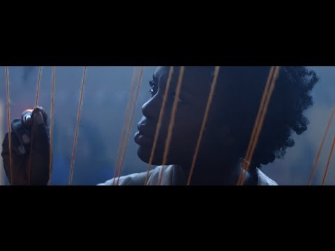
The Execution: The ad follows a simple, mythic narrative structure: the journey to reunion. The setup introduces two protagonists, separated but linked by the ad's hero device: the physical orange thread. This instantly visualizes the campaign's core idea. The journey forms the bulk of the film—a montage that serves two purposes. First, it establishes the global scale of the Orange network, taking the characters through diverse urban, rural, and industrial landscapes. Second, the choice of Timber Timbre's haunting song, "Run From Me," creates a compelling tension. The lyrics suggest pursuit and escape, adding a layer of dramatic complexity to what could have been a simple love story. The payoff is the quiet, final meeting. When the text 'Orange brings you closer' appears, the brand's role is finally made explicit. The masterstroke is the final line: 'the rest is in your hands.' This cedes control back to the user, positioning Orange as a humble enabler of human moments, not the creator of them. It's a smart, respectful way to build a brand without over-claiming its role in people's lives.
The Debrief: The key lesson here is the power of a single, well-executed visual metaphor. The orange thread does all the strategic heavy lifting, communicating global reach, reliability, and the brand's core purpose without a single word of voiceover. However, the campaign also highlights a potential pitfall of this high-concept approach: a weak link to the actual product. The ad is so cinematic and abstract that it risks being remembered as a beautiful short film rather than a compelling argument for choosing Orange. It builds brand love but might struggle to build market share on its own.
Theme Keywords
Brand Position
The essential enabler of meaningful human connection.
Brand Archetype
The Lover: Focused on relationships, intimacy, and bringing people together.
Creative Game Plan
Make the invisible power of our network tangible and emotional by showing it as an unbreakable thread that physically connects people across any distance.
Diagnosis: Issues & Solutions
Primary Issue: Strategic Sense
The Problem:
The ad's core creative concept, while beautiful, is not strongly ownable. The 'colored thread of connection' is a fairly common advertising trope. A competitor could replicate this idea with their own brand color, diminishing its distinctiveness for Orange.
The Solution:
To make this more ownable, the execution could have subtly tied the thread's behavior to a specific network attribute. For example, showing the thread effortlessly passing through a thick subway wall to signify signal strength or moving at high speed to hint at data performance, thus linking the metaphor to a tangible product proof point.
Secondary Issue: Clarity of "What's Next?"
The Problem:
The campaign is purely philosophical, offering no pathway for an interested consumer to act. After creating this emotional high, it leaves the viewer with nowhere to go, risking that the positive feeling evaporates without any commercial benefit.
The Solution:
A simple, non-intrusive end card with a targeted message like 'Discover our plans for staying connected' and a clean URL would have provided a valuable bridge between the brand story and the business, without undermining the ad's emotional tone.
Additional Notes
Credits
Share this Analysis
More Orange ad breakdowns
- Orange - WoMen's Football (case study)Orange
- ORANGE - SAFERPHONE 🎄 (VA)Orange
- Orange_Together SeasonOrange
- Orange - Toujours bien connecté - Service MobileOrange
- Orange - Alone In The WorldOrange
- Orange Lovenames - Babycakes, Sweetheart, Honey Bear...Orange
- Si les Bleus vont en Amérique, ce n'est pas pour jouer la comédieOrange
- Orange 2013 Me Bone EnglishOrange