MILKA - FIRST TASTES - Ad Analysis

AI Editor notes
Straight from the gut!!
“This is smart, classic advertising. The setup is a relatable gag reel of 'first taste' faces that everyone recognizes. It’s funny, human, and hooks you in. The switch to Milka feels a little saccharine, sure, but the strategy is solid. It elevates the chocolate from a simple candy to an antidote for life's less pleasant moments. It's not groundbreaking, but it's effective emotional branding.”
Quick Summary
This ad cleverly positions Milka chocolate not just as a treat, but as a reliable source of tender, pleasant comfort in a world of harsh or acquired tastes. By contrasting the universal, often comical, human experience of trying challenging foods for the first time with the simple, immediate joy of its chocolate, Milka reinforces its core brand promise of 'tenderness' as both a flavor profile and an emotional reward.
Executive Summary
Milka’s “First Tastes” is a textbook example of how to build a brand by anchoring it to a simple, universal human truth. The ad, created by agency Buzzman, doesn't sell chocolate so much as it sells an emotion: tenderness. It operates on the core insight that not all experiences are pleasant, but some simple pleasures—like Milka—are a reliable comfort. This strategy is designed to strengthen the brand's long-held positioning and create an emotional connection that transcends product features.
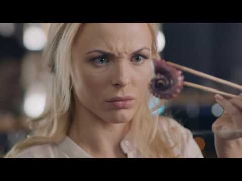
The execution follows a classic Setup-Turn-Payoff structure. The Setup is a skillfully edited montage of people of all ages experiencing challenging flavors for the first time. We see the comical and relatable disgust of tasting a pickle, an oyster, a chili pepper, or even popping candy. These vignettes are short, sharp, and universally understood, requiring no dialogue. The quirky a-cappella soundtrack adds to the lighthearted, slightly tense feeling. This montage effectively establishes a problem: the world is full of harsh, unpleasant, or acquired tastes.
The Turn is delivered with a simple line of text on a purple screen: “Some first tastes are more tender than others.” This is the pivot point where the ad transitions from the general human experience to the specific brand promise. It reframes the preceding montage not just as a series of funny moments, but as a setup for the solution the brand provides.
The Payoff is the resolution offered by Milka. The music softens, the lighting becomes warm, and the pacing slows down. A mother gives her young daughter a piece of Milka chocolate. The girl's reaction isn't shock or disgust; it’s one of quiet, immediate delight. This final scene is the emotional anchor of the entire spot. It visually embodies the brand’s tagline, “Tenderness is inside,” by linking the product to a tender moment of connection between a mother and child. The girl's simple joy serves as the ultimate proof of the ad's central claim.
The debrief for the team would be clear: this is how you make a brand mean something. The ad succeeds because it doesn’t just show a product; it frames the product as the answer to a shared experience. The strategic decision to use no dialogue and rely on universal facial expressions makes the campaign easily adaptable across multiple European markets, which was part of the plan. [3] It’s a lesson in disciplined, single-minded branding that reinforces Milka’s identity as an accessible, comforting, and emotionally resonant choice in a crowded confectionery market.
Theme Keywords
Brand Position
Milka owns the position of the most tender and comforting chocolate experience.
Brand Archetype
The Caregiver
Creative Game Plan
Contrast the universal shock of trying challenging new foods with the reliably tender and joyful experience of tasting Milka chocolate for the first time.
Diagnosis: Issues & Solutions
Primary Issue: Emotional Connection
The Problem:
The final payoff scene, while effective, borders on being overly sentimental and cliché. The idyllic mother-daughter moment with perfect lighting and braided hair feels almost too perfect, which could slightly undermine the authenticity established by the more raw, genuine reactions in the first half.
The Solution:
Consider a slightly more naturalistic final scene. Perhaps the girl could be surprised by how good it is, a subtle callback to the 'first taste' theme, rather than just serene delight. This would connect the two halves of the ad more tightly and feel less like a stock footage moment.
Secondary Issue: Strategic Sense
The Problem:
The ad does such a good job of setting up the 'bad tastes' that it risks being more memorable for the gags than for the brand. Viewers might recall the funny faces (the grandma with popping candy is a highlight) but forget that it was an ad for Milka.
The Solution:
To enhance brand recall without disrupting the flow, the iconic Milka lilac color could have been subtly integrated into the background of one or two of the 'bad taste' vignettes, priming the viewer for the final reveal.
Additional Notes
Related Links
Credits
Share this Analysis
More Milka ad breakdowns
- Milka "Mr. Milkman"Milka
- Patamilka - Milka's marmot, 20 years later.Milka
- Don't let life's interruptions get in the way. Have a quality break with KitKat®🍫KitKat
- Break ClausKit Kat
- SNICKERS 'Gremlins' by GARY FREEDMANSnickers
- Crunch: Generation warsCrunch
- eQlibri™ - ReflexoseQlibri
- Nørregade: GothNørregade