Help Relieve Itchy and Watery Eyes with Optrex Actimist - Ad Analysis

AI Editor notes
Straight from the gut!!
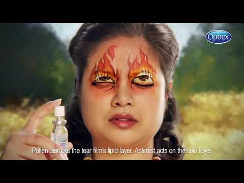
“Okay, the painted eyes are a clever visual hook. It's a smart way to show an internal feeling externally. It's a bit jarring at first, but it works. For a 20-second spot, it gets the point across fast: eyes feel awful, this spray fixes it. It's not trying to win awards for poetry, it's trying to sell a seasonal remedy, and the directness is its strength. The 'Open your eyes to spring' line is solid.”
Quick Summary
This ad successfully visualizes an invisible feeling—the misery of hay fever eyes—through a memorable and ownable creative device. By painting the symptoms directly onto sufferers' faces, Optrex makes the problem tangible and the relief immediate, executing a classic problem-solution strategy in a way that's hard to ignore in a crowded, functional category.
Executive Summary
In the over-the-counter healthcare space, clarity trumps cleverness nine times out of ten. The Optrex Actimist 'Open Your Eyes to Spring' campaign is a testament to this rule, but with a crucial twist: it achieves its clarity through a clever creative device. The ad is a tight, 20-second masterclass in the Problem-Solution narrative structure, designed for maximum impact in short-form digital and social environments. Its primary goal isn't to build a deep, emotional connection to the Optrex brand, but to cement Actimist as the go-to solution for the acute, seasonal misery of hay fever.
The core insight is simple: hay fever sufferers feel like their eyes are literally on fire, leaking, or being electrocuted. It’s an internal, invisible feeling that’s hard to depict. The ad’s strength lies in making this internal feeling external and visible. Instead of the cliché shot of someone rubbing their red eyes, the campaign uses striking, hand-painted makeup and VFX to show the symptoms. This creative choice is the engine of the ad. The 'Problem' phase is established in the first three seconds with arresting visuals of people whose eyes are painted with flames and waterfalls. This is the hook; it's visually disruptive and immediately communicates 'suffering' without a single word of dialogue. The setup is both artistic and slightly grotesque, ensuring it grabs attention.
The 'Solution' phase is executed with brutal efficiency. The product appears, is used correctly (sprayed on closed lids), and the effect is instantaneous. The painted-on malady dissolves, and the stylized, impressionistic background sharpens into a clear, happy reality. This before-and-after transformation provides the proof and payoff. The final tagline, 'Open your eyes to spring,' isn't just a clever sign-off; it's a direct summary of the benefit. The viewer is freed from their pollen prison to enjoy the season as they're meant to.
The debrief for the team here is about the power of visualizing an internal state. When your product solves an invisible problem (like an itch or irritation), finding a distinctive visual metaphor is key to breaking through. This ad avoids the generic, clinical language of its competitors and instead creates a memorable shorthand for both the problem and the solution. It proves that even for a functional, medical product, the execution can be creative and bold without sacrificing clarity. It’s a solid piece of seasonal, tactical advertising that does its job effectively.
Theme Keywords
Brand Position
The expert eye care solution that lets you live life uninterrupted.
Brand Archetype
The Magician (transforms a negative situation into a positive one instantly).
Creative Game Plan
Visually dramatize the internal misery of hay fever to make the product's relief feel more immediate and tangible.
Diagnosis: Issues & Solutions
Primary Issue: Strategic Sense
The Problem:
The ad's greatest strength—its tight focus on seasonal hay fever—is also a potential limitation. It positions Actimist squarely as a hay fever product, potentially missing an opportunity to broaden its use-case for other eye irritations (e.g., from screen time, air conditioning) that the 'lipid layer repair' mechanism also addresses.
The Solution:
Develop a parallel creative that uses a similar 'painted eyes' device but for different modern problems. For example, show eyes painted with pixelated static for 'screen fatigue' or dry, cracked earth for 'office air-con eyes' to expand the product's relevance beyond a single season.
Secondary Issue: Clarity of "What's Next?"
The Problem:
While the ad strongly implies 'buy this product,' the final tagline 'Open your eyes to spring' is more of a brand statement than a direct action. For a performance-focused digital campaign, it could benefit from a more explicit nudge towards purchase, especially in clickable formats.
The Solution:
In social or clickable video placements, supplement the final brand slate with a simple, direct overlay like 'Find it in pharmacies' or a 'Shop Now' button linked to major online retailers. This bridges the gap between awareness and conversion without altering the core creative.