Health Insurance Abhi Lena SMART Hai | Get the RIGHT health insurance on your side | Star Health - Ad Analysis

AI Editor notes
Straight from the gut!!
“It's a textbook emotional insurance ad, but executed with polish and a strong central metaphor. The split-screen is a classic for a reason—it instantly communicates the core conflict and resolution. The casting of a relatable, everyman actor instead of a superstar makes the situation feel more grounded and real. It’s effective and gets the point across without being overly complicated.”
Quick Summary
This ad's power comes from making an abstract fear tangible. It uses a simple split-screen to show two realities of a medical crisis: one filled with anxiety, confusion, and financial stress, and the other with calm, confidence, and care. By dramatizing this 'fine line,' the ad doesn't just sell a policy; it sells certainty in a moment of utter uncertainty. It's a direct and effective emotional pitch to the person responsible for their family's well-being.
Executive Summary
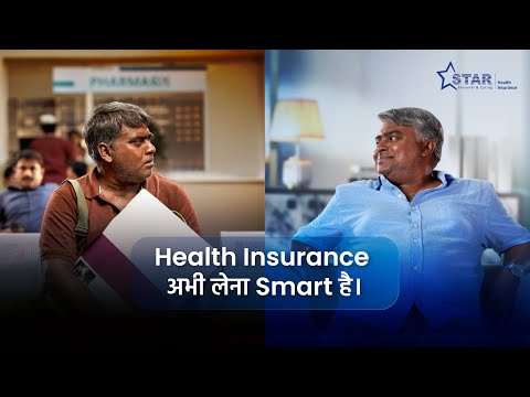
The ad is built around a single, powerful metaphor: the 'fine line' that separates peace of mind from panic during a medical emergency. It opens with a narrator, who is also our protagonist, speaking directly to this idea. The core of the ad is a beautifully simple, yet effective, split-screen execution. On the left, we see the world 'without' Star Health Insurance. It's a world of grim, crowded, and bureaucratic public hospitals. The lighting is harsh, the colors are drab, and our protagonist is visibly stressed, alone, and overwhelmed by paperwork and queues. He is seen struggling at the cash counter, looking helpless.
On the right, we see the world 'with' Star Health Insurance. The environment is a modern, clean, and calm private hospital. The lighting is soft and the color palette is a reassuring teal. Here, the same protagonist is confident and supported. Doctors are attentive, his family is by his side, and the financial aspect is handled seamlessly with a 'Cashless Claim Approved' notification on his phone. The contrast is stark and immediate. Every beat of the 'without' scenario has a corresponding 'with' scenario that resolves the pain point: waiting in a queue vs. being attended to, financial stress vs. cashless approval, loneliness vs. family and doctor support. The payoff is the final shot where the two realities converge. The stressed man on the left looks across at his calm, insured self on the right, who gives a slight, knowing nod of reassurance. The ad concludes by explicitly stating that Star Health Insurance keeps you on the 'right side' of that fine line, turning the abstract concept of security into a tangible, visual choice.
Brand Position
Based on this ad, Star Health's position is 'The Decisive Factor for a Caring & Personal Healthcare Experience.' They are not just a financial tool, but the partner that ensures dignity, calm, and quality care.
Brand Archetype
The Caregiver. Their personality is Responsible, Empathetic, and Reassuring.
Creative Game Plan
The core creative idea was to 'Visualize the Two Futures.' They made the invisible benefit of insurance—peace of mind—visible by showing two parallel realities unfolding at the same time.
Diagnosis: Issues & Solutions
Primary Issue: Strategic Sense
The Problem:
The ad's primary weakness is that its core message, while powerful, is the generic promise of the entire insurance category. The story is about the benefit of having 'health insurance' more than it is about the specific benefit of having 'Star Health Insurance'. A competitor could easily swap their logo at the end and the ad would still make sense.
The Solution:
Integrate a unique brand-specific proof point into the narrative itself. For instance, if Star Health has the industry's fastest claim approval, the split-screen could have shown the 'without' character waiting for days while the 'with' character's approval happens in minutes on screen. This would tie the emotional benefit directly to a tangible, ownable product feature, making the brand indispensable to the story.
Secondary Issue: Clarity of 'What's Next?'
The Problem:
The ad successfully creates a strong emotional desire for the product but the call to action, while clear, is standard. It doesn't leverage the emotional peak of the ad to create a more compelling immediate next step.
The Solution:
The final call-to-action screen could have been more dynamic. For example, instead of just a URL, they could have added a specific, low-friction offer like 'Get a free quote in 60 seconds' or 'See plans for your family now'. This provides a more concrete and less intimidating first step for a viewer who has just been taken on a heavy emotional journey.
Additional Notes
Credits
Share this Analysis
More Star Health Insurance ad breakdowns
- For the Wanderers Like Shreya | Health Insurance Lena Smart Hai | Star Health InsuranceStar Health Insurance
- For the Hustlers Like Kapil | Health Insurance Lena Smart Hai | Star Health InsuranceStar Health Insurance
- For Every Foodie Like Varun | Health Insurance Lena Smart Hai | Star Health InsuranceStar Health Insurance
- Munnabhai and Circuit | ACKO Health InsuranceACKO
- Munnabhai and Circuit | ACKO Health Insurance | Sanjay Dutt | Arshad WarsiACKO
- Mary Aunty and the BiscuitsGeneral Insurance Council
- Cigna "The Casting Call"Cigna
- Walk 10,000 Steps a day, Get Up to 30% Discount* on Care Supreme Renewal Premium!Care Health Insurance