Google Impact Challenge | UK 2013 - A better world, faster - Ad Analysis

AI Editor notes
Straight from the gut!!
“This is classic, peak 'Don't Be Evil' Google. The creative concept—making the cursor the agent of change—is smart and clean. It connects their digital world to real-world impact in a simple way. Still, it feels a bit generic. It's a nicely executed piece of feel-good marketing, but it lacks a sharp, ownable edge. Any big tech company could have made this ad, and a decade later, it's pleasant but not particularly memorable.”
Quick Summary
By transforming the mundane computer cursor into a hero, Google effectively reframes the simple, everyday act of clicking into a powerful tool for global change. The ad successfully associates the Google brand not with its complex technology, but with the user's own agency to do good, making its corporate philanthropy feel accessible and empowering.
Executive Summary
This ad for the Google Impact Challenge is a masterclass in simple, effective messaging for a corporate social responsibility campaign. Its entire strategy rests on a single, powerful insight: in a world of complex, overwhelming problems, the small, mundane digital actions people take every day can be reframed as acts of meaningful change.
The Core Insight: The campaign taps into a fundamental human desire to make a difference, contrasted with a feeling of individual powerlessness. The simple truth is that most people spend hours online, clicking a mouse, without connecting that action to any real-world outcome. This ad bridges that gap, suggesting that this ubiquitous digital gesture, when channeled through Google's initiative, is not futile but powerful.
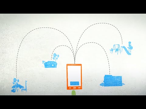
The Execution: The creative follows a clear, repetitive montage structure. There is no complex narrative arc; instead, it's a rapid succession of micro-stories, each built on a 'Problem-Solution' framework where the cursor is the hero. Each 5-second vignette works like this:
- Setup: A problem is visualized simply (e.g., a figure representing a human rights activist is threatened by a large, dark shadow).
- Turn: The cursor, the ad's protagonist, enters and intervenes. It becomes a shield, a bridge, a light source, or a tool for connection.
- Payoff: The problem is visually resolved, leading to a positive outcome (the activist is protected; the unemployed youth finds a path forward). This formula is repeated nearly a dozen times, relentlessly hammering home the core message. The calm female voiceover and gentle, optimistic music create a consistent, reassuring tone. The visual style—a textured, 2D paper-cut animation—feels handcrafted and earnest, distancing the message from a cold, corporate aesthetic. The entire ad serves as the setup for the final call to action, 'Vote Now,' which positions the viewer to become the hero of the next story.
The Debrief: The key lesson here is the power of a simple, portable creative device. Using the cursor as the agent of change is a clever way to directly link the digital world of Google to the tangible, social good it wants to foster. For a CSR campaign, the goal isn't necessarily groundbreaking creativity but rather clarity, sincerity, and emotional warmth. The ad succeeds by not overcomplicating its message and by delivering it with a visual and tonal consistency that builds a feeling of hope and empowerment, culminating in a clear, actionable step for the viewer.
Theme Keywords
Brand Position
The platform that empowers ordinary people to create extraordinary change.
Brand Archetype
Sage
Creative Game Plan
We will demonstrate that the simplest digital action—a single click—has the power to solve the world's most complex problems when channeled through our initiative.
Diagnosis: Issues & Solutions
Primary Issue: Emotional Connection
The Problem:
The ad's 'buffet' approach to social issues—showing ten problems in sixty seconds—creates a broad sense of goodwill but prevents any single issue from landing with genuine emotional weight. The viewer feels generally hopeful but is unlikely to connect deeply with any specific cause, diluting the potential for powerful emotional resonance.
The Solution:
Instead of a montage, focus the ad on a single, compelling story. Follow one non-profit's journey, using the animation to illustrate their specific challenge and how the Impact Challenge can help them triumph. A deeper narrative would create a stronger, more memorable emotional hook.
Secondary Issue: Brand Distinctiveness
The Problem:
The creative concept is not inherently ownable by Google. The cursor is a universal icon of the digital age, not a specific brand asset. A competitor like Microsoft or Apple could have run a nearly identical campaign, simply swapping the logo at the end.
The Solution:
Subtly weave in more unique Google brand elements. The cursor's trail could have briefly flashed in Google's four colors, or one of the solutions could have visually hinted at a technology like Google Maps or Translate, making the connection to the parent brand stronger without turning it into a product ad.
Additional Notes
Credits
Share this Analysis
More Google ad breakdowns
- Veo3 Launches in IndiaGoogle
- Introducing Gangoogly, Sourav Gangoogly 😉Google
- Make Everyday Easier With GeminiGoogle
- Google x Baker Boy | Helping you help othersGoogle
- Move On Dengan Bantuan GoogleGoogle
- Project Relate | Google for India 2022Google
- Suaramu Inspirasi Mereka #SelamatHariKartiniGoogle
- Helping you help othersGoogle