End Youth Homelessness - Ad Analysis

AI Editor notes
Straight from the gut!!
“This is a smart, sharp piece of work. It sidesteps the usual charity ad clichés of sad-eyed kids and somber piano music. The Banksy-esque graffiti animation is a clever creative device that feels authentic to the 'street' element of the story. It’s arresting, respects the viewer's intelligence, and gets its point across without being emotionally manipulative. A really solid, memorable campaign.”
Quick Summary
By transforming stenciled words into a life-threatening obstacle course, this ad brilliantly visualizes the impossible choice facing homeless youth. It reframes the problem from one of location ('home' vs. 'street') to one of survival ('abuse' vs. 'harm'), forcing the viewer to feel the terrifying precariousness of a situation where there are no good options.
Executive Summary
This campaign from End Youth Homelessness is a masterclass in using a simple creative device to explain a complex and brutal truth. Its power lies in its restraint and intelligence, opting for a visual metaphor over the more common, and often less effective, tropes of the charity sector. The core strategy is to reframe the viewer's understanding of youth homelessness, moving it from a simplistic narrative of 'running away from home' to the horrifying reality of having to choose between two life-threatening environments.
The insight at the heart of the campaign is potent: for many young people, home is not a safe place, but the streets are no better. [2] The choice isn't freedom versus safety; it's one form of danger versus another. This is the 'dilemma' the ad so effectively portrays. The creative team at Leo Burnett and the director, FX Goby, made a critical decision to visualize this insight literally, turning the words describing the choice into physical, treacherous terrain. [2, 3]
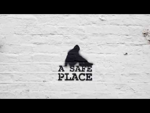
The execution follows a clean Setup-Turn-Payoff structure. The Setup introduces the animated silhouette and the stenciled-word environment, establishing the visual rules of this world. It begins with the seemingly benign phrase, 'LIVE AT HOME'. The Turn is swift and brutal. The concept of 'home' is immediately corrupted with the revelation of abuse, and the alternative, 'the street,' is shown to be just as perilous with the threat of harm from strangers. The animation brings this to life; the figure stumbles, hides, and struggles, their physical journey mirroring their emotional and psychological turmoil. The minimalist sound design, consisting only of harsh, real-world street noise and the character's strained efforts, amplifies the sense of hostility and isolation. [5] The Payoff brings the resolution. After explicitly stating the core message—'It's a dilemma no teenager should have to deal with'—the ad presents the solution: 'GET THEM TO A SAFE PLACE'. [3] The visual of the house outline being sprayed around the resting figure is a simple, powerful symbol of the security the organization provides. It’s a moment of quiet relief that directly answers the tension built throughout the spot.
The debrief for the team behind this would be overwhelmingly positive. They successfully took a difficult, abstract concept and made it tangible and emotionally resonant without resorting to melodrama. They created a piece of communication that is not only memorable but also highly shareable, respecting the audience's intelligence and rewarding them with a clever, well-crafted film. The campaign proves that for social causes, a powerful, well-defined idea can be more effective than simply showing the grim reality of a situation.
Theme Keywords
Brand Position
The compassionate non-profit that uniquely understands the hidden, complex dangers young people face before they even reach the street.
Brand Archetype
Caregiver
Creative Game Plan
Visualize a young person's impossible choice as a literal, life-or-death obstacle course made of words.
Diagnosis: Issues & Solutions
Primary Issue: Clarity of "What's Next?"
The Problem:
The ad does a brilliant job of framing the problem but is soft on the solution from a viewer's perspective. It ends with the URL 'EYH.ORG.UK', but leaves the viewer to figure out the specific action they should take—is it to donate, volunteer, or simply learn more? This lack of a specific directive can reduce conversion from awareness to action.
The Solution:
Strengthen the final call-to-action with a more direct, yet still tonally appropriate, prompt. A simple change on the end card to 'Help us create more safe places. Visit EYH.ORG.UK' would provide a clearer path and purpose for the viewer's next step.
Secondary Issue: Emotional Connection
The Problem:
The use of a stylized, anonymous silhouette is a key strength, making the story universal. However, this abstraction can create a slight emotional distance. The viewer feels empathy for the *situation*, but doesn't connect with a specific human story, which can sometimes be a more powerful driver for donations.
The Solution:
On the campaign landing page (EYH.ORG.UK), immediately follow up the allegorical film with short, real-life stories or testimonials. This would bridge the gap between the conceptual problem shown in the ad and the real people it affects, grounding the powerful metaphor in human reality.