DIESEL FALL/WINTER 21 - Ad Analysis

AI Editor notes
Straight from the gut!!
“Okay, this is clever. It's the logical, absurd endpoint of branding. Instead of just putting your clothes on people, you become the canned peas they eat and the toilet paper they use. The surrealism works because it feels like a commentary on itself. The red-skinned model is a perfect, 'what the hell?' moment that makes you stop scrolling. It’s weird, it’s confident, and it perfectly nails the rebellious, ironic DNA Diesel built its name on. [11]”
Quick Summary
By transforming a mundane supermarket into a world where every single product is from Diesel, the brand makes a powerful, ironic statement about consumer culture. [17, 19] It argues that in a sea of meaningless choices, Diesel isn't just another option—it's the entire landscape. The ad isn't selling jeans; it's selling a 'For Successful Living' worldview where the brand is so essential, it replaces even the most basic necessities.
Executive Summary
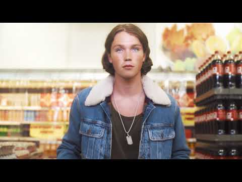
This Fall/Winter 2021 campaign from Diesel marks a confident return to form, leaning into the ironic, provocative spirit that defined the brand in its heyday. [9, 11] Under the creative direction of Glenn Martens, the film doesn't just sell clothes; it builds a self-contained universe to make a sharp commentary on consumerism itself. [19] By setting the action in a supermarket where every single item, from disinfectant to canned peas, is a Diesel product, the brand creates a surrealist fantasy that is both a critique and a celebration of its own pervasiveness.
The core insight here is that in a world oversaturated with choice, true brand loyalty feels like an all-or-nothing proposition. Diesel plays with this idea by literally removing all other choices. The campaign suggests that 'Successful Living' isn't about picking the right item off a crowded shelf, but about wholesale immersion in a particular attitude. This was the first major campaign under Glenn Martens' vision, and it served as a powerful statement of intent: to restore Diesel’s reputation as a challenger brand that plays by its own rules. [5]
The execution follows a clear Setup-Turn-Payoff structure. The Setup is the familiar, almost dreary backdrop of a local supermarket, made slightly uncanny by the stylishly out-of-place shoppers. This grounds the ad in a universally understood reality. The Turn is the gradual, then overwhelming, realization that every product is Diesel-branded. This is the central joke and conceit, turning a mundane shopping trip into a bizarre, pop-art fever dream. The use of mixed media, cutting between polished, colorful shots and grainy CCTV footage, enhances this disorientation, making the viewer feel like they are both a participant and a voyeur. The Payoff is the chaotic, joyful climax where the shoppers embrace the absurdity, followed by the simple, confident tagline: 'For Successful Living.' This final message reframes the entire film: this isn't a dystopia of no choice; it's a utopia where the only choice you need is Diesel. The clothes themselves are part of the landscape rather than the single focus, positioning the apparel as the uniform for inhabitants of this surreal brand-world.
The debrief for the team that made this is simple: when you have a strong, historical brand identity rooted in irony, lean all the way in. The campaign succeeded because it wasn't afraid to be weird. It understood that for a brand like Diesel, being memorable is more important than being universally liked. It trusted its audience to get the joke about consumer culture [17] and, in doing so, re-established a powerful sense of complicity with its customers, just as its legendary 90s campaigns did. [11]
Theme Keywords
Brand Position
The unapologetic, ironic, and democratic choice for successful living.
Brand Archetype
The Jester / The Outlaw
Creative Game Plan
Demonstrate that Diesel is more than a brand—it's a complete, self-sufficient lifestyle—by ironically replacing every consumer product with a Diesel version.
Diagnosis: Issues & Solutions
Primary Issue: Strategic Sense
The Problem:
The concept is so strong and the execution so total that the actual products—the Fall/Winter 2021 clothing collection—are somewhat upstaged. Viewers remember the Diesel-branded soup cans more than a specific jacket or pair of jeans.
The Solution:
In future iterations of this concept, create one or two 'hero' product moments. For example, have a character interact with a piece of clothing with the same reverence and focus that another gives to a can of 'Diesel Peas' to better bridge the concept with the commerce.
Secondary Issue: Emotional Connection
The Problem:
The ad's tone is cool, ironic, and detached. While this is on-brand for Diesel, it risks keeping the viewer at an intellectual arm's length, admiring the cleverness without feeling a deeper pull or connection to the people in the ad.
The Solution:
Introduce a micro-narrative or a moment of genuine, unexpected human connection between two of the characters amidst the surreal chaos. This could add a layer of warmth without compromising the campaign's edgy, ironic core.
Additional Notes
Related Links
Credits
Share this Analysis
More Diesel ad breakdowns
- Make Love Not Walls - Diesel SS17Diesel
- DIESEL X MUSTAFA - The Ultimate CollaborationDiesel
- DIESEL - The CapsuleDiesel
- NEYMAR JR. X DIESEL FRAGRANCES - SPIRIT OF THE BRAVEDiesel
- HAPPY APOCALYPSE #GetItWhileYouCanDiesel
- DIESEL Magic of Christmas BEHIND THE DREAMSDiesel
- The A-Z of DanceDiesel
- No Fuel For Life In My Life - TShirtDiesel