AXA: The Choir - Ad Analysis

AI Editor notes
Straight from the gut!!
“Okay, this is clever. Using a male choir to personify a guy's internal monologue of fatherhood panic is a solid creative hook. It's relatable without being sappy. But is the product itself—the 'Precious Mom and Child' plan—getting lost in the gimmick? The transition from the chaotic crib-building to the sterile AXA office is a bit jarring. It works, but it feels like two different ads stitched together at the 30-second mark.”
Quick Summary
This ad succeeds by translating a complex, internal feeling—the escalating anxiety of a father-to-be—into a simple, memorable, and funny visual device: a growing choir of men that follows him everywhere. It uses this humorous, surreal concept to make a traditionally dull product category, maternity insurance, feel approachable and emotionally relevant. The core message is clear: AXA removes the financial worry so you can focus on the joy.
Executive Summary
In the typically staid and rational world of insurance advertising, AXA’s “The Choir” stands out by refusing to lead with fear or statistics. Instead, it finds a powerful lane by tapping into a nuanced emotional truth about parenthood and wrapping it in a clever, surrealist package. The work is a prime example of how to make a functional product feel deeply human.
The Core Insight here is that for an expecting father, the journey to parenthood isn't just one big worry; it's an accumulation of small, persistent, and growing anxieties. It’s not just about the birth; it’s about the ultrasound, the morning sickness, the prenatal classes, and the impossible-to-assemble furniture. This insight is far more specific and relatable than a generic promise of 'peace of mind.'
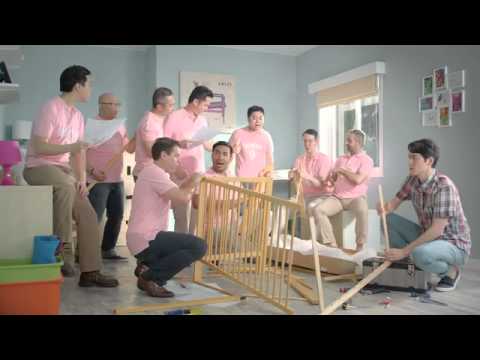
The Execution uses a classic Setup-Turn-Payoff structure, brilliantly visualized. The Setup introduces the core creative device: a male choir that personifies the father’s inner anxieties. This choir—singing a determinedly upbeat a cappella version of The Proclaimers' “I’m Gonna Be (500 Miles)”—grows in size and changes its uniform to match each stage of the pregnancy. This is a smart, funny way to show, not just tell, the mounting pressure. The humor comes from the juxtaposition of the mundane reality of pregnancy with this absurd, ever-present singing group. The Turn happens precisely at the moment of peak chaos, as the father is overwhelmed while trying to build the crib. A simple voiceover, 'As a dad to be, you don't have to over-worry,' signals the shift. The protagonist crosses a literal red line on the floor, moving from his chaotic home life into the calm, orderly world of an AXA office. This visual transition is the problem meeting the solution. The Payoff is twofold. First, the rational benefit is explained: AXA's insurance covers mother and child, removing the financial risk. Second, and more importantly, the emotional benefit is shown. We see the father, now relaxed and happy, enjoying his wife and newborn. The choir is still present, but they’ve been transformed—now dressed in fuzzy animal costumes, they represent joyful support rather than anxiety. This final scene beautifully resolves the initial tension, proving the campaign's core promise: AXA manages the risk so you can manage the joy.
The Debrief for the team is that creative risk pays off in a conservative category. By personifying a universal feeling with a memorable, humorous device, the ad creates an emotional shortcut to the brand's value proposition. It proves that you don't need to show worst-case scenarios to sell insurance; sometimes, showing the best-case scenario (undisturbed joy) is far more powerful. The key was grounding a surreal idea in a very real human insight.
Theme Keywords
Brand Position
The empathetic partner that understands the emotional journey of parenthood and manages financial risks, so you don't have to.
Brand Archetype
The Caregiver
Creative Game Plan
Visually represent the internal anxiety of an expecting father with a surreal, growing choir to show how AXA's maternity insurance can turn that worry into joy.
Diagnosis: Issues & Solutions
Primary Issue: Clarity of 'What's Next?'
The Problem:
The ad does a fantastic job of building emotional connection and presenting the problem/solution, but the final call-to-action is soft. After the AXA logo, the ad ends. It relies entirely on the viewer's initiative to search for 'AXA Pregnancy Protection Plan' without providing a clear, immediate next step like a localized URL or a dedicated hotline number on the screen.
The Solution:
Strengthen the final end card. Alongside the product name, add a clear, localized call-to-action such as 'Visit axa.com.hk/baby' or 'Search: AXA Baby Plan' to bridge the gap between interest and action, making the path to conversion more direct for an engaged viewer.
Secondary Issue: Strategic Sense
The Problem:
The transition from the chaotic, warm-toned home life to the cool, sterile AXA office is abrupt. While it effectively contrasts the problem and solution, it momentarily breaks the charm of the ad and makes the 'sell' feel slightly disconnected from the creative story that preceded it.
The Solution:
Integrate the AXA brand more organically into the narrative's resolution. For instance, the AXA agent could hand the father a symbolic item that, when brought back to the home scene, visually 'tames' the choir (e.g., turning their worried expressions into smiles), creating a smoother and more integrated narrative flow.