AXA makes tv ad you can step into - Ad Analysis

AI Editor notes
Straight from the gut!!
“This is a classic from the early 2011 marketing playbook. For its time, using a QR code to 'unlock' the rest of a TV ad was a genuinely clever idea. The case-study format is a bit self-congratulatory, but the core concept is solid. It's built for industry buzz and awards, and it works on that level. The alien is a weird, but memorable, twist.”
Quick Summary
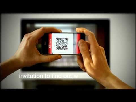
By embedding a QR code into a TV spot, AXA created an 'i-mercial' that transformed passive viewing into an active, interactive experience. This allowed them to not only tell a story about why you need home insurance but also to demonstrate their brand's commitment to innovation and drive immediate downloads for their new mobile app.
Executive Summary
This case study for AXA's 'i-mercial' is a time capsule from 2011, showcasing a pivotal moment when brands were first learning to bridge the gap between traditional broadcast media and the interactive potential of smartphones. The work, from agency Duval Guillaume, isn't just an ad; it's a demonstration of a new way to think about advertising structure, turning a 30-second spot into a doorway to a deeper experience.
The core insight is simple but powerful: unresolved curiosity is a potent motivator. Standard insurance ads show you a disaster and then the solution. AXA chose to show the disaster—a meteor strike—but hide the consequence. The only way to resolve the tension was to actively participate. This reframed the viewer from a passive recipient to an active investigator, a far more engaged position.
The execution follows a clean Hook-Value-Proof-Ask model. The Hook is the dramatic and unexplained meteor crash on television, which creates immediate intrigue. The Value for the viewer is the payoff for their curiosity—the ability to 'step inside' the ad via their phone and explore the scene, granting them access to a hidden piece of content. The Proof is the experience itself; it proves AXA's claim of being an innovative company while the chaotic scene inside the house serves as visceral proof of why one needs home insurance. The quirky alien reveal at the end ensures the experience is talked about and shared. Finally, the Ask is perfectly timed. After the viewer has been entertained and primed with the brand's message, the ad prompts them to download the very app the campaign was designed to launch.
The key debrief for any team studying this work is the importance of integrating technology into the core of the creative idea. The QR code wasn't an afterthought; it was the entire mechanism of the story's progression. [2] While the technology itself is now commonplace, the strategic thinking behind it—creating a 'secret' for the audience to unlock—is timeless. It's a masterclass in generating outsized PR value and industry awards from a media buy by being the first to use a new tool in a narratively compelling way.
Theme Keywords
Brand Position
The insurance company that is redefining standards through digital innovation.
Brand Archetype
The Explorer
Creative Game Plan
We will leverage emerging second-screen technology to turn a passive TV ad into an interactive mystery that proves our brand's innovation and drives app downloads.
Diagnosis: Issues & Solutions
Primary Issue: Emotional Connection
The Problem:
The experience is intellectually clever but emotionally sterile. The final reveal of a small, sad alien is a humorous, sci-fi twist that completely diffuses the real-world anxiety of home damage—the very feeling that sells insurance. It turns a moment of potential empathy into a quirky gag.
The Solution:
To ground the experience in a more powerful emotion, the interior exploration could have focused on the damage to personal, relatable items (a child's drawing, a broken family photo). This would connect the fantastical event to a more tangible fear of loss, making the need for insurance feel more urgent and personal.
Secondary Issue: Clarity of "What's Next?"
The Problem:
The barrier to entry for the interactive experience was significantly high in 2011. It required the viewer to have their smartphone handy, have a QR code reader app installed (not a native function at the time), and successfully scan a fleeting image on their TV screen. Many interested viewers were likely lost due to this friction.
The Solution:
The TV spot should have given more visual weight to the simple URL (`axa.be/iphone`) as an alternative entry point. This would have provided a lower-friction path for viewers who were intrigued but not equipped to scan a QR code instantly, maximizing the number of people who could reach the campaign's digital destination.